PhotoshopForums.com Home
Navigate Contact FAQ Search Members
Pulled by the Wind (Criticism Anyone?)
Post new topic   Reply to topic    PhotoshopForums.com Forum Index -> Design and Graphic Reviews
 See a User Guidelines violation? Please contact us.
Author Message

The Megal

Joined: 16 Apr 2010
Posts: 3
Location: The Twilight Zone


Post
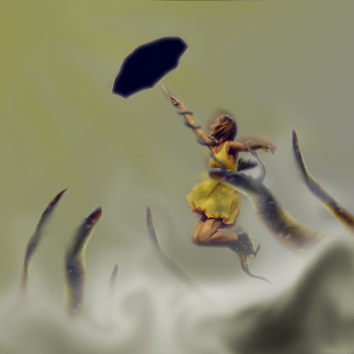
Posted: Tue May 25, 2010 11:08 pm    Post subject: Pulled by the Wind (Criticism Anyone?) Reply with quote

What do you think of it? Could you tell me what I could have done better? What do you think of the concept?[/img]


pulledbythewind copy.jpg
 Description:
 Filesize:  104.85 KB
 Viewed:  535 Time(s)

pulledbythewind copy.jpg


View user's profile Send private message

darklite

Joined: 19 Dec 2009
Posts: 277
Location: Oregon, U.S.
PS Version: cs
OS: windows 7

PostPosted: Wed May 26, 2010 5:35 am    Post subject: Reply with quote

I like the concept a lot, but it almost looks as if she's floating and not moving with the wind. I think it's the blurring around her head and body, and the fact that her dress is blowing in an upward direction and not behind her. Her hair is also blowing upward-against the wind. It's a very interesting piece though.
_________________
Jeff

http://www.autumnwindstudios.com
View user's profile Send private message Visit poster's website

Patrick
Administrator
Administrator

Joined: 14 Feb 2003
Posts: 11945
Location: Harbinger, NC, U.S.A.


PostPosted: Wed May 26, 2010 2:00 pm    Post subject: Reply with quote

darklite makes some interesting points. Like him, I think it's an interesting concept, though. Maybe the fingerlike things could be a little more transparent.

Patrick

_________________
Patrick O'Keefe - PhotoshopForums.com Administrator
Have a suggestion or a bit of feedback relating to PhotoshopForums.com? Please contact me!
User Guidelines
View user's profile Send private message Send e-mail Visit poster's website AIM Address Yahoo Messenger MSN Messenger

Auieos

Joined: 29 Jan 2010
Posts: 2019


PostPosted: Wed May 26, 2010 6:10 pm    Post subject: Reply with quote

Great concept. I would prefer it to be more Disney like and less grim, but that's a personal thing.
View user's profile Send private message

jk3000

Joined: 16 Apr 2009
Posts: 38


PostPosted: Tue Jun 08, 2010 1:36 am    Post subject: Reply with quote

I would add more detail to the umbrella and a little less blur; just on the umbrella.
View user's profile Send private message Visit poster's website
Display posts from previous:   
Post new topic   Reply to topic    PhotoshopForums.com Forum Index -> Design and Graphic Reviews All times are GMT - 6 Hours
Page 1 of 1
Jump to:  
You cannot post new topics in this forum
You cannot reply to topics in this forum
You cannot edit your posts in this forum
You cannot delete your posts in this forum
You cannot vote in polls in this forum
You cannot attach files in this forum
You can download files in this forum


Contact - User Guidelines >

Copyright © 2003-2016. PhotoshopForums.com, iFroggy Network. All Rights Reserved.
Powered by phpBB © phpBB Group. phpBB SEO. Privacy Policy.
We are in no way affiliated with Adobe. Photoshop, Adobe and related marks are registered trademarks of Adobe.
PhotoshopForums.com