|
|
| Author |
Message |
The Megal
Joined: 16 Apr 2010
Posts: 3
Location: The Twilight Zone
|
 Posted: Tue May 25, 2010 11:08 pm Post subject: Pulled by the Wind (Criticism Anyone?) Posted: Tue May 25, 2010 11:08 pm Post subject: Pulled by the Wind (Criticism Anyone?) |
 |
|
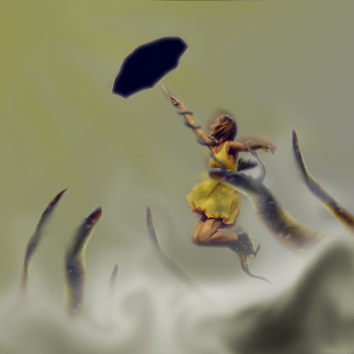
What do you think of it? Could you tell me what I could have done better? What do you think of the concept?[/img]
| Description: |
|
| Filesize: |
104.85 KB |
| Viewed: |
529 Time(s) |

|
|
|
|
|
|
 |
darklite
Joined: 19 Dec 2009
Posts: 277
Location: Oregon, U.S.
PS Version: cs
OS: windows 7
|
 Posted: Wed May 26, 2010 5:35 am Post subject: Posted: Wed May 26, 2010 5:35 am Post subject: |
 |
|
I like the concept a lot, but it almost looks as if she's floating and not moving with the wind. I think it's the blurring around her head and body, and the fact that her dress is blowing in an upward direction and not behind her. Her hair is also blowing upward-against the wind. It's a very interesting piece though.
_________________
Jeff
http://www.autumnwindstudios.com |
|
|
|
|
 |
Patrick
Administrator

Joined: 14 Feb 2003
Posts: 11945
Location: Harbinger, NC, U.S.A.
|
 Posted: Wed May 26, 2010 2:00 pm Post subject: Posted: Wed May 26, 2010 2:00 pm Post subject: |
 |
|
|
|
|
|
|
 |
Auieos
Joined: 29 Jan 2010
Posts: 2019
|
 Posted: Wed May 26, 2010 6:10 pm Post subject: Posted: Wed May 26, 2010 6:10 pm Post subject: |
 |
|
Great concept. I would prefer it to be more Disney like and less grim, but that's a personal thing.
|
|
|
|
|
 |
jk3000
Joined: 16 Apr 2009
Posts: 38
|
 Posted: Tue Jun 08, 2010 1:36 am Post subject: Posted: Tue Jun 08, 2010 1:36 am Post subject: |
 |
|
I would add more detail to the umbrella and a little less blur; just on the umbrella.
|
|
|
|
|
 |
|


