Posted: Tue Aug 14, 2012 2:15 pm Post subject: Travel Poster Comp C&C
Travel Poster Comp C&C
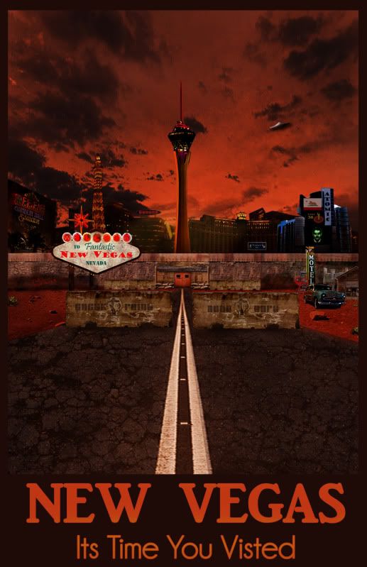
Done for a class PSD class i have been auditing
Tried to stick to old school travel poster feel but while doing so keeping how New Vegas would look as if it was real.
_________________ Programs i use CS4/CS6, Premire Pro, Encore After effects, Illustrator, Indesign, 3Ds Max, Sound booth, Dream Weaver.
Joined: 14 Feb 2003
Posts: 11945
Location: Harbinger, NC, U.S.A.
Posted: Fri Aug 17, 2012 4:52 pm Post subject:
I think it is cool. The one thing is that the hotel on the right (prior to the barrier) and the car... I don't know, something about the scale of them, compared to each other and the photo as a whole... it just doesn't look right to me. Not sure. Hope that helps.
thx ya ill try and find a better size for the car i wanted it to stand out more or be pushed forward into view over the garage. _________________ Programs i use CS4/CS6, Premire Pro, Encore After effects, Illustrator, Indesign, 3Ds Max, Sound booth, Dream Weaver.
Joined: 26 Jun 2012
Posts: 105
Location: Denmark PS Version: CS5 OS: Mac OS X
Posted: Thu Aug 23, 2012 12:54 pm Post subject:
It has good potential, but I don't think that it looks like a finished project - more like a 'detailed sketch'. If I should 'remake' it or do something to change it, I would keep it more simple. All the textures look wierd, like you have repeated them, e.g. when making the wall that the city is behind.
Also I would limit the amount of buildings in the background the way less, maybe even only one building - the tower. I like the line going all the way through the center of the picture, and that's why the centered tower-building has a good effect in the picture.
Last, but not least, the colors are a bit too intense for my taste (remember, all I am saying is that it doesn't fit my taste very good - luckily we all have different opinions ). I would tone them down, maybe make a copy of the entire image, adjust the curves a bit and turn down the saturation and apply a gradient map with colors like a dusty dark blue and purple/dark pink or orange, turn down the opacity of this layer to about 30 - 20% and change the blending mode to lighten/screen.
Oh, and the text; it looks like it took about ten seconds to make, which makes the impression of the image slightly worse than if the text was really thought through - great typographic work always pays off!
I hope I made myself sort of clear, and that my post is not all gibberish
You cannot post new topics in this forum You cannot reply to topics in this forum You cannot edit your posts in this forum You cannot delete your posts in this forum You cannot vote in polls in this forum You cannot attach files in this forum You can download files in this forum