|
|
| Author |
Message |
Skyhawk
Joined: 28 Oct 2011
Posts: 48
Location: New York City, USA
|
 Posted: Fri Nov 18, 2011 12:22 pm Post subject: Get out your color pencil Posted: Fri Nov 18, 2011 12:22 pm Post subject: Get out your color pencil |
 |
|
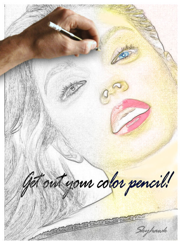
Just learning here, what do ya think?
| Description: |
|
| Filesize: |
130.34 KB |
| Viewed: |
2240 Time(s) |

|
_________________
Adopt a stray or shelter animal and save a life |
|
|
|
|
 |
Auieos
Joined: 29 Jan 2010
Posts: 2019
|
 Posted: Sun Nov 20, 2011 6:18 pm Post subject: Posted: Sun Nov 20, 2011 6:18 pm Post subject: |
 |
|
Good idea combining real with drawing to create contrast.
Probably a bit to much detail with some of the edges in the face make it look noisy.
Apart from that its looking good.
Have you seen this? http://www.alienskin.com/snapart/
|
|
|
|
|
 |
jerryb4417
Joined: 20 Dec 2008
Posts: 710
Location: Oklahoma
PS Version: photoshop cs5
OS: win7 pro 64 bit, i7-3.2g, GTS 450,
|
 Posted: Sun Nov 20, 2011 7:17 pm Post subject: Posted: Sun Nov 20, 2011 7:17 pm Post subject: |
 |
|
hi,
overall I like it... a nice idea,,
pretty good job on converting the image to line art... just minor negatives.
1. got alittle wild in getting yellow in the hair.. smiling...
2. there two things that seems to me to be very distracting...
a. the nostrils... smiling... there dominating... when you first look at the image those nostrials just pulls your eyes to them.... i would maybe minimize or eliminate....
b. the lips ... i don't knowhow todiscribe but the lips don't lookrightlook like there a hole in them ...
butlike isaid i like your work
|
|
|
|
|
 |
Skyhawk
Joined: 28 Oct 2011
Posts: 48
Location: New York City, USA
|
 Posted: Sun Nov 20, 2011 9:05 pm Post subject: Posted: Sun Nov 20, 2011 9:05 pm Post subject: |
 |
|
Thank you both for your comments Im glad you like the overall concept. I saw this done several times online and figured Id take a stab at it.
Auieos, more noise
no problem buddy, noise it is.
Jerry, I agree with you in that the nostrils are a bit overbearing and you can rest assured that I will work on softening them somewhat. The lips on the other hand what you see as a hole is really lip gloss but remember that the hand hasnt finished yet, hell eventually get around to making it look real.
Great comments thanks again! 
_________________
Adopt a stray or shelter animal and save a life |
|
|
|
|
 |
jerryb4417
Joined: 20 Dec 2008
Posts: 710
Location: Oklahoma
PS Version: photoshop cs5
OS: win7 pro 64 bit, i7-3.2g, GTS 450,
|
 Posted: Sun Nov 20, 2011 10:15 pm Post subject: Posted: Sun Nov 20, 2011 10:15 pm Post subject: |
 |
|
hi
ok on the lips... smiling.... i can see your having fun with it
|
|
|
|
|
 |
iloveprint
Joined: 12 Jan 2012
Posts: 34
|
 Posted: Mon Feb 27, 2012 4:29 am Post subject: Re: Get out your color pencil Posted: Mon Feb 27, 2012 4:29 am Post subject: Re: Get out your color pencil |
 |
|
The hand seems a little out of focus, but I love the shadow underneath it! My only other critique would be that the placement of the text/font seems a bit awkward. The overall concept is really great, though. Thanks for sharing!
|
|
|
|
|
 |
Netaddict
Joined: 16 Feb 2011
Posts: 332
Location: Earth
PS Version: CS6
OS: Windows 7 Professional
|
 Posted: Tue Feb 28, 2012 11:09 pm Post subject: Posted: Tue Feb 28, 2012 11:09 pm Post subject: |
 |
|
It looks great! Only oe improvements:
Instead of the hand covering up a reasonable portion of the image, why not put the hand at the bottom right where the signature is, as if the hand has finished drawing and is signing
|
|
|
|
|
 |
hytham
Joined: 17 Nov 2011
Posts: 37
Location: 64
|
 Posted: Sat Mar 03, 2012 7:27 am Post subject: Posted: Sat Mar 03, 2012 7:27 am Post subject: |
 |
|
Great work..but i agree with the point of nose..it's need to be modified...and i think lips need to be less glossy..
I like it..keep it up
|
|
|
|
|
 |
darklite
Joined: 19 Dec 2009
Posts: 277
Location: Oregon, U.S.
PS Version: cs
OS: windows 7
|
 Posted: Mon Mar 12, 2012 5:40 pm Post subject: Posted: Mon Mar 12, 2012 5:40 pm Post subject: |
 |
|
This is beautiful. The nose and mouth don't bother me, but look great. However, simple toning with some light gray, or relevant colors will take away the impact of the stark white of the nostrils and the inside of the mouth. I think her lips should definitely be glossy, no problem there. She's glamorous.
_________________
Jeff
http://www.autumnwindstudios.com |
|
|
|
|
 |
|


