|
|
| Author |
Message |
The Megal
Joined: 16 Apr 2010
Posts: 3
Location: The Twilight Zone
|
 Posted: Fri Apr 16, 2010 5:26 pm Post subject: Falling Star (looking for criticism) Posted: Fri Apr 16, 2010 5:26 pm Post subject: Falling Star (looking for criticism) |
 |
|
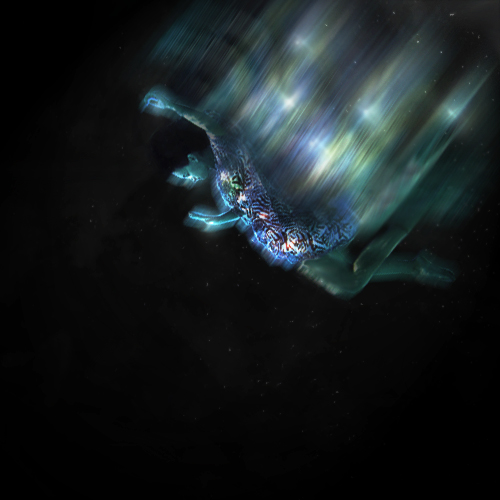
Hello, I'm brand new to these parts and I was wondering if ya guys could give me some gentle criticism. I liked how this piece turned out, when I found the model I knew I had to do something with it. But I feel like it's missing...something. If this where you're creation, what would you change/add? Please and thank you.
| Description: |
|
| Filesize: |
122.18 KB |
| Viewed: |
726 Time(s) |

|
|
|
|
|
|
 |
TechnoBach
Joined: 16 Apr 2010
Posts: 16
Location: Ottawa, ON, CANADA
|
 Posted: Fri Apr 16, 2010 6:12 pm Post subject: Posted: Fri Apr 16, 2010 6:12 pm Post subject: |
 |
|
Hey Megal. I'm new to this too, so maybe someone could critique my critique? 
Anyways, I really like your picture, the falling/glowing effect, but I agree it seems like somethings missing. I was thinking you could make the model be reaching for something? It'd give it more direction. And then maybe a bright star where she's pointing, again for a bit more direction and purpose.
_________________
I do weird things when i'm bored....
I also get bored alot. |
|
|
|
|
 |
The Megal
Joined: 16 Apr 2010
Posts: 3
Location: The Twilight Zone
|
 Posted: Fri Apr 16, 2010 7:43 pm Post subject: Posted: Fri Apr 16, 2010 7:43 pm Post subject: |
 |
|
| TechnoBach wrote: | Hey Megal. I'm new to this too, so maybe someone could critique my critique? 
Anyways, I really like your picture, the falling/glowing effect, but I agree it seems like somethings missing. I was thinking you could make the model be reaching for something? It'd give it more direction. And then maybe a bright star where she's pointing, again for a bit more direction and purpose. |
Thank you, that's a good idea I shall try it out. I can post it here once I'm done 
|
|
|
|
|
 |
darklite
Joined: 19 Dec 2009
Posts: 277
Location: Oregon, U.S.
PS Version: cs
OS: windows 7
|
 Posted: Sat Apr 17, 2010 9:13 am Post subject: Posted: Sat Apr 17, 2010 9:13 am Post subject: |
 |
|
I think it really needs something like more stars in the background not alot, but something to bring out the foreground pic. But mostly, what I see that's distracting is the motion blur filter all around the figure. I agree that a soft glow would help, but to me, the motion should be directly behind the figure, not all around it. Overall, I love it. It's a great idea, and visually very strking.
_________________
Jeff
http://www.autumnwindstudios.com |
|
|
|
|
 |
icesamurai
Joined: 08 Mar 2010
Posts: 35
|
 Posted: Sat Apr 17, 2010 11:39 am Post subject: Posted: Sat Apr 17, 2010 11:39 am Post subject: |
 |
|
I'd put one planet in the background then lower the opacity on the planet as if its far away.
|
|
|
|
|
 |
niftyned
Joined: 07 Mar 2010
Posts: 154
Location: Australia
PS Version: CS4
OS: Windows7
|
 Posted: Sat Apr 17, 2010 6:22 pm Post subject: Posted: Sat Apr 17, 2010 6:22 pm Post subject: |
 |
|
The major thing I can see wrong with your peice is the motion blur on the hands and face. The m/blur on the body suggests that the figure is travelling in a downward direction but on the hands and face it is below the figure which suggests that these are moving upward, a bit confusing to the eye. I agree that the b/g needs something subtle added to the big dark space in the lower section. Overall I like the concept but the figure is confused.
_________________
The only limitation is my imagination. |
|
|
|
|
 |
|


