|
|
| Author |
Message |
CadillacMatt
Joined: 19 Aug 2009
Posts: 12
|
 Posted: Sun Apr 11, 2010 2:57 pm Post subject: New mixtape cover Posted: Sun Apr 11, 2010 2:57 pm Post subject: New mixtape cover |
 |
|
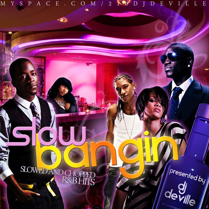
Hey guys... been milling over ideas for my next project, and decided to do a slowed-and-chopped R&B mixtape... been workin all morning on the cover, what do you guys think? Just trying to get a general opinion if there's anything can improve, as I'm still beginning and always trying to get better. Thanks!!
 |
|
|
|
|
 |
darklite
Joined: 19 Dec 2009
Posts: 277
Location: Oregon, U.S.
PS Version: cs
OS: windows 7
|
| Posted: Sun Apr 11, 2010 5:56 pm Post subject: |
|
|
This is an awesome piece. The colors, the graphics, and especially the slow bangin logo is first rate. My only suggestion is that it looks like the curve of the ceiling got away from you a bit. I'm talking about the part right over the guy on the right. It looks kind of like an illusion, but maybe you intended for that to be. Anyway, you've got a good design sense. great job!
_________________
Jeff
http://www.autumnwindstudios.com |
|
|
|
|
|
CadillacMatt
Joined: 19 Aug 2009
Posts: 12
|
| Posted: Sun Apr 11, 2010 6:07 pm Post subject: |
|
|
| darklite wrote: | | This is an awesome piece. The colors, the graphics, and especially the slow bangin logo is first rate. My only suggestion is that it looks like the curve of the ceiling got away from you a bit. I'm talking about the part right over the guy on the right. It looks kind of like an illusion, but maybe you intended for that to be. Anyway, you've got a good design sense. great job! |
Thanks much for the kind words darklite, which part of the ceiling are you referring to, the area with the floral motif?
Thanks again |
|
|
|
|
|
CadillacMatt
Joined: 19 Aug 2009
Posts: 12
|
| Posted: Sun Apr 11, 2010 8:03 pm Post subject: |
|
|
Finished working on the back... I wanted to get an opinion of the tracklist font/layout... it's a little eccentric, I think it fits well with the theme, but is it too hard to read? Maybe I should stick with a simple serif font?
Thanks
 |
|
|
|
|
|
darklite
Joined: 19 Dec 2009
Posts: 277
Location: Oregon, U.S.
PS Version: cs
OS: windows 7
|
| Posted: Mon Apr 12, 2010 4:47 pm Post subject: |
|
|
Nice cover again. Poppin design! The font spacing seems to be the problem, otherwise the font is very readable, it's just too close together. The only cure I can see for that is to just go a bit smaller, or let it ride as it is.
As for your first piece, I'm referring to the section just about an inch away from the guy's head on the right-the guy with the sunglasses.
_________________
Jeff
http://www.autumnwindstudios.com |
|
|
|
|
|
CadillacMatt
Joined: 19 Aug 2009
Posts: 12
|
| Posted: Mon Apr 12, 2010 8:42 pm Post subject: |
|
|
Now that I look at it you're absolutely right about the spacing. Going to fix that. Thanks again for your insight!  |
|
|
|
|
|
|


