|
|
| Author |
Message |
lakita
Joined: 11 Nov 2006
Posts: 23
|
 Posted: Sat Nov 11, 2006 4:28 pm Post subject: Critique and possible help on newbie flyer Posted: Sat Nov 11, 2006 4:28 pm Post subject: Critique and possible help on newbie flyer |
 |
|
Hello all!
Here's the scoop ladies and gents,
My passion is praise dance and youth ministry. I just so happen to have a BS in Information Technology and work in the IT field by profession....not as a web designer or graphic designer mind you....most of that I learn as I go.
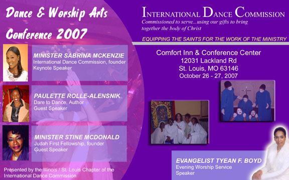
Here is my 2nd draft of a flyer for a Dance Ministry State Wide Worship Arts Conference I want to host Oct 2007:
Is the 'glow' on the worship service speaker too strong?
One thing I don't like is the sharp rectangle boxes with the speakers names against the rounded picture...any suggestions there?
Anything else?
Lakita
PS
If anyone wants to play with the PSD version let me know
| Description: |
| 2nd Draft of conference flyer |
|
| Filesize: |
84.73 KB |
| Viewed: |
722 Time(s) |
|
|
|
|
|
|
 |
swanseamale47
Joined: 23 Nov 2004
Posts: 1478
Location: Swansea UK
|
| Posted: Sun Nov 12, 2006 4:25 am Post subject: |
|
|
I don't mind the glow on the minister, nor do the square boxes bother me, but the other photos under the address look dark on the version posted here.
If the square boxes are a problem why not change them to oval? (with the eliptical marquee tool) and you could soften the edges with a feather if you wished as well. Wayne
|
|
|
|
|
|
lakita
Joined: 11 Nov 2006
Posts: 23
|
| Posted: Sun Nov 12, 2006 7:38 am Post subject: |
|
|
| swanseamale47 wrote: | but the other photos under the address look dark on the version posted here.
|
I was playing around with the "fill" slider because the one pic with the mimes was REALLY bright....is there a way to get it so the brightness is sort of equal?
Sabrina's pic is about the brightness I want, I'm going to try to get a different pic from Stine with a lighter background.
Thanks
|
|
|
|
|
|
swanseamale47
Joined: 23 Nov 2004
Posts: 1478
Location: Swansea UK
|
| Posted: Sun Nov 12, 2006 12:02 pm Post subject: |
|
|
Probably the easiest way is to open all the photos at the same time in photoshop and compare them, auto levels might do the trick as well, but I prefer the manual approach myself.
When you have them all resized for the webpage, open a new 10x8, fill it with the webpage colour and drag all your photos onto it and place them roughly where they will end up, then if you open the layers palette and click on the layers one by one you can ajust each pic at a time and compare it with all the others.
I think I'd also turn the photos on the left side so they are looking into the page rather than out (image/rotate/flip canvas horizontaly) Wayne
|
|
|
|
|
|
Bazman
Joined: 04 Oct 2006
Posts: 77
Location: United Kingdon
PS Version: CS3
OS: Mac OS X Leopard 10.5
|
| Posted: Mon Nov 13, 2006 10:45 am Post subject: |
|
|
I agree with Wayne on the boxes, glow and images, you could also try matching the curve of the background circle for the right hand side of the square boxes.
_________________
Barry Flammia
Freelance Designer
www.realflairdesign.co.uk |
|
|
|
|
|
|


