PhotoshopForums.com Home
Navigate Contact FAQ Search Members
Website Layout Review
Post new topic   Reply to topic    PhotoshopForums.com Forum Index -> Design and Graphic Reviews
Goto page Previous  1, 2
 See a User Guidelines violation? Please contact us.
Author Message

lasa

Joined: 08 Aug 2005
Posts: 1090
Location: Florida
PS Version: CS
OS: MS XP

PostPosted: Sun Jul 09, 2006 6:52 am    Post subject: Reply with quote

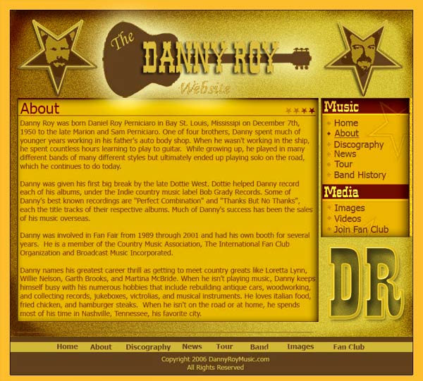
I think the over all design isn't bad it just missing some "pop"..
The text is hard to read because it meshes to much with the backgoround.
The site reminds me of a flyer...I'd take advantage of all the tools in hand.

I cut the site up and simply put it back with shadows and gradients..
Is it better?... probably not but maybe it will spark some ideas.

Good luck,
Lasa


danny_roy1.jpg
 Description:
 Filesize:  74.55 KB
 Viewed:  635 Time(s)

danny_roy1.jpg


View user's profile Send private message Send e-mail Visit poster's website

expinch

Joined: 23 Mar 2004
Posts: 8
Location: Diamondhead, MS


PostPosted: Thu Jul 13, 2006 8:54 pm    Post subject: Reply with quote

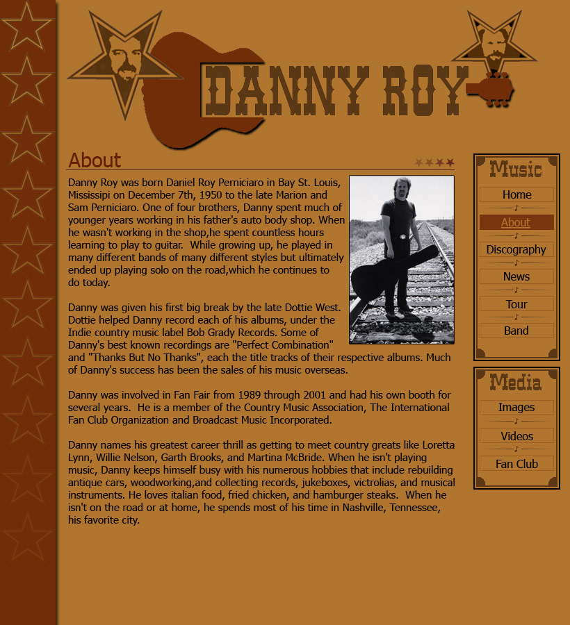
OK all. Here is my 2nd try and I've tried to add some depth and use color suggestions. I went a little loopy on this one so fire away.


layout3.jpg
 Description:
 Filesize:  198.83 KB
 Viewed:  603 Time(s)

layout3.jpg


_________________
-brad
View user's profile Send private message

Haunus

Joined: 24 Nov 2004
Posts: 740


PostPosted: Fri Jul 14, 2006 6:25 am    Post subject: Reply with quote

much much better, the colors work well together and add to the "Style" you're trying to achieve. You have the depth and various little details that work towards the overall effect. *Claps*
View user's profile Send private message

malcon

Joined: 23 Feb 2005
Posts: 391
Location: miami florida


PostPosted: Fri Jul 14, 2006 9:11 pm    Post subject: Reply with quote

i think your halfway there. deffinettly on the right track. but it still needs somthing to pull you in. push it untill youhave gone to far, then pull it back. then your there.
_________________
http://malconpierce.deviantart.com/
http://malcon.cgsociety.org/gallery/

FOR HIRE! malconpierce@gmail.com
View user's profile Send private message AIM Address

expinch

Joined: 23 Mar 2004
Posts: 8
Location: Diamondhead, MS


PostPosted: Sat Jul 15, 2006 4:43 pm    Post subject: Reply with quote

Thanks guys. malcon, could you be a little more specifc, or provide an example of something that 'pulls you in'? Are you talking about graphics?
_________________
-brad
View user's profile Send private message

malcon

Joined: 23 Feb 2005
Posts: 391
Location: miami florida


PostPosted: Sat Jul 15, 2006 10:26 pm    Post subject: Reply with quote

its the same thing i said before. you added some shadows etc. but i just think you should do more of what you did. maybe up the shadow. no doubt it looks awesome. i love the changes but i think you could add a little more depth to it. similar to what Lasa did.
your deffinatly on the right track man! keep it up. and keep us posted as always

_________________
http://malconpierce.deviantart.com/
http://malcon.cgsociety.org/gallery/

FOR HIRE! malconpierce@gmail.com
View user's profile Send private message AIM Address
Display posts from previous:   
Post new topic   Reply to topic    PhotoshopForums.com Forum Index -> Design and Graphic Reviews All times are GMT - 6 Hours
Goto page Previous  1, 2
Page 2 of 2
Jump to:  
You cannot post new topics in this forum
You cannot reply to topics in this forum
You cannot edit your posts in this forum
You cannot delete your posts in this forum
You cannot vote in polls in this forum
You cannot attach files in this forum
You can download files in this forum


Contact - User Guidelines >

Copyright © 2003-2016. PhotoshopForums.com, iFroggy Network. All Rights Reserved.
Powered by phpBB © phpBB Group. phpBB SEO. Privacy Policy.
We are in no way affiliated with Adobe. Photoshop, Adobe and related marks are registered trademarks of Adobe.
PhotoshopForums.com