|
|
| Author |
Message |
2bad
Joined: 26 Jan 2006
Posts: 16
|
 Posted: Sat Feb 11, 2006 11:06 pm Post subject: new to photoshop- review my work? Posted: Sat Feb 11, 2006 11:06 pm Post subject: new to photoshop- review my work? |
 |
|
I just got photoshop about 2-3 weeks ago, and have just been learning like crazy, but my images all still feel so empty. could some of you guys help me out and review these? i appreciate it.
| Description: |
|
| Filesize: |
54.61 KB |
| Viewed: |
1430 Time(s) |
|
| Description: |
|
| Filesize: |
51.89 KB |
| Viewed: |
1430 Time(s) |

|
| Description: |
|
| Filesize: |
47.56 KB |
| Viewed: |
1430 Time(s) |

|
|
|
|
|
|
 |
2bad
Joined: 26 Jan 2006
Posts: 16
|
| Posted: Sat Feb 11, 2006 11:12 pm Post subject: |
|
|
here is one of the sigs with a little brushing,and a cool gangster pic i made(i hope I'm doing this whole brushing thing right), and a devil pic.

| Description: |
|
| Filesize: |
47.01 KB |
| Viewed: |
1422 Time(s) |

|
| Description: |
|
| Filesize: |
57.91 KB |
| Viewed: |
1428 Time(s) |

|
|
|
|
|
|
|
2bad
Joined: 26 Jan 2006
Posts: 16
|
| Posted: Mon Feb 13, 2006 10:09 pm Post subject: |
|
|
lol I must suck...no one is saying anything.
|
|
|
|
|
|
helcyon
Joined: 02 Oct 2005
Posts: 191
PS Version: CS3
OS: OSX 10
|
| Posted: Tue Feb 14, 2006 12:46 pm Post subject: |
|
|
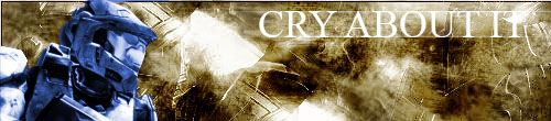
cry sig 2.jpg is pretty cool. deff the best out of all these. The background is really cool. i would change the hue on the guy tho. a slightly different hue of blue would look better. Cry sig isnt that great. the weird background with lines is kind of interesting, but it doesnt work witht the text or image you have.
But since you are just starting out and learning the differnt tools and what they do, this stuff is pretty good. keep practicing and doing different tutorials so you can learn how to do a variety of things.
_________________
www.kg-studios.com |
|
|
|
|
|
2bad
Joined: 26 Jan 2006
Posts: 16
|
| Posted: Tue Feb 14, 2006 5:36 pm Post subject: |
|
|
Finally someone replied. Thank you for the CC, I really appreciate it man.
The first cry sig wasn't even done though, I don't know why I posted it  . Maybe it was an accident. . Maybe it was an accident.
Also, do you know why the "gangsta" picture shows up so blurry? In Photoshop it looks crystal clear.
|
|
|
|
|
|
helcyon
Joined: 02 Oct 2005
Posts: 191
PS Version: CS3
OS: OSX 10
|
| Posted: Wed Feb 15, 2006 1:05 am Post subject: |
|
|
the only thing blurry in the gangsta pic are the two images you got online from some website that had low rez pics.
To see what things actually look like while in PS, click either the zoom or hand tool. then there will be an option at the top that says view actual size. click that to see what it will actually look like. Most likely, you had it fit to window while you were working on it in photoshop. then when u saved it as a jpeg it saved it at the resolution that you had previously chosen. So when you host it, it shows it at 1000x1000 pixles.
Thats just my guess on why it looks diff.
something that might look cool with that is to make gangsta look like its on a wall. copy the type layer, then shut one off. with the visible one, right click and select rasterize type. then go to edit>transform>distort.
This along with perspective and warp, are really cool tools. Mess around with those and get familier with them so you can apply them in different compositions.
_________________
www.kg-studios.com |
|
|
|
|
|
|


