Posted: Tue Jun 21, 2005 10:47 am Post subject: mnmlst
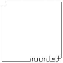
Another logotype design for a fictitious company. I think it would also make a pretty decent CD cover for a contemporary ambient or noize artist.
If you thought the last one looked too simple, you're going to hate this. :-)
A few specific questions:
1) Right now, the "n" is made from the same arch as the "m," which makes it half the size. I thought reusing the same component would go with the minimalist component, but maybe the "n" looks too narrow. Should I make it wider, say 75% of the width of the "m"?
2) Of course, I want the design to be as minimal as possible. Does it need the ornament in the top left corner? The idea is to suggest a blank sheet of paper (with curled corners), but would the design be more effective if there was nothing at all in the square except the name?
3) Do you read "mnmlst" or just "mnmls"? That is, does the presence of the ornament in the top left make you not recognise the one in the bottom right as being part of the name, or does it still look like a "t" to you?
4) Does all the spacing look okay?
5) I lengthened the ascender on the "t" to match the "l". This should help with #3, but does the fact that it is no longer identical to the ornament in the top left make it look like a mistake? Should I make the ornament identical, that is, with lines of uneven length?
1 the size of the n looks good to me
2 I like the thing in the upper corner its simple yet elegant
3 it reads mnmlst to me
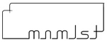
4 looks to spacy my personal tast would be to space it like the attached pic
5 no it makes it look like a t while matching it to the design
Joined: 08 Jun 2005
Posts: 864
Location: Jersey, Channel Islands, UK
Posted: Tue Jun 21, 2005 11:14 am Post subject:
I really like it, its very simple, but gives a very good effect, and would be great on its own, or as a template for other things, nice work Xopods _________________ www.jerseyhacker.co.uk
Thanks for the feedback, guys. I'm glad you like it.
Ekosh: regarding #4, I meant the spacing between the letters, whether it looked even. However, I know where you're coming from. The version you show looks nice and I was tempted to do it that way. It's certainly better proportioned from a conventional design perspective.
The reasons I went with the big empty square were:
a) As I said, I wanted to evoke a blank canvas or sheet of paper. A horizontal rectangle looks more like a label/sticker or an envelope.
b) Aside from a circle, a square is the simplest, most elegant shape. A rectangle isn't *much* more complicated, but it is a little bit.
I may still switch to a rectangle. The nice thing about this design is that not only can it be scaled to any size, it can also be reproportioned to fit any medium.
Joined: 05 Mar 2003
Posts: 3987
Location: Cheltenham, UK
Posted: Wed Jun 22, 2005 5:42 pm Post subject:
I'm at a bit of a loss with what to say about this one to be honest. My head and heart scream "NO! NO! NO!"
I certainly don't want to assasinate your design, but I see little merit in it. I like your thought processes behind the design but I dislike the execution. It smacks of Paint and a spare 5 mins. whilst you have obviously thought about the process behind it deeply. I appreciate the attention to detail, but can't say that I like the finished product. There is no obvious application for a logotype of this kind to my mind. I would certainly have goosebumps of dread before pitching this idea to a potential client.
Sorry to be such a grouch, I hope that you don't take my comments as a personal slight of your accomplishments, it is obvious that you have a firm grounding in the rudiments of design, it's just that this looks a little 'unfinished'. _________________ If life serves you lemons, make lemonade!
Ugh. If three hours of careful work with the pen tool ends up looking like 5 minutes in Paint, I must be pretty awful. I think you underestimate the difficulty of doing lettering from scratch, however. (Yes, I know three hours is still not a great deal of effort in design - I'm just saying the work that went into this is less trivial than it may appear at first)
As for the goosebumps of dread, I agree that this is a somewhat risky design. The large white space doesn't draw as much attention to the name as I'd hoped - perhaps it's the ornament in the top left that's distracting, which is why I asked about it. Still, if a company was going to name itself "mnmlst," I think they'd be expecting an identity with an emphasis on emptiness.
Anyway, don't worry about being a "grouch." My ego tends to interfere with my design sense, so getting put in my place once in a while does me good. However, your criticisms would be more useful if they were more specific. What improvements would you suggest?
honestly the worst part in my openion is that there is too much dead space, I understand you were going for the blank page look but when i first saw it I jsut saw it as a square with wasted space not a page, I dont think in a logo design there should be that much blank space it takes away from the name/design, the name in and of itself is minimal thus the huge area of emptiness is not really needed, but thats just me you saw what i would do to chaang it around and give it a more logo type look
You cannot post new topics in this forum You cannot reply to topics in this forum You cannot edit your posts in this forum You cannot delete your posts in this forum You cannot vote in polls in this forum You cannot attach files in this forum You can download files in this forum