Alright, I'm going to cave to your demands and reduce the dead space. I think the concept needs a fair amount of it - ekosh's example goes too far and doesn't have enough white space for the concept to work, in my opinion - but my original design has too much, it's true. It distracts too much from the name.
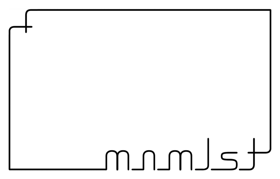
One of my design profs told us it's never a bad idea to work the golden ratio into your designs, so I've changed the square to a golden rectangle, and reduced the size, so that instead of the name taking up exactly half of the bottom edge, it takes up exactly 1.62:1 of the bottom edge.
I suppose it still looks a bit like "5 minutes in Paint," but the same could be said for most logos. Drawing something vaguely swoosh-like would take less than that, but I'm pretty sure the Nike swoosh was a lengthy production.
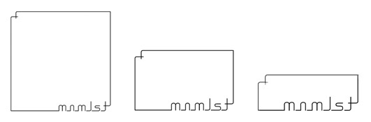
its better I just like the ratio for a logo that i choose the best lol, here they are so you can see them in comparison all the same size, although your second one is better i still think there is too much space but thats just me, imagine it on like a letterhead or an envelope what would look best?
I still like the middle one better than yours. Yours has better balance between content and white space, but the point was to break that balance to convey a message. The aspect ratio of the middle rectangle is also the most aesthetically pleasing one possible, or at least so the ancient Greeks would claim.
Obviously, neither of us can be entirely objective about this. Of course we both prefer our own. I'd like to hear what someone else thinks, if anyone other than us is still reading this thread, that is.
All times are GMT - 6 Hours Goto page Previous1, 2
Page 2 of 2
You cannot post new topics in this forum You cannot reply to topics in this forum You cannot edit your posts in this forum You cannot delete your posts in this forum You cannot vote in polls in this forum You cannot attach files in this forum You can download files in this forum