|
|
| Author |
Message |
malcon
Joined: 23 Feb 2005
Posts: 391
Location: miami florida
|
 Posted: Sun Aug 28, 2005 10:40 pm Post subject: drummer! Posted: Sun Aug 28, 2005 10:40 pm Post subject: drummer! |
 |
|
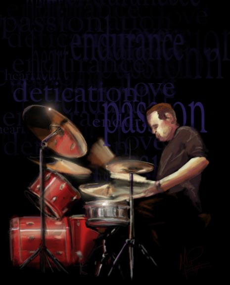
hey this is a picture i was working on tonight. its all free hand. but ive never been that great a figures. and i found it had to get the reflections off the drum stands and what not. any advise?
| Description: |
|
| Filesize: |
40.74 KB |
| Viewed: |
1280 Time(s) |
|
|
|
|
|
|
 |
Brooksi

Joined: 15 Jun 2005
Posts: 48
Location: UK
|
| Posted: Tue Aug 30, 2005 1:40 am Post subject: Rating,. |
|
|
Looks good dude, but i wouldnt have blue text in the background, perhaps red so it matches other colours
_________________
Dialog box's are trouble,
Cliking yes will shut everything down,
Clicking no will freeze everything your doing,
Clicking cancel will just get you another one. |
|
|
|
|
|
Jersey Hacker
Joined: 08 Jun 2005
Posts: 864
Location: Jersey, Channel Islands, UK
|
| Posted: Tue Aug 30, 2005 1:42 am Post subject: |
|
|
Great work if its done form freehand, ive just bought a wacom graphire 3 studio tablet so i can get better at that but the text is not very good, i think it ruins it, i think its pointless making half freehand and half font for that kind of image
_________________
www.jerseyhacker.co.uk
Free File Uploader for Everyone to use |
|
|
|
|
|
BryanDowning

Joined: 05 Jul 2004
Posts: 1554
Location: California, USA
|
| Posted: Tue Aug 30, 2005 5:11 pm Post subject: |
|
|
I agree about the text not looking agreeable. Also the glares on the symbol and drum look too defined.
I think you should maybe work in a setting. Put him in a coffee shop or on a stage or a garage or something. Maybe you could work in a piece of band scenery with the words you want - like a backdrop.
Also you spelled "dedication" wrong.
Looks excellent though. I like the reflection of the drum on the under side of the symbol. Keep it up.
_________________
Best Regards,
Bryan Downing
bryandowning.com |
|
|
|
|
|
cyborg
Joined: 12 Oct 2004
Posts: 1102
Location: canada
|
| Posted: Wed Aug 31, 2005 2:44 am Post subject: |
|
|
change the text color and its perfect....dont worry about the reflections...it looks good....red text would probably looks better.
|
|
|
|
|
|
Datameister

Joined: 28 Jun 2005
Posts: 506
|
| Posted: Wed Aug 31, 2005 10:23 am Post subject: |
|
|
Nice! You're having fun with that Cintiq tablet, I see. 
Being a percussionist myself, I enjoyed that image. The guy's expression is a little funny; you might want to work on the clarity of his expression a bit. The reflections on the instruments are very well executed. I'm around drums all the time, so I have a pretty good feel for how they look. I agree that a different setting might be nice. If not, perhaps slightly brighter and/or reddish text. In any case, it's looking great. Keep it up.
_________________
Interested in showcasing your special effects or learning some new ones from the masters? Check out PSFX! |
|
|
|
|
|
malcon
Joined: 23 Feb 2005
Posts: 391
Location: miami florida
|
| Posted: Wed Aug 31, 2005 7:25 pm Post subject: |
|
|
awesome. ill make some changes and post the changes. but yeah, the expression is sorta strange but i like it for some reason. uhmm yeah i wasnt sure about the text it was just something i thought about . but yeah i like the blank back ground. i will try diferent tones or lighting it up some. but yeah keep the comments comming. i really appreciate the advice.
PS: what type of percussionist are you? drumset, rudamental, keyboards? or just all around. thats cool though man
|
|
|
|
|
|
malcon
Joined: 23 Feb 2005
Posts: 391
Location: miami florida
|
| Posted: Wed Aug 31, 2005 7:46 pm Post subject: |
|
|
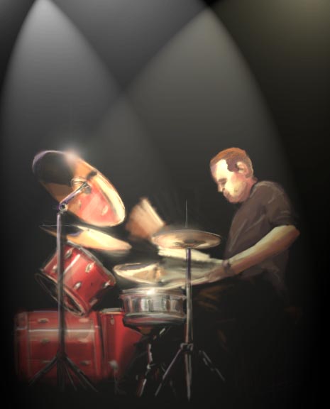
ok i took the text out and tried some lighting stuff. anyway. i like it better but i still dont want to put like a real background behind it. i thought about maybe hinting at a crowd or somthing. but that just seems a little hokey
| Description: |
|
| Filesize: |
34.08 KB |
| Viewed: |
1200 Time(s) |
|
|
|
|
|
|
|
BryanDowning
Joined: 05 Jul 2004
Posts: 1554
Location: California, USA
|
| Posted: Thu Sep 01, 2005 5:02 pm Post subject: |
|
|
Looks much better to me.
_________________
Best Regards,
Bryan Downing
bryandowning.com |
|
|
|
|
|
malcon
Joined: 23 Feb 2005
Posts: 391
Location: miami florida
|
| Posted: Fri Sep 02, 2005 2:05 am Post subject: |
|
|
|
|
|
|
|
|
|


