|
|
| Author |
Message |
Xopods

Joined: 19 Apr 2005
Posts: 96
Location: Montreal, Quebec
|
 Posted: Tue Apr 19, 2005 9:32 am Post subject: "ink" on wood Posted: Tue Apr 19, 2005 9:32 am Post subject: "ink" on wood |
 |
|
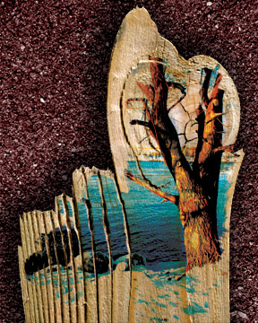
Hi, this is my first post here. I'm a student just starting to enter into the world of professional design/photography/desktop publishing. I'd like some opinions on my latest Photoshop experiment. I'm not sure it's done, but I'm not quite sure where I'd like to take it from here.
My girlfriend's father was showing me this book of absolutely stunning prints by a Slovakian artist named Bernovsky (I'm not sure of the spelling; can't find anything about him online). Some of his prints were printed directly onto rough planks of wood in a very organic way, with lots of the wood showing through. It was an extremely cool effect, so I decided to try to do something similar in Photoshop.
This image uses three of my photos. The "ink" on the wood is a photo of a tree near my house in the winter, put in Multiply mode with lots of layer masking (done with one of the ragged brushes). The wood is from a photo of a fence, cut out with the pen tool, then given eroded edges using layer mask and a little bit of clone brush for the splinters. The background is a photo of wet sand, turned low-key through Levels and made into a duotone. The shadow is just a feathered selection + Levels.
| Description: |
|
| Filesize: |
113.02 KB |
| Viewed: |
917 Time(s) |

|
|
|
|
|
|
 |
Haunus

Joined: 24 Nov 2004
Posts: 740
|
 Posted: Tue Apr 19, 2005 5:58 pm Post subject: Posted: Tue Apr 19, 2005 5:58 pm Post subject: |
 |
|
I like it but up towards the top its a little rough:

Other than that its awsome (and you mioght have done that on purpose), its hard to offer help I really like it. Ive never really put any thought into making graphics a career (just a cool hobby) but good luck
|
|
|
|
|
 |
thehermit
Joined: 05 Mar 2003
Posts: 3987
Location: Cheltenham, UK
|
 Posted: Wed Apr 20, 2005 6:06 am Post subject: Posted: Wed Apr 20, 2005 6:06 am Post subject: |
 |
|
I like all but the background at the moment. I would be tempted to carry the trunk of the tree a little further towards the bottom of canvas, past the water.
As for the background, a more organic/natural look might be more fitting.
_________________
If life serves you lemons, make lemonade! |
|
|
|
|
 |
cyborg
Joined: 12 Oct 2004
Posts: 1102
Location: canada
|
 Posted: Wed Apr 20, 2005 6:07 am Post subject: Posted: Wed Apr 20, 2005 6:07 am Post subject: |
 |
|
thats pretty nice..is it a manip or freehand?? the texture looks really good
|
|
|
|
|
 |
Xopods

Joined: 19 Apr 2005
Posts: 96
Location: Montreal, Quebec
|
 Posted: Wed Apr 20, 2005 7:42 am Post subject: Posted: Wed Apr 20, 2005 7:42 am Post subject: |
 |
|
Useful comments, everyone. I agree with most of what you're saying. The "roughness" mentioned is actually the forest on the far side of the river, but now that I look at it, it looks weird even at full resolution (just a slash of colour - hard to tell what it is). I'll try taking it out and see how that looks, although I may then have the problem of the water just disappearing with no sky behind it. I may have to add some daubs of blue, perhaps cloning from the snow at the bottom.
As for the background, I'm not entirely happy with it either, but have no idea what to do. This is meant to be an experiment in texture, so I don't want to just set it against a solid colour or a Render->Clouds. Perhaps I'll try a tree trunk texture, so we have tree trunk against wood plank against tree trunk. I might also experiment with rippled water or cracked ice...
And to address the question of whether it's freehand or a manip, it's a manip. If you look at my original post, I give a brief explanation of how I did it, but I can elaborate if you need more specifics.
|
|
|
|
|
 |
Xopods

Joined: 19 Apr 2005
Posts: 96
Location: Montreal, Quebec
|
 Posted: Wed Apr 20, 2005 8:24 am Post subject: v2.0 Posted: Wed Apr 20, 2005 8:24 am Post subject: v2.0 |
 |
|
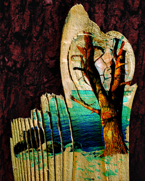
Here's a new version of the picture, trying to implement the suggestions I've received here. It's still kind of a draft, requiring a lot of fussing over the details, but I think it's an improvement...
| Description: |
|
| Filesize: |
188.62 KB |
| Viewed: |
884 Time(s) |

|
|
|
|
|
|
 |
Haunus

Joined: 24 Nov 2004
Posts: 740
|
 Posted: Wed Apr 20, 2005 9:29 am Post subject: Re: v2.0 Posted: Wed Apr 20, 2005 9:29 am Post subject: Re: v2.0 |
 |
|
| Xopods wrote: | | Here's a new version of the picture, trying to implement the suggestions I've received here. It's still kind of a draft, requiring a lot of fussing over the details, but I think it's an improvement... |
I dont see anything...
|
|
|
|
|
 |
Xopods

Joined: 19 Apr 2005
Posts: 96
Location: Montreal, Quebec
|
 Posted: Wed Apr 20, 2005 12:21 pm Post subject: Posted: Wed Apr 20, 2005 12:21 pm Post subject: |
 |
|
You don't see any change, or you don't see an image at all? If the former, look more carefully; the background is different, the distant shore is gone, and the trunk has been extended a bit further down.
If the latter, I'm not sure what the problem is. I see the image okay... anyone else have a problem?
|
|
|
|
|
 |
Moi

Joined: 21 Mar 2005
Posts: 308
|
 Posted: Wed Apr 20, 2005 3:34 pm Post subject: Posted: Wed Apr 20, 2005 3:34 pm Post subject: |
 |
|
i can't see it either 
but i like the above image very much! 
|
|
|
|
|
 |
Proprius
Joined: 28 Feb 2005
Posts: 137
|
 Posted: Wed Apr 20, 2005 5:12 pm Post subject: Posted: Wed Apr 20, 2005 5:12 pm Post subject: |
 |
|
For a background you could do wood again. To get enough contrast I would do a dark, varnished wood, with the grain running opposite the wood in the foreground)
|
|
|
|
|
 |
|


