|
|
| Author |
Message |
seaco

Joined: 31 Dec 2009
Posts: 729
Location: UK
PS Version: CC
OS: Windows 10
|
 Posted: Mon Jan 17, 2011 11:31 am Post subject: Posted: Mon Jan 17, 2011 11:31 am Post subject: |
 |
|
To reduce the light edges you have around the foliage etc you could try going to the layers panel then Ctrl click on the thumbnail layer that has the background cutout which should give you marching ants around the tree edges.
Go to SELECT/MODIFY/CONTRACT choose 1 pixel then OK after this go to SELECT/INVERSE then hit the backspace key which should help remove the light fringe...
Or alternatively you could select the tree layer then go to LAYER/MATTING/REMOVE WHITE MATTE or try DEFRINGE 1 or 2 pixels...
_________________
Lee |
|
|
|
|
 |
zenno
Joined: 08 Jan 2011
Posts: 20
|
| Posted: Mon Jan 17, 2011 12:31 pm Post subject: |
|
|
Yes, remove white matte seems to work for the left part of the picture. Thank you i didn't even know about that function in photoshop.
I like it better than your first option because it does not delete any more of the branches, only the white around it.
I was surprised to see that there were not some kind of adjustment for the white matte tool, like many other photoshop function.
I will post my final results in a few days.
Again, thank you very much for your precious help.
|
|
|
|
|
|
zenno
Joined: 08 Jan 2011
Posts: 20
|
| Posted: Sun Jan 23, 2011 9:36 am Post subject: Finally......... |
|
|
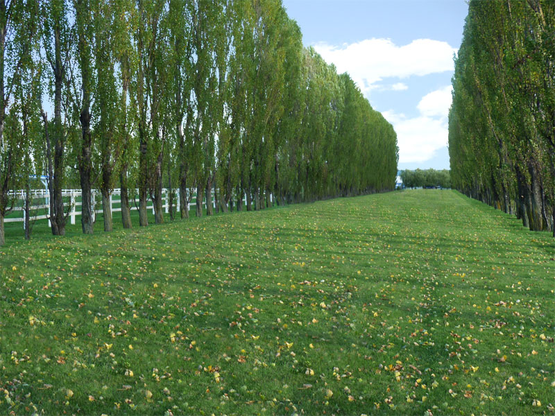
Ok, it's finally not so bad. :-)
Now it's ready to put in a few selected shots of the wedded couple. Cutting out the couple from their tree background will be a challenge, and judging by the time it took me for this picture alone, let me just say merry christmas in advance.... ;-)
Thank you again.
| Description: |
|
| Filesize: |
191.83 KB |
| Viewed: |
546 Time(s) |
|
|
|
|
|
|
|
seaco
Joined: 31 Dec 2009
Posts: 729
Location: UK
PS Version: CC
OS: Windows 10
|
| Posted: Sun Jan 23, 2011 12:38 pm Post subject: |
|
|
Well done Zenno, the only thing I can see to improve things is to clone over some of the leaves that are repeating amazing how the eye can easily pick them out...
_________________
Lee |
|
|
|
|
|
zenno
Joined: 08 Jan 2011
Posts: 20
|
| Posted: Sun Jan 23, 2011 8:07 pm Post subject: |
|
|
Oh, i thought i have been careful about that....
Where are they, more on the back or the front ?
|
|
|
|
|
|
zenno
Joined: 08 Jan 2011
Posts: 20
|
| Posted: Wed Jan 26, 2011 2:17 pm Post subject: Homework done ! |
|
|
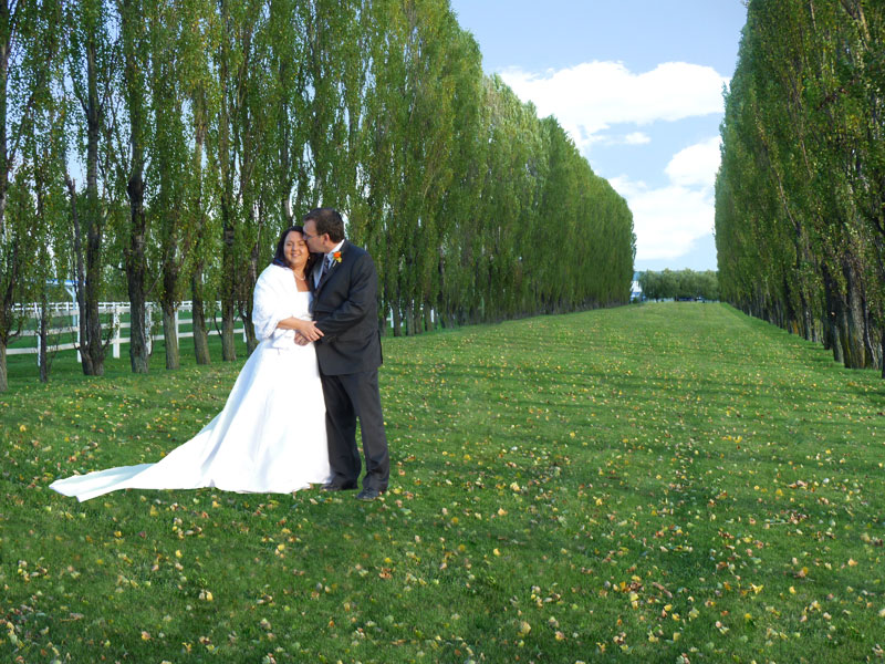
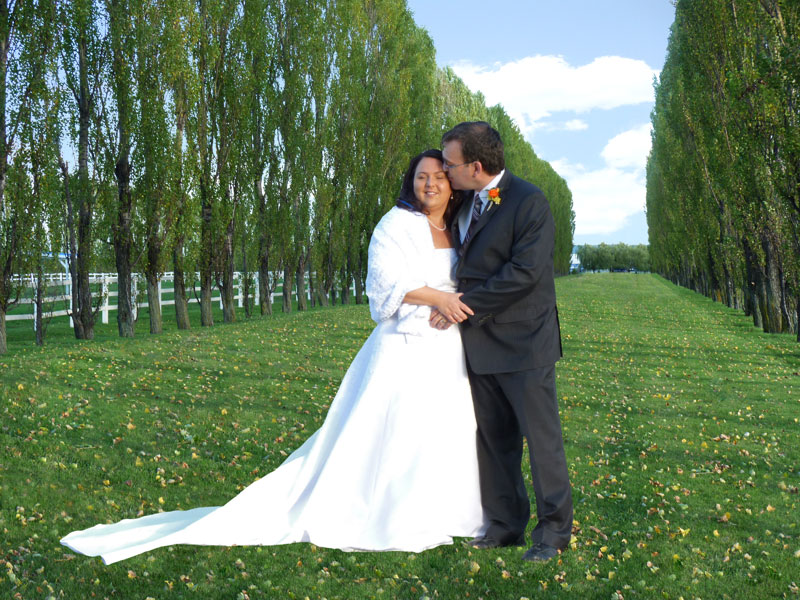
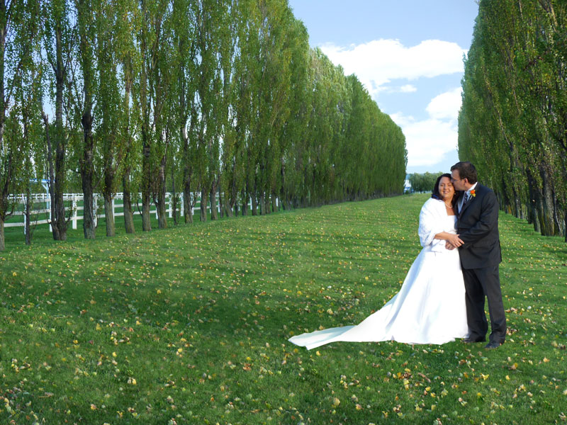
Ok, you were right, i removed the most obvious duplicates.
Here are my results. Once again, i am not quite satisfied with the results on the couple edges. not enough realistic for my taste, looks a little like it's a layer and not part of the background.
But, so far, i'm happy, it's not that bad.
| Description: |
|
| Filesize: |
183.66 KB |
| Viewed: |
514 Time(s) |
|
| Description: |
|
| Filesize: |
172.54 KB |
| Viewed: |
514 Time(s) |
|
| Description: |
|
| Filesize: |
190.28 KB |
| Viewed: |
514 Time(s) |
|
|
|
|
|
|
|
YourOnlySin
Joined: 23 Jan 2011
Posts: 230
|
| Posted: Wed Jan 26, 2011 7:29 pm Post subject: |
|
|
Hey...those are looking good! I know that once you figure out where you want things placed permanently you'll start bringing in some shadows... One of the things that caught my eye was the ground around the tree lines. If you happen to have a layer without the trees in place, you might create a "shadow" layer above it and paint in a dark area and give it a nice Gaussian Blur or something..the grass is too bright under those trees. Maybe the picket fence too?
_________________
http://www.jmerrittphotorestoration.com/ |
|
|
|
|
|
zenno
Joined: 08 Jan 2011
Posts: 20
|
| Posted: Wed Jan 26, 2011 8:47 pm Post subject: |
|
|
Well, the line of grass under the line of trees is like that simply because the lawnmower did not complete it's work that day, the original is like that :-)
But there and near the fence, the 2 places you mentionned, the color difference is accentuated because i boosted the contrast of the entire grass to make it greener.
I'll see what i can do about that.
But, for the shadows, of course i want to put some, but i failed to know how to do that. There's is probably a better way than using drop shadow on the layer. Also, i really have to find in which way and where exactly that shadow must appear to look realistic....But i'm no artist.
Thank you for your inputs. As usual, you were right on the spot.
|
|
|
|
|
|
YourOnlySin
Joined: 23 Jan 2011
Posts: 230
|
| Posted: Wed Jan 26, 2011 8:57 pm Post subject: |
|
|
I see! There are a lot of ways to create shadows. Try creating a new blank layer above your image and using the airbrush tool (black). Select the blank layer and paint the shadows where you want them, then use filter gaussian blur and adjust the radius to get a good effect. If you still have everything separated into layers you can achieve pretty decent results this way, but there are other methods too.
_________________
http://www.jmerrittphotorestoration.com/ |
|
|
|
|
|
zenno
Joined: 08 Jan 2011
Posts: 20
|
| Posted: Thu Jan 27, 2011 11:53 am Post subject: |
|
|
Ok, here's what i tried, i used black airbrush very slightly on the couple but i used a dark green airbrush for the main shadow on the grass because i wanted their shadow to look like the ones of the trees. So after the blur, i also slightly change the hue of the shadow and the opacity of the layer.
At first, i put a smaller shadow on the grass, but when i saw the original shadows on the couple from another photo, i found out that it needed to be much longer than that, like the ones for the trees. This was taken at 4h55 pm so the sun was very low.
I used 3 layers for different parts of the shadow so please, feel free to tell if you don't like what i did so far, i could erase it easily.
Thank you. :-)
| Description: |
|
| Filesize: |
182.4 KB |
| Viewed: |
486 Time(s) |
|
|
|
|
|
|
|
|


