|
|
| Author |
Message |
KainOcelot
Joined: 29 Mar 2006
Posts: 5
|
 Posted: Wed Sep 13, 2006 5:15 pm Post subject: Website Banner Tips/Suggestions/C+C/Etc... Posted: Wed Sep 13, 2006 5:15 pm Post subject: Website Banner Tips/Suggestions/C+C/Etc... |
 |
|
Hey guys. I'm working on a banner for a website. So far I'm happy with it, however I was wondering if there was anything I could do to "spice" it up. Mainly I want the text to stand out amongst everything. I still have to add a picture of a marine from Natural Selection, a Half-Life mod, I just haven't found any decent pictures yet.
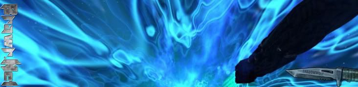
I kind of threw this idea out, you couldn't make out the ship very well:
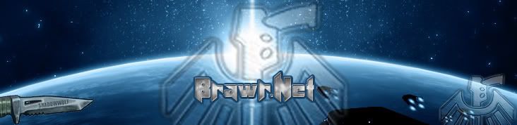
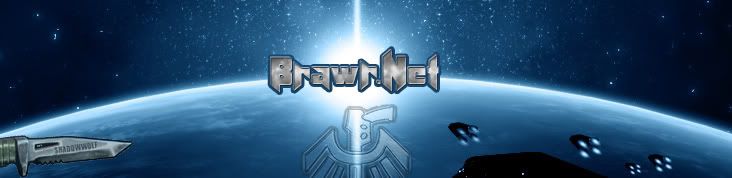
Overall, I'm most happy with the last attempt:
Anyways, anything you guys have to say would be greatly valued and appreciated. Thanks in advance. |
|
|
|
|
 |
malcon
Joined: 23 Feb 2005
Posts: 391
Location: miami florida
|
| Posted: Sun Sep 17, 2006 1:42 pm Post subject: |
|
|
hey whats up man. so far so good as far as content. the layout is lacking. a few things i think that could be inproved is the layout.
the knife sooms to stuck in there. it doesnt belong from what i can see. plus its very weird having it hanging off the banner. it would be better smaller and having some space between the edge of the knife and the border.
also you were saying you wanted the text to stand out more. i think that having the blue stroke on the text makes it blend in more. maybe try a white text with a glow simil;ar to the bright light in the center of the planet.
as a whole i think it would be more succesfull with larger text that filled most of the banner. i think on the bevel and emboss, change the highlight color to a light blue instaed of white (that will make it look less plasticly.i see that you have been playing around with the inca style bird symbol (i could be way off)
i like it better without it. or maybe really transp[arent and to the right or somthing. just remember that having everything symetrical can be boring.
anyway i like the colors and the feel of this and i think it can be really cool.
i hope this helps some
if you make changes please let us know!
keep it up man!
-malcon
_________________
http://malconpierce.deviantart.com/
http://malcon.cgsociety.org/gallery/
FOR HIRE! malconpierce@gmail.com |
|
|
|
|
|
heatherchan112

Joined: 18 Sep 2006
Posts: 12
|
| Posted: Mon Sep 18, 2006 3:32 am Post subject: |
|
|
Hmm..it seems really random lol.
Maybe I need to see the rest of the project?
-Heather
_________________
Beginning CD #2 for Photoshop CS2 at Amazing eLearning right now.
CD #1 was great, rate a 9/10. Will start CD #1 for InDesign soon after. |
|
|
|
|
|
Cynosure
Joined: 11 Sep 2006
Posts: 3
|
| Posted: Thu Sep 21, 2006 4:48 am Post subject: |
|
|
The last looks the best to me.
I like everything but the spaceships and the knife =)
Just make the spaceships so they are higher on the banner, and possibly bigger.
For the knife.. I'm just not feeling it, especially with the whole space scene. =/ I'd say replace it with something else or just take it off completely.
_________________
http://img200.imageshack.us/img200/6238/untitled1copy2xs.jpg |
|
|
|
|
|
|


