|
|
| Author |
Message |
kentro
Joined: 21 Jan 2005
Posts: 4
|
 Posted: Fri Jan 21, 2005 2:26 am Post subject: Milk Effect Posted: Fri Jan 21, 2005 2:26 am Post subject: Milk Effect |
 |
|
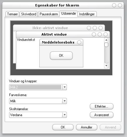
Hai guys
Does anyone know how to create Milk effect to buttons??
They r very cool how to creat it??
Thanx for ur help in advance
[/img]
| Description: |
|
| Filesize: |
48.85 KB |
| Viewed: |
1031 Time(s) |

|
|
|
|
|
|
 |
photo-synthesis

Joined: 07 Jan 2005
Posts: 89
Location: Atlanta, GA
|
 Posted: Fri Jan 21, 2005 8:42 am Post subject: Posted: Fri Jan 21, 2005 8:42 am Post subject: |
 |
|
Just looks like a rounded rectangle with a white background. Maybe some shading/gradient at the bottom (cant really tell, to early in the morning  ). ).
|
|
|
|
|
 |
photo-synthesis

Joined: 07 Jan 2005
Posts: 89
Location: Atlanta, GA
|
 Posted: Fri Jan 21, 2005 11:23 am Post subject: Posted: Fri Jan 21, 2005 11:23 am Post subject: |
 |
|
kinda like this? needs a little tweeking, q&d
rounded rectangle shape tool
text tool
blending effects:
grey stroke
gradient overlay w/ low opacity
pillow emboss
| Description: |
|
| Filesize: |
25.9 KB |
| Viewed: |
1019 Time(s) |

|
|
|
|
|
|
 |
cyborg
Joined: 12 Oct 2004
Posts: 1102
Location: canada
|
 Posted: Fri Jan 21, 2005 11:24 am Post subject: Posted: Fri Jan 21, 2005 11:24 am Post subject: |
 |
|
that actually looks almost perfect!!! only problems are that the border is i think a pixel to thick and the gradient goes to high into the white...but other than that great job figuring it out!!!
|
|
|
|
|
 |
photo-synthesis

Joined: 07 Jan 2005
Posts: 89
Location: Atlanta, GA
|
 Posted: Fri Jan 21, 2005 11:27 am Post subject: Posted: Fri Jan 21, 2005 11:27 am Post subject: |
 |
|
actually i think some of the border issue stems from the pillow emboss. the stroke border is only a pixel thick and is really light grey. could do better but it's hard to @ work 
|
|
|
|
|
 |
cyborg
Joined: 12 Oct 2004
Posts: 1102
Location: canada
|
 Posted: Fri Jan 21, 2005 11:30 am Post subject: Posted: Fri Jan 21, 2005 11:30 am Post subject: |
 |
|
ahh ic ya pillow emboss does that alot to me too.
|
|
|
|
|
 |
kentro
Joined: 21 Jan 2005
Posts: 4
|
 Posted: Fri Jan 21, 2005 9:20 pm Post subject: Posted: Fri Jan 21, 2005 9:20 pm Post subject: |
 |
|
Ya thank buddies.. for ur ideas i finally did it...
That was great
Also i saw more or less similar effect on everaldo 's web site.. http://www.everaldo.com/
In this it looks same except for color..
But when i tried i couldnt do it..
ANy ideas...
| Description: |
|
| Filesize: |
21.7 KB |
| Viewed: |
996 Time(s) |

|
|
|
|
|
|
 |
photo-synthesis

Joined: 07 Jan 2005
Posts: 89
Location: Atlanta, GA
|
 Posted: Fri Jan 21, 2005 10:13 pm Post subject: Posted: Fri Jan 21, 2005 10:13 pm Post subject: |
 |
|
which part are you saying you couldn't do. theres alot of elements to that .png.
|
|
|
|
|
 |
kentro
Joined: 21 Jan 2005
Posts: 4
|
 Posted: Fri Jan 21, 2005 10:39 pm Post subject: Posted: Fri Jan 21, 2005 10:39 pm Post subject: |
 |
|
What i am saying is this..
In first screenshot everything seems to be plain white button ..
But in this 2) there is white to white gradient...
But when i do it looks more beveled...
|
|
|
|
|
 |
photo-synthesis

Joined: 07 Jan 2005
Posts: 89
Location: Atlanta, GA
|
 Posted: Fri Jan 21, 2005 10:52 pm Post subject: Posted: Fri Jan 21, 2005 10:52 pm Post subject: |
 |
|
i see what your saying. I'll have to play around with it to figure out how they got it. kinda hurts my eyes trying to focus on it. looks almost blurry.
|
|
|
|
|
 |
|


