|
|
| Author |
Message |
EtD
Joined: 17 May 2013
Posts: 4
Location: Australia
|
 Posted: Tue Jun 18, 2013 12:53 am Post subject: Desperately need feedback Posted: Tue Jun 18, 2013 12:53 am Post subject: Desperately need feedback |
 |
|
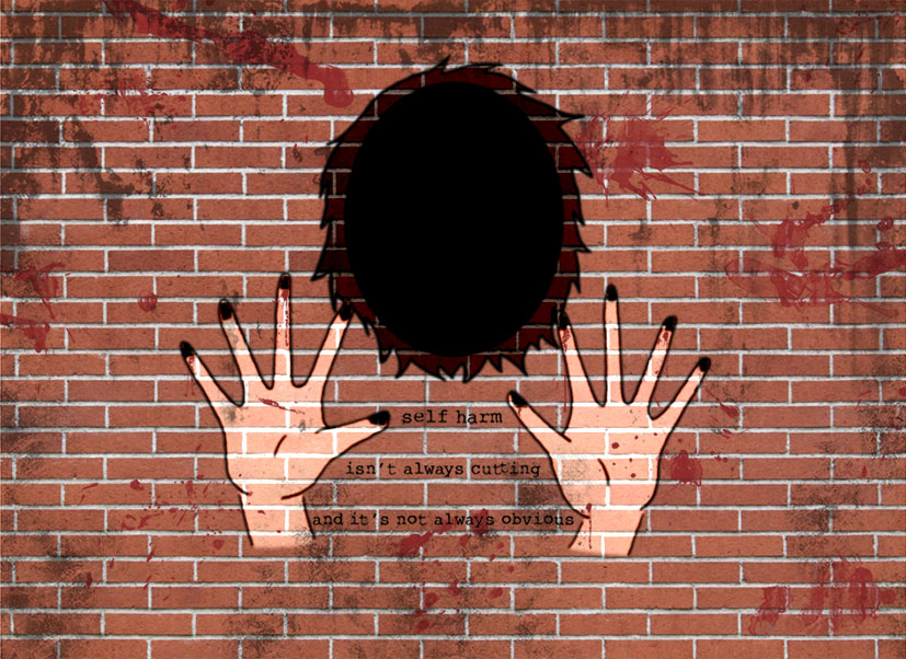
The attached picture is for a school assignment and I really could use some feedback on it. The theme is grunge/graffiti, and I had to make some comment on a social issue.
The marks on the fingers are supposed to be burns, but I couldn't get them to stand out as much as I wanted to.
Any and all help would be greatly appreciated! How could I improve this?
| Description: |
|
| Filesize: |
195.51 KB |
| Viewed: |
546 Time(s) |

|
|
|
|
|
|
 |
Auieos
Joined: 29 Jan 2010
Posts: 2019
|
 Posted: Tue Jun 18, 2013 5:51 am Post subject: Posted: Tue Jun 18, 2013 5:51 am Post subject: |
 |
|
Looks good but the burns look too much like black painted finger nails.
Burns are more of a reddish brown so aim for closer to that.
|
|
|
|
|
 |
coproper
Joined: 18 Jun 2013
Posts: 11
|
 Posted: Wed Jun 19, 2013 11:42 am Post subject: Posted: Wed Jun 19, 2013 11:42 am Post subject: |
 |
|
Why is the face black/shadow? I like the idea but I dont think it really communicates what youre trying to say at the moment.. And same with the burns, i thought they were finger nails first... maybe go for somehting more simple?
|
|
|
|
|
 |
|


