|
|
| Author |
Message |
Sprinkhaan
Joined: 18 Jul 2012
Posts: 10
|
 Posted: Sat Mar 16, 2013 1:45 pm Post subject: Person from text. Posted: Sat Mar 16, 2013 1:45 pm Post subject: Person from text. |
 |
|
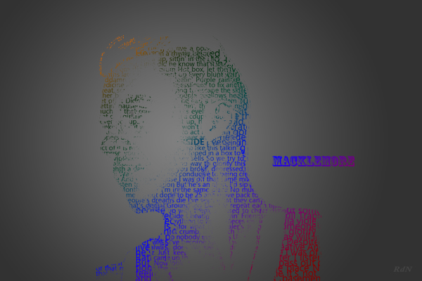
I used the lyrics of otherside for the text.
I'd like your opinion for improvements.
greats.
Sprinkhaan
| Description: |
|
| Filesize: |
139.5 KB |
| Viewed: |
738 Time(s) |
|
_________________
Greats Sprinkhaan |
|
|
|
|
 |
SSO
Joined: 26 Jun 2012
Posts: 105
Location: Denmark
PS Version: CS5
OS: Mac OS X
|
| Posted: Sat Mar 16, 2013 5:17 pm Post subject: |
|
|
I don't find it very interesting to look at, sorry to say. You should first of all use only black/white/gray, or at least some more 'dusty/shady' colors - your choice in coloring is really bad. And also, if you want to use a gradient for the background make it more subtle..
Secondly I think that it is a cheap way of making typographic art if you just make a layer containing a lot of text and mask it to fit into some specific silhouette, instead of taking the time to place every word where it has to be. Doing so will make it look like it has taken more time - which it obviously has - and it will make it look a thousand times better than the result you have made. Anyone can do it, but few has the patience needed.
Long story short, I think that what you are asking for feedback on is only a rough draft of what the final result should really be.
I hope it's not all nonsense.
//SSO
_________________
24" |
|
|
|
|
|
Rarity
Joined: 27 Nov 2012
Posts: 329
Location: The Netherlands
PS Version: CS6
OS: Windows 8
|
| Posted: Sat Mar 16, 2013 6:42 pm Post subject: |
|
|
Did something similar once (http://vgboxart.com/view/49134/the-best-of-jimi-hendrix-cover/)
Couple of quick tips:
- Use a brighter background, it will make your colours pop more.
- When creating the mask do shadows in white and midtones in 50% grey, rest black.
- Vary up the type
- Don't use the whole spectrum of colours.
- With a soft brush with about 30-ish% paint back some details with white on the mask.
Hope it'll get you somewhere.
Mvg,
_________________
Bart J.A.H. de Brouwer |
|
|
|
|
|
Sprinkhaan
Joined: 18 Jul 2012
Posts: 10
|
| Posted: Sun Mar 17, 2013 6:35 am Post subject: |
|
|
So black letters (some dark some lighter)
more of the original picture, doenst look that nice.
what do you mean with a subtle gradian?
less notable?
_________________
Greats Sprinkhaan |
|
|
|
|
|
Rarity
Joined: 27 Nov 2012
Posts: 329
Location: The Netherlands
PS Version: CS6
OS: Windows 8
|
| Posted: Sun Mar 17, 2013 7:42 am Post subject: |
|
|
Here's the PSD shrunken down heavily.. You'll still be able to tell what I did.
Wouldn't go for black letters, make the coloured, but don't use the whole spectrum. So use a spectrum gradient, but enlarge it so not all colours show, then drag it like you want it to get the 2-3 colours you want.
https://dl.dropbox.com/u/18679939/psd%20share%20for%20sprinkhaan.psd[/url]
_________________
Bart J.A.H. de Brouwer |
|
|
|
|
|
Sprinkhaan
Joined: 18 Jul 2012
Posts: 10
|
| Posted: Sun Mar 17, 2013 11:26 am Post subject: |
|
|
You just inverted the picture and pasted it in a mask of a text layer. right?
I used 2 difrend text layers (one the shadows and one for the midtones).
But it doesn't come out that well because it was not a origanal black picture i geus.
about the background thats where im strugglin. i cant make it workin..
i think i need to play more with te text, and ad some shadows in the original picture.
thx
_________________
Greats Sprinkhaan |
|
|
|
|
|
SSO
Joined: 26 Jun 2012
Posts: 105
Location: Denmark
PS Version: CS5
OS: Mac OS X
|
| Posted: Sun Mar 17, 2013 3:59 pm Post subject: |
|
|
| Sprinkhaan wrote: | So black letters (some dark some lighter)
more of the original picture, doenst look that nice.
what do you mean with a subtle gradian?
less notable? |
Well, you could say that you actually have to create the original image all over by using different shades of black, white, and grey. So it doesn't really matter what the original stock-photo looks like.
Yeah, by subtle gradient i mean less notable. More like a dark grey to black, or grey to darker grey. A smoother gradient, if you will..
An example of what I think this kind of typography should look like is this: http://theexperiential.deviantart.com/art/Burdened-151752417
I know that there is a large gap between your work and this, but then again I think that the hours extra (many many hours extra) that are put into the proces of making the image will result in a piece worth a lot more and way more exciting and overwhelming to look at. The only thing to do - IMO - is to get started on making the big things instead of taking the easy way out. Yet remember, this is just my view on things!
_________________
24" |
|
|
|
|
|
|


