|
|
| Author |
Message |
FadedinPS23

Joined: 27 Dec 2004
Posts: 183
|
 Posted: Sun Jan 02, 2005 3:21 am Post subject: 1 more and a logo Posted: Sun Jan 02, 2005 3:21 am Post subject: 1 more and a logo |
 |
|
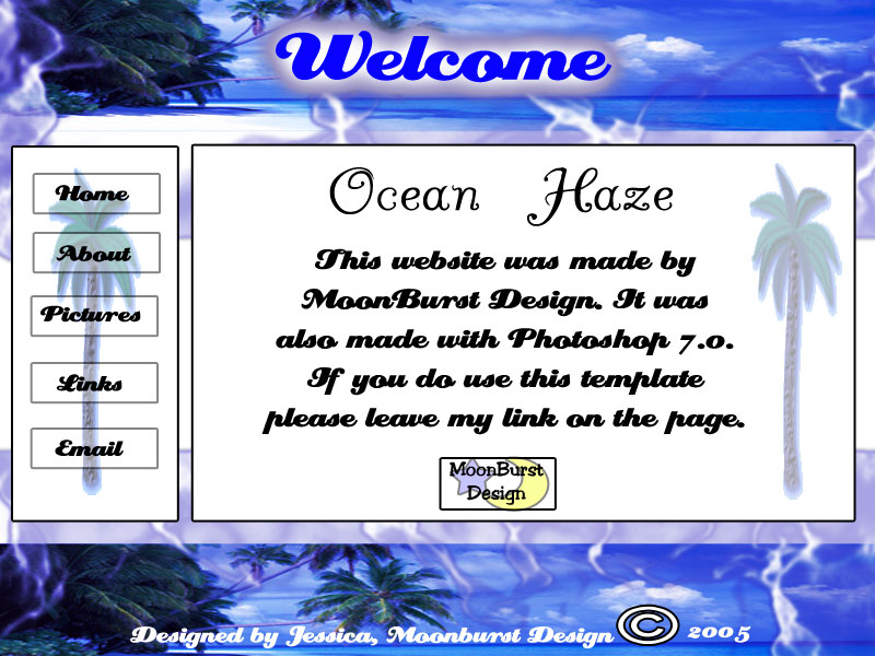
I made this template in about 10 minutes.....just whipped it out(I'm surprised at myself;excuse me). The logo is the logo I'm going to use for my website. Thank you for all the advice, it's really helping out. I want to especially say thanks to f!sson for the link http://good-tutorials.com. I think www.good-tutorials.com is a great website to learn ANYTHING.
Sincerely,
Jessica
| Description: |
|
| Filesize: |
117.92 KB |
| Viewed: |
567 Time(s) |

|
|
|
|
|
|
 |
bailemos
Joined: 29 Dec 2004
Posts: 10
|
 Posted: Sun Jan 02, 2005 8:20 am Post subject: Posted: Sun Jan 02, 2005 8:20 am Post subject: |
 |
|
I like it generally (except for the huge copyright symbol) but it should only be used in context, for example for a travel company or travel guide website to have a special impact. I am no expert at this but would also like the top palm trees not to be hidden by the big blurry background of "Welcome" although I agree that the text should not get lost in the banner either.
|
|
|
|
|
 |
|


