|
|
| Author |
Message |
jon711b
Joined: 26 Mar 2012
Posts: 8
|
 Posted: Thu Jun 28, 2012 10:14 pm Post subject: Opinions on my business card design Posted: Thu Jun 28, 2012 10:14 pm Post subject: Opinions on my business card design |
 |
|
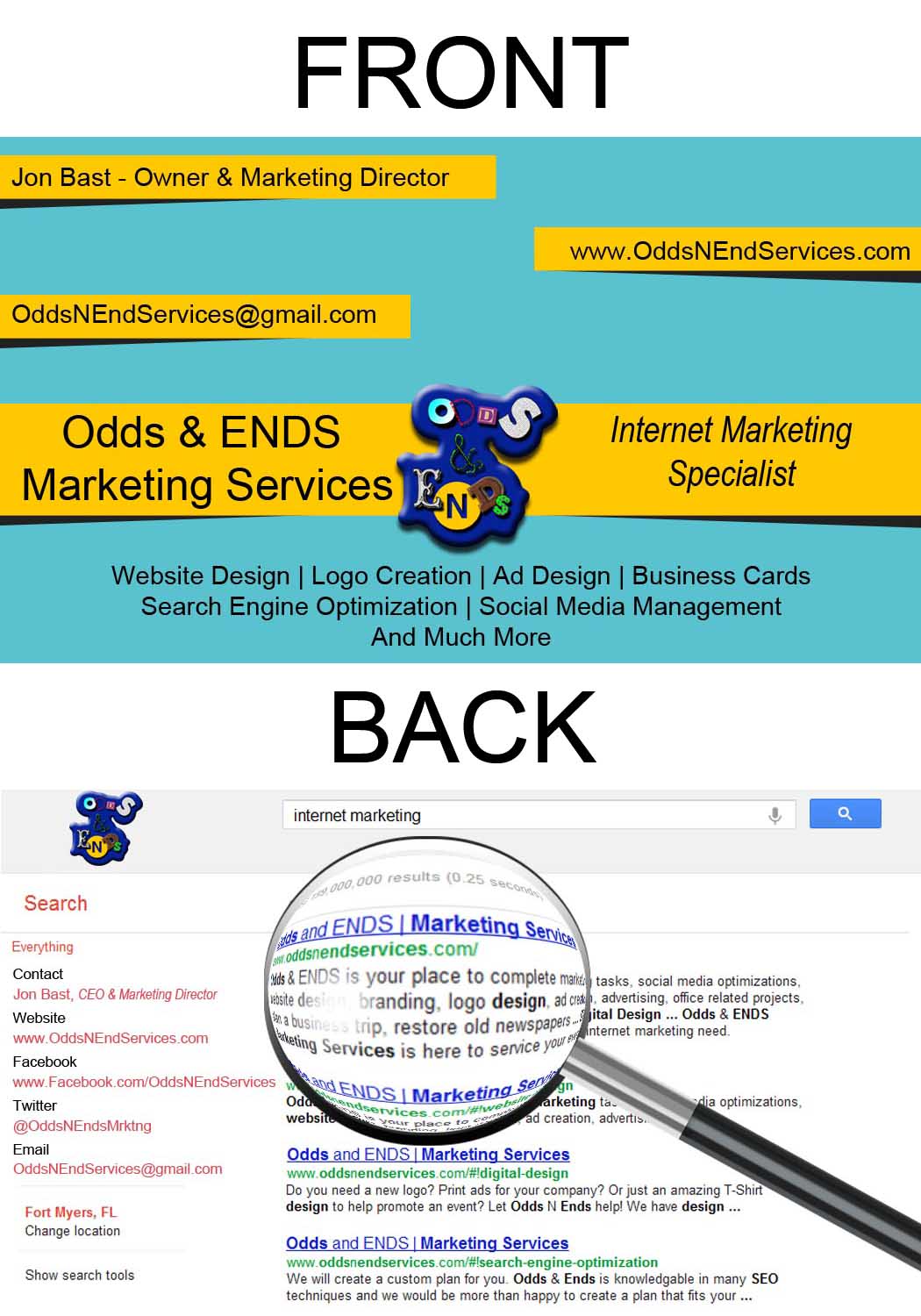
Hello guys (and gals),
I have started up an internet marketing agency and am in the process of designing business cards for my employees and I. I have attached my card design to this forum. Please let me know if you have any suggestions to my design.
Thanks in advance,
Jon
| Description: |
|
| Filesize: |
163.28 KB |
| Viewed: |
940 Time(s) |
|
_________________
Jon
OddsNEndServices.com |
|
|
|
|
 |
WayniacKT
Joined: 28 Jun 2012
Posts: 4
Location: Houston
|
| Posted: Fri Jun 29, 2012 6:48 am Post subject: |
|
|
I like the yellow banners and the colors work for me, nice idea.
I'd make the logo much bigger to fill the space in the middle of the card and overlap the ends of those yellow bands. Logos on b/c's need to be larger and readable.
I would also drop the bevel/emboss/dropshadow look. It works on the web (sometimes) but on a printed piece flat and bold is usually more visually pleasing and readable.
_________________
Wayniac |
|
|
|
|
|
jon711b
Joined: 26 Mar 2012
Posts: 8
|
| Posted: Fri Jun 29, 2012 9:08 am Post subject: Thanks Wayniac |
|
|
Thanks Wayniac,
I'm glad you like the colors, I had a debate on whether or not it wasn't professional enough. But I decided to leave them because I felt that they will stand out and be remembered.
I will work on re-sizing the logo, I thinks that's a great idea.
As far as the beveling, you are referring to the logo correct?
_________________
Jon
OddsNEndServices.com |
|
|
|
|
|
WayniacKT
Joined: 28 Jun 2012
Posts: 4
Location: Houston
|
| Posted: Fri Jun 29, 2012 10:23 am Post subject: |
|
|
Yes, the logo. It looks "bubbly". Thinking it would work and read better as flat.
_________________
Wayniac |
|
|
|
|
|
Patrick
Administrator

Joined: 14 Feb 2003
Posts: 11945
Location: Harbinger, NC, U.S.A.
|
| Posted: Sat Jun 30, 2012 2:15 pm Post subject: |
|
|
Hey jon711b,
Here are some observations:
I think that the logo doesn't convey the right image. To me, it looks like a logo that you might expect from a crafting (like scrapbooking) or kid related venture, like a preschool. It doesn't really give me the vibe of a serious business.
There is inconsistency in branding. I see Odds and ENDS in text and on your website header tag. I see Odds & ENDS in text and in your logo. The domain name is oddsnendservices.com. Meaning Odds N Ends Ervices, not Services. You should buy oddsnendsservices.com. Perhaps it is worth picking a new name, since oddsandendsservices.com is taken and so is oddsnendsmarketing.com. Just a thought.
The spacing on the front could use some attention. Like "Internet Marketing Specialist" not being centered vertically. You might want to take a look at some other business card designs for some inspiration on how to organize the information on the card. It isn't a really polished look for me.
Regarding the back of the card, calling yourself CEO and Marketing Director looks kind of odd. Instead, you may want to call yourself Owner. When it is a one man operation, people often balk at someone calling themselves CEO.
There are some things to get started. I hope that they are helpful.
Best of luck,
Patrick
_________________
Patrick O'Keefe - PhotoshopForums.com Administrator
Have a suggestion or a bit of feedback relating to PhotoshopForums.com? Please contact me!
User Guidelines |
|
|
|
|
|
jon711b
Joined: 26 Mar 2012
Posts: 8
|
| Posted: Tue Jul 10, 2012 8:23 am Post subject: Thanks Patrick |
|
|
Thanks Patrick! All of those are very useful tips.
_________________
Jon
OddsNEndServices.com |
|
|
|
|
|
Patrick
Administrator
Joined: 14 Feb 2003
Posts: 11945
Location: Harbinger, NC, U.S.A.
|
| Posted: Wed Jul 11, 2012 10:00 am Post subject: |
|
|
|
|
|
|
|
|
iloveprint
Joined: 12 Jan 2012
Posts: 34
|
| Posted: Thu Aug 02, 2012 12:10 am Post subject: |
|
|
I also think the protruding effect would work. I like business cards which are simple and flat yet very professional. But I like the idea of the back print.
|
|
|
|
|
|
|


