|
|
| Author |
Message |
nullandvoid
Joined: 26 Jan 2012
Posts: 1
|
 Posted: Thu Jan 26, 2012 4:19 pm Post subject: movie posters Posted: Thu Jan 26, 2012 4:19 pm Post subject: movie posters |
 |
|
Hi all,
First post here on what seems like a great lil' forum. I'm fairly new to the world of photoshop, been working alot on tutorials and some advice from friends in the design industry. I've now started putting some techniques I've learned into practice and having a bit of fun as I do.
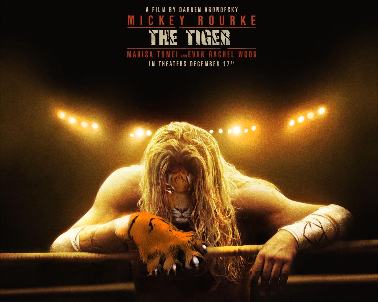
I've started out by reworking some movie posters. The first is from the film 'The Wrestler'. Love the film, but thought it needed a tiger?
Feedback greatly appreciated - any tips on creating seamless merging of skin and fur would b good?
Many thanks,
Daz
| Description: |
|
| Filesize: |
187.15 KB |
| Viewed: |
1362 Time(s) |

|
|
|
|
|
|
 |
jerryb4417
Joined: 20 Dec 2008
Posts: 710
Location: Oklahoma
PS Version: photoshop cs5
OS: win7 pro 64 bit, i7-3.2g, GTS 450,
|
 Posted: Thu Jan 26, 2012 4:36 pm Post subject: Posted: Thu Jan 26, 2012 4:36 pm Post subject: |
 |
|
hi,
itried tofind the orginal but couldn't anyway
first not bad at all good...
but one thing that i noticed was the claw... if you notice on his right rist.. you have that cloth very obvious but on the left wrist it appears the the fur/skin is on top of the cloth... .. think it would be better if the cloth overlapping the fur ...
now your slection of the claw appears good but there a certain amount texture tha missing for example look at the background, the skin, the ropes, etc... look closely you get the perception there a little noise there... but the claw appears to have none....
|
|
|
|
|
 |
esprintguy
Joined: 17 Feb 2012
Posts: 14
|
 Posted: Tue Apr 03, 2012 11:08 pm Post subject: Posted: Tue Apr 03, 2012 11:08 pm Post subject: |
 |
|
It's a good start but you still need to work on making the picture smoother and less obviously edited. The paw, for one thing, looks a bit mangled and the tiger's face needs just a bit of a tweak in order to put it in the right position.
|
|
|
|
|
 |
Ammon
Joined: 09 Apr 2012
Posts: 7
|
 Posted: Wed Apr 11, 2012 9:41 am Post subject: Posted: Wed Apr 11, 2012 9:41 am Post subject: |
 |
|
Not sure you still care or even still alive in this forum
but here goes anyway I would:
-make the tiger's face little bigger
-flip the tiger's face horizontal
-erase the hair next to his mouth
-use shadow next his mouth on the hair (so the face will come out more)
-brighten the mouth area with dodge tool (highlights)
-brighten the pupils using mask tool (soft light)
so far not bad at all for a beginner
Tip: for me the best way to merge skin is by using erasing the edges with eraser tool with the opacity around 60%
and then change the opacity lower and with smaller eraser and zigzag on the 'erased edges' again..
|
|
|
|
|
 |
gohan2091

Joined: 20 Apr 2012
Posts: 56
Location: England
|
 Posted: Fri Apr 20, 2012 6:50 am Post subject: Posted: Fri Apr 20, 2012 6:50 am Post subject: |
 |
|
Nice work but it needs some serious noise reduction 
|
|
|
|
|
 |
iloveprint
Joined: 12 Jan 2012
Posts: 34
|
 Posted: Mon Jun 04, 2012 6:17 pm Post subject: Posted: Mon Jun 04, 2012 6:17 pm Post subject: |
 |
|
Take note of color. Make sure that the tiger fur and the human skin blend smoothly so that there is a good transition between them. Sure, color blind people might not be able to tell the difference, but most people will.
|
|
|
|
|
 |
costisefu

Joined: 10 Apr 2012
Posts: 52
|
 Posted: Thu Jun 07, 2012 7:35 am Post subject: Posted: Thu Jun 07, 2012 7:35 am Post subject: |
 |
|
I wanted to say that it looks pro for a begginer, but I think nnow that the poster is someone elses and you only replaced the guy's face. That is the only thing that looks like the work of a begginer.
Most striking is that it doesn't have the same type of granulation like the poster. Maybe you can add some grain from filters-texture, or a halftone pattern in filters-sketch
_________________
Hi5 free PSD downloads |
|
|
|
|
 |
|


