PhotoshopForums.com Home
Navigate Contact FAQ Search Members
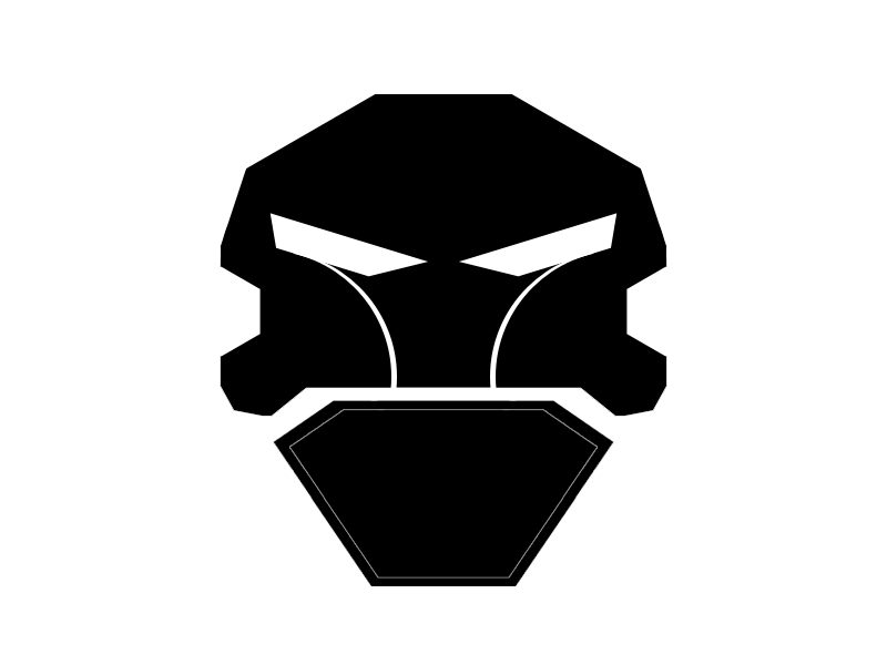
Clan logo help [attached picture]
Post new topic   Reply to topic    PhotoshopForums.com Forum Index -> Design and Graphic Reviews
 See a User Guidelines violation? Please contact us.
Author Message

WolfCreedEntertainment

Joined: 10 Feb 2012
Posts: 2


PostPosted: Fri Feb 10, 2012 1:20 am    Post subject: Clan logo help [attached picture] Reply with quote

So I am making a logo for a fellow clan member and basically he wants a skull with a Beret like the army wears with a basic shield with the captain insignia in gold.

Only problem is that I don't know how to make a beret that would work with the flow of the image attached.

Any help would be greatly appreciated...


Dushclan-logo.jpg
 Description:
 Filesize:  35.31 KB
 Viewed:  2119 Time(s)

Dushclan-logo.jpg


View user's profile Send private message

jerryb4417

Joined: 20 Dec 2008
Posts: 710
Location: Oklahoma
PS Version: photoshop cs5
OS: win7 pro 64 bit, i7-3.2g, GTS 450,

PostPosted: Fri Feb 10, 2012 10:27 am    Post subject: Reply with quote

hi,
sort of difficult to determine what would look best you may need to experiement alittle...

is it important that the lines be straight orcan you have curves lines...???

use a compbination of black and white lines to outline tha hat...

i found a couple that might work out....
http://www.bing.com/images/search?q=army+Beret+Clip+Art&view=detail&id=5292AEAAF34ECA7B0921B51472A1205B323FA580&first=31&FORM=IDFRIR
or http://www.bing.com/images/search?q=army+Beret+Clip+Art&view=detail&id=6AF99A7F49D11AC40D7DF69BD7C29D650E200716&first=0&FORM=IDFRIR

now this link shows a full silhouette
http://www.shutterstock.com/pic-5049115/stock-vector-special-force-man-in-beret-vector-silhouette.html

if you look at the hat area and imagine the base of the hat would have atright white line and put in a diagonal white line , to reinforce the hat idea.. that would work i think ...

now to me, maybe wrong.. i think they lend themselves to being black ans white and you could use straight lines to replace the curves if need be, ... maybe use thin black and white lines (of course the appriate fill) to give the perception of the the hat.. all three of the link i looked at there room on the hat to put in a black white emblem ..

i hope that helps...
View user's profile Send private message

WolfCreedEntertainment

Joined: 10 Feb 2012
Posts: 2


PostPosted: Fri Feb 10, 2012 11:31 pm    Post subject: thank you so much Reply with quote

Thank you the second picture was actually the exact thing I was trying to come up with, but it always came out to......blocky.

Wow. That will look so good...I'll probably repost the new look of it, but thank you so much for the help.
View user's profile Send private message

jerryb4417

Joined: 20 Dec 2008
Posts: 710
Location: Oklahoma
PS Version: photoshop cs5
OS: win7 pro 64 bit, i7-3.2g, GTS 450,

PostPosted: Sat Feb 11, 2012 11:40 am    Post subject: Reply with quote

hi,
your welcome... and thank you for getting back, glad those image helps out...

goodl uck on your project
View user's profile Send private message
Display posts from previous:   
Post new topic   Reply to topic    PhotoshopForums.com Forum Index -> Design and Graphic Reviews All times are GMT - 6 Hours
Page 1 of 1
Jump to:  
You cannot post new topics in this forum
You cannot reply to topics in this forum
You cannot edit your posts in this forum
You cannot delete your posts in this forum
You cannot vote in polls in this forum
You cannot attach files in this forum
You can download files in this forum


Contact - User Guidelines >

Copyright © 2003-2016. PhotoshopForums.com, iFroggy Network. All Rights Reserved.
Powered by phpBB © phpBB Group. phpBB SEO. Privacy Policy.
We are in no way affiliated with Adobe. Photoshop, Adobe and related marks are registered trademarks of Adobe.
PhotoshopForums.com