|
|
| Author |
Message |
hytham
Joined: 17 Nov 2011
Posts: 37
Location: 64
|
 Posted: Wed Jan 11, 2012 6:31 pm Post subject: Cover for Facebook By Me Posted: Wed Jan 11, 2012 6:31 pm Post subject: Cover for Facebook By Me |
 |
|
Hello guys!
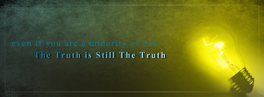
I made this cover for Facebook
Maybe there is something wrong in the blur effect on the 1st line...but i added it because i felt that it's support the meaning of this line.
anyway i'm waiting for your opinions :>
| Description: |
|
| Filesize: |
163.39 KB |
| Viewed: |
1099 Time(s) |

|
|
|
|
|
|
 |
jerryb4417
Joined: 20 Dec 2008
Posts: 710
Location: Oklahoma
PS Version: photoshop cs5
OS: win7 pro 64 bit, i7-3.2g, GTS 450,
|
 Posted: Mon Jan 16, 2012 9:21 am Post subject: Posted: Mon Jan 16, 2012 9:21 am Post subject: |
 |
|
hi,
well just my opinion........... smiling... and alwlays go a million...lol
1. on the left side of the bulb... i keep thinking that there a edge to the bulb and there isn't .. seems like i would see maybe a slight outline like you do on the right side...
2. the glow area ,on the left side seems like to me it extends too much to the left.... I noticed this when i was using brightness/contrast to try to determine the lighting and ( something about the whole area pricked my mind and just see what happens...)
3. on the left side in general , between the bulb and the left edge and the bottom half of the whole are...
appears to be too dark! to the point where you lose that greenish markble texture that you have in upper half...
i am thinking overall.... limit the radio of the yellow glow maybe a little more dstintive than what it is now which give me a sense it strecthes to the entire left side..... and on bottom left take out some of that darkness or heavy shadow
anyway those are my opinion....
|
|
|
|
|
 |
hytham
Joined: 17 Nov 2011
Posts: 37
Location: 64
|
 Posted: Mon Jan 16, 2012 5:22 pm Post subject: Posted: Mon Jan 16, 2012 5:22 pm Post subject: |
 |
|
Thank you for your important advices
I will read it and modify the design.
.
.
.
.
.
|
|
|
|
|
 |
hytham
Joined: 17 Nov 2011
Posts: 37
Location: 64
|
|
|
|
|
 |
jerryb4417
Joined: 20 Dec 2008
Posts: 710
Location: Oklahoma
PS Version: photoshop cs5
OS: win7 pro 64 bit, i7-3.2g, GTS 450,
|
 Posted: Tue Jan 17, 2012 7:52 pm Post subject: Posted: Tue Jan 17, 2012 7:52 pm Post subject: |
 |
|
hi,
to me i think looks a lot better to see more that marble texture on the bottom half and the light bulb looks lot better..
more important do you feel better about it.... your the artist....
i still see a little shadow areas below the words "the truth" where i don't see that above the words .. i can see that marble texture..
maybe it my imagination but where improved that bottom half , great the green texture comming thru but it looks maybe little fuzzy not sharp like above the text ....
i wish other guys would jump in to give there perspective... i am just one person.... smiling... so you a good overview..
|
|
|
|
|
 |
hytham
Joined: 17 Nov 2011
Posts: 37
Location: 64
|
 Posted: Thu Jan 19, 2012 11:13 pm Post subject: Posted: Thu Jan 19, 2012 11:13 pm Post subject: |
 |
|
lol..yes..you are the only person who told me opinions...so i wanna thank you...your advices are really important...i think it's not necessary now to modify it again..i got your view 
|
|
|
|
|
 |
jerryb4417
Joined: 20 Dec 2008
Posts: 710
Location: Oklahoma
PS Version: photoshop cs5
OS: win7 pro 64 bit, i7-3.2g, GTS 450,
|
 Posted: Fri Jan 20, 2012 8:30 am Post subject: Posted: Fri Jan 20, 2012 8:30 am Post subject: |
 |
|
hi,
your welcome and thank you...
you have a good weekend....
|
|
|
|
|
 |
|


