|
|
| Author |
Message |
Cloudless_Creative
Joined: 23 Dec 2011
Posts: 113
PS Version: Adobe CS5
OS: Mac
|
 Posted: Sat Dec 24, 2011 7:08 pm Post subject: Manipulated images. Please leave feedback :) Posted: Sat Dec 24, 2011 7:08 pm Post subject: Manipulated images. Please leave feedback :) |
 |
|
Please Note: Not all of the images are my originals, although all the images used are not under any copyright and are not restricted against reposting/editing. I take no credit for the original image and no image is in its original state, also I give credit and thanks to the original creator <3
Just some quick ideas I had, some off my own back, some influenced by what I've seen.
Please leave a comment, advice, tips, ways to improve etc 
(there is also two pictures that I had to post as a reply due to restrictions)
| Description: |
| This started out as a Mongolian chap on a horse. :) |
|
| Filesize: |
116.02 KB |
| Viewed: |
3163 Time(s) |

|
| Description: |
Forget Labradoodle, its a Labrahorse.
Inspired by the 'Photoshop Hybrids' I have seen recently. |
|
| Filesize: |
195.51 KB |
| Viewed: |
3163 Time(s) |

|
| Description: |
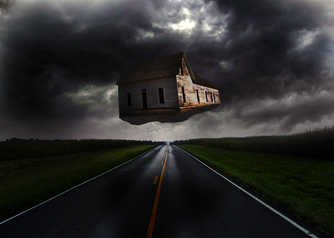
| The house Wilbur and Orville built (Wilbur and Orville created the first fixed wing plane). |
|
| Filesize: |
84.65 KB |
| Viewed: |
3163 Time(s) |

|
Last edited by Cloudless_Creative on Sun Dec 25, 2011 3:02 pm; edited 1 time in total |
|
|
|
|
 |
Cloudless_Creative

Joined: 23 Dec 2011
Posts: 113
PS Version: Adobe CS5
OS: Mac
|
 Posted: Sat Dec 24, 2011 7:11 pm Post subject: Here's the other two :) Posted: Sat Dec 24, 2011 7:11 pm Post subject: Here's the other two :) |
 |
|
Please comment on these two as well. Criticism helps people grow!
| Description: |
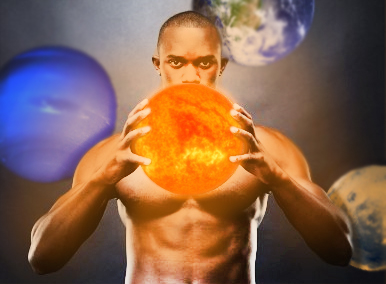
| He was originally holding a basket ball. |
|
| Filesize: |
73.99 KB |
| Viewed: |
3161 Time(s) |

|
| Description: |
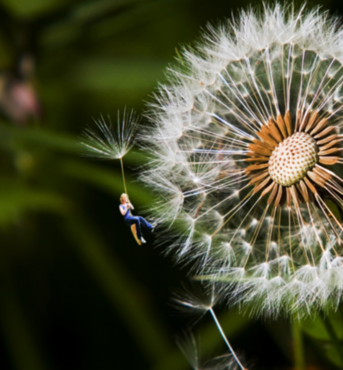
| Thought of this when watching a documentary on a all female sky diving squad. |
|
| Filesize: |
193.29 KB |
| Viewed: |
3161 Time(s) |

|
_________________
Those who dare to waste one moment of time have not yet discovered the value of life. |
|
|
|
|
 |
Paulr
Joined: 28 Dec 2011
Posts: 5
Location: Australia
|
 Posted: Fri Dec 30, 2011 6:51 pm Post subject: Posted: Fri Dec 30, 2011 6:51 pm Post subject: |
 |
|
Nice images, the last one should have been - flower out of focus and the woman riding the fluff in focus.
|
|
|
|
|
 |
jerryb4417
Joined: 20 Dec 2008
Posts: 710
Location: Oklahoma
PS Version: photoshop cs5
OS: win7 pro 64 bit, i7-3.2g, GTS 450,
|
 Posted: Fri Dec 30, 2011 8:19 pm Post subject: Posted: Fri Dec 30, 2011 8:19 pm Post subject: |
 |
|
hi,
they all very nice......
1. on the house.... what stood out for me was the shadow... you got the sun sort of on the side but yet the shadow in in front of the house...
2. the horse-dog.... now it real good but... the mane on the neck doesn't look natural ... it maybe me but the mane lookslike it on the other side of the neck and i am expecting it to be on top and the tail it bothers me but i can't quite put my finger on it... maybe it the positioning of the tail that might slight off....
|
|
|
|
|
 |
Cloudless_Creative

Joined: 23 Dec 2011
Posts: 113
PS Version: Adobe CS5
OS: Mac
|
 Posted: Sat Dec 31, 2011 12:24 pm Post subject: Posted: Sat Dec 31, 2011 12:24 pm Post subject: |
 |
|
Hey, Paulr; I was trying to get that effect but the image of the flower was quite high resolution and the woman low and for some reason, I don't know - they just seemed to do the opposite to what I wanted, thinking of re-doing the image with my own actual photographs so I'll keep your idea in mind.
And Jerry, I completely get all your points! I didn't try repositioning the tail and the mane but I'll definitely have another go, and that house I now see the shadow is completely off! Practise makes perfect so I'll practise some more 
Oh and thanks for criticism and compliments, they're greatly appreciated <3
_________________
Those who dare to waste one moment of time have not yet discovered the value of life. |
|
|
|
|
 |
jerryb4417
Joined: 20 Dec 2008
Posts: 710
Location: Oklahoma
PS Version: photoshop cs5
OS: win7 pro 64 bit, i7-3.2g, GTS 450,
|
 Posted: Sat Dec 31, 2011 12:43 pm Post subject: Posted: Sat Dec 31, 2011 12:43 pm Post subject: |
 |
|
hi,
now yesterday when i was looking at horses tails....lol.... i came across that orginal horse image.. in that image that the mane looked more natural ....
as far as tail.... well with a real horse it doesn't look like that how the tail leave the body, and part of it could be the perspective.. however it could be for artistic reason... it maybe the right effect....
sawa lotof artist conceptions on the horses tail....
isn't this crazy subj "horses tail" lol
|
|
|
|
|
 |
Skyhawk
Joined: 28 Oct 2011
Posts: 48
Location: New York City, USA
|
 Posted: Sat Dec 31, 2011 12:45 pm Post subject: Posted: Sat Dec 31, 2011 12:45 pm Post subject: |
 |
|
Wow these are awesome! I particularly like the 3rd image of the floating house, perhaps a little more debris underneath the house will make it look more realistic. The 2nd image, however, needs better color blending of the dog's head, you can tell it's been photochopped. Nice work! 
_________________
Adopt a stray or shelter animal and save a life |
|
|
|
|
 |
Cloudless_Creative

Joined: 23 Dec 2011
Posts: 113
PS Version: Adobe CS5
OS: Mac
|
 Posted: Sat Dec 31, 2011 9:38 pm Post subject: Posted: Sat Dec 31, 2011 9:38 pm Post subject: |
 |
|
Thanks for your comments, I see the dog head is a different colour now too. I'll seek on improving, thanks again 
_________________
Those who dare to waste one moment of time have not yet discovered the value of life. |
|
|
|
|
 |
photofan
Joined: 18 Dec 2011
Posts: 7
|
 Posted: Thu Jan 12, 2012 2:37 am Post subject: Posted: Thu Jan 12, 2012 2:37 am Post subject: |
 |
|
they are very nice and creative, i like the 3rd image most~
_________________
basketball world~ my nike kobe is now~ |
|
|
|
|
 |
thehermit
Joined: 05 Mar 2003
Posts: 3987
Location: Cheltenham, UK
|
 Posted: Thu Jan 12, 2012 6:14 am Post subject: Posted: Thu Jan 12, 2012 6:14 am Post subject: |
 |
|
Oh bother!
I didn't really want to comment as I admire a lot of your work and appreciate the time put in, but I can't hold back any longer.
The one image I am transfixed by is the horse/dog montage. You have done a good job on the matching of the two images, but what bothers me is the proportion of the two elements. I would like to see a smaller head that is scaled to that of the horse's head and the neck being in the same proportion to the horse's neck. I believe it would 'sell' the image more.
/Ramble
_________________
If life serves you lemons, make lemonade! |
|
|
|
|
 |
|


