|
|
| Author |
Message |
Skyhawk
Joined: 28 Oct 2011
Posts: 48
Location: New York City, USA
|
 Posted: Mon Dec 12, 2011 2:30 pm Post subject: Lust Dream Posted: Mon Dec 12, 2011 2:30 pm Post subject: Lust Dream |
 |
|
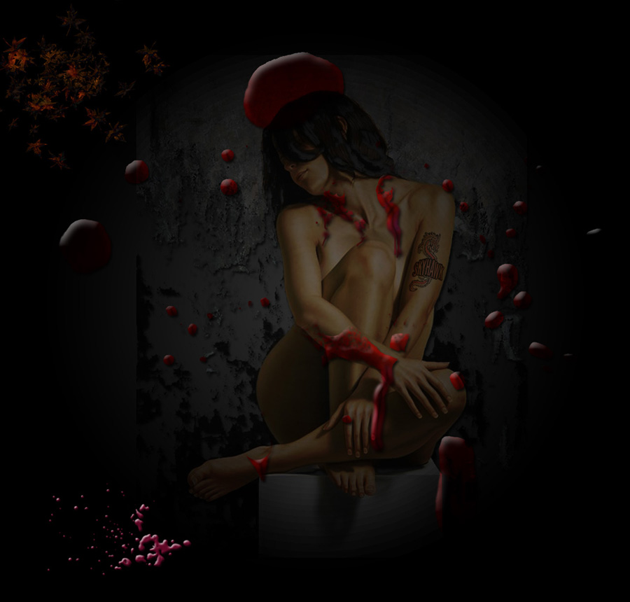
Working with background blending and would love to hear what you think. Thanks!
(I have this in wallpaper size if you want a copy~1280x1224)
| Description: |
|
| Filesize: |
108.25 KB |
| Viewed: |
712 Time(s) |
|
_________________
Adopt a stray or shelter animal and save a life |
|
|
|
|
 |
jerryb4417
Joined: 20 Dec 2008
Posts: 710
Location: Oklahoma
PS Version: photoshop cs5
OS: win7 pro 64 bit, i7-3.2g, GTS 450,
|
| Posted: Mon Dec 12, 2011 3:16 pm Post subject: |
|
|
hi,
i like your work....
ithought the the image was to dark.... at least on my screen. i was thinking maybe lighten the girl alittle that would pull a person eye more toward the girl... as it is...at least with me... it sort of a battle which get first attention the girl or the background and blobslll
also was thinking did you try to remove that stand she sitting on? and how it would work with the overall theme... i was thinking maybe it would be alittle more provacative if it appears she was floating... just a thought...
|
|
|
|
|
|
Digitalgfx
Joined: 12 Dec 2011
Posts: 1
Location: Uk
|
| Posted: Mon Dec 12, 2011 5:31 pm Post subject: Lust Dream |
|
|
I agree very dark overall, I think you could adjust the lighting effects, the blood splatter has a moon type glow from above,
if you added silver to white lighting on the girls body from above to compliment this and a sense of depth by adding a shadow to the wall behind.
-Digitalgfx
_________________
Author of Atomic Graphics Pack Pro |
|
|
|
|
|
Auieos
Joined: 29 Jan 2010
Posts: 2019
|
| Posted: Tue Dec 13, 2011 1:28 am Post subject: |
|
|
I like her tattoo 
|
|
|
|
|
|
Skyhawk
Joined: 28 Oct 2011
Posts: 48
Location: New York City, USA
|
| Posted: Tue Dec 13, 2011 9:10 am Post subject: |
|
|
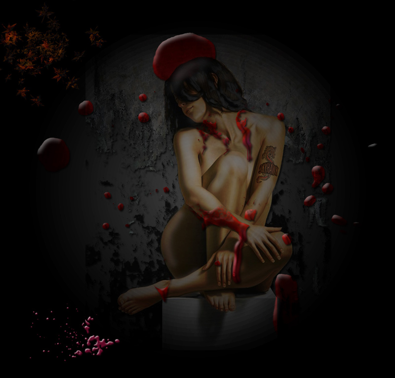
Thank you all for your comments. Im inclined to agree with you both that this image is far too dark especially when viewed from a laptop, if thats in fact what you are using, however, when I create these images I use my 20 inch screen where colors are a tad different and details are way easier to see, so that may not translate too well. This is all good tho because I need to be aware of the difference and run these images through my laptop before posting them. It should be lighter now,see below.
Jerry, thanks for the feedback buddy, actually I was not trying to remove the stand shes sitting on those might be compression lines, although I like your idea of her floating in thin air.
Digitalgfx, your advice is spot on. I see what you mean about the moon glow and adding white light to the girls body. I had some free time so I did a quick mod, see below. Thanks!
Auieos, Thanks!
| Description: |
|
| Filesize: |
148 KB |
| Viewed: |
669 Time(s) |
|
_________________
Adopt a stray or shelter animal and save a life |
|
|
|
|
|
jerryb4417
Joined: 20 Dec 2008
Posts: 710
Location: Oklahoma
PS Version: photoshop cs5
OS: win7 pro 64 bit, i7-3.2g, GTS 450,
|
| Posted: Tue Dec 13, 2011 9:27 am Post subject: |
|
|
hi,
compression lines... to me it looks like a block she sitting on...
one thing to keep in mind.... is your monitor settings..!!!
not all are equal!!! smiling... if your monitor not setup right for brightness/contrast/gamma ... when you edit.. and display on other monitors you may find the color and brightness/contrast do not match your originall ... also that will effect your printing!!!! ie: on monitor it looks good but the printing comes out too dark or too light..!!!!
bottom line check yur setting and get them close and also for all your pc's ... you can set thing eyeballing or you can use a calibration program..
now the gal... i don't know if this is what you wanted.. but it looks like the center of her body is more brighter than her head!!!
|
|
|
|
|
|
thehermit
Joined: 05 Mar 2003
Posts: 3987
Location: Cheltenham, UK
|
| Posted: Tue Dec 13, 2011 9:49 am Post subject: |
|
|
To sort out the striations, either Gaussian blur and add a little noise or even better (still not foolproof) create your PS files in 16bit not 8bit. Although the caveat remains that it may be the technique used not always the bit depth.
_________________
If life serves you lemons, make lemonade! |
|
|
|
|
|
|


