|
|
| Author |
Message |
Danman03
Joined: 25 Jun 2011
Posts: 57
Location: Oklahoma
|
 Posted: Tue Nov 08, 2011 3:06 pm Post subject: Business Card. Posted: Tue Nov 08, 2011 3:06 pm Post subject: Business Card. |
 |
|
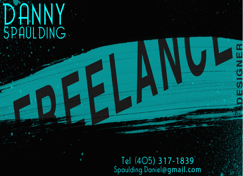
I decided to make up a business card for myself. I am starting to do some freelance work and thought, why not? I was just wondering what you guys think of my design. The size is pretty big just to see better detail.
| Description: |
|
| Filesize: |
177.98 KB |
| Viewed: |
1072 Time(s) |

|
|
|
|
|
|
 |
thehermit
Joined: 05 Mar 2003
Posts: 3987
Location: Cheltenham, UK
|
 Posted: Tue Nov 08, 2011 5:33 pm Post subject: Posted: Tue Nov 08, 2011 5:33 pm Post subject: |
 |
|
I don't want to be harsh, or point out the obvious, what do you do?
I see you in the far right are a 'designer', but without being told, what does your Bcard say what you 'do'? You could be good, could be rubbish, I can't say.
What or who do you design?
_________________
If life serves you lemons, make lemonade! |
|
|
|
|
 |
Danman03
Joined: 25 Jun 2011
Posts: 57
Location: Oklahoma
|
 Posted: Tue Nov 08, 2011 8:42 pm Post subject: Posted: Tue Nov 08, 2011 8:42 pm Post subject: |
 |
|
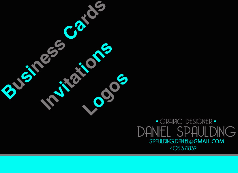
See, that's what I was really wanting to know. I wasn't sure if I needed to add some descriptions of what I can do. I would more than likely keep it simple right now, because I am still in school. I would do logos, invitations, business cards, and maybe other small projects. So I should ad a small list of things I could do?
|
|
|
|
|
 |
renata
Joined: 26 Nov 2010
Posts: 368
Location: Australia
|
 Posted: Tue Nov 08, 2011 9:55 pm Post subject: Posted: Tue Nov 08, 2011 9:55 pm Post subject: |
 |
|
I agree with Mr Hermit, I would want to know what you do.
To me (though I'm not always typical of what other people like), the word "freelance" is unnecessary. Why not get to the point of what you do? I'd rather see the words "logos, invitations, business cards" in there somewhere.
Maybe you can have a few examples of your work available somewhere online and print the address on the business card?
Also, sometimes when things are printed the edges get cut off a little, so it might be worth moving the words a bit further from the edge.
Other than that, looks good.
|
|
|
|
|
 |
Danman03
Joined: 25 Jun 2011
Posts: 57
Location: Oklahoma
|
 Posted: Tue Nov 08, 2011 10:29 pm Post subject: Posted: Tue Nov 08, 2011 10:29 pm Post subject: |
 |
|
Wow, sorry about all the same posts. I guess it sent them more times than I wanted. So with the addition of my different areas of design, I should take out "freelance"? I saw a few business cards that had that on there so I figured I would use freelance, but if it isn't necessary, I can take it out.
|
|
|
|
|
 |
renata
Joined: 26 Nov 2010
Posts: 368
Location: Australia
|
 Posted: Wed Nov 09, 2011 4:21 am Post subject: Posted: Wed Nov 09, 2011 4:21 am Post subject: |
 |
|
Hey, have confidence in yourself. Listen to other people's ideas and weigh them up, but then go with what you think. Sometimes if you ask 20 different people you can get 20 different answers and then you just go crazy. Go for it, young (?) man, and good luck!
|
|
|
|
|
 |
thehermit
Joined: 05 Mar 2003
Posts: 3987
Location: Cheltenham, UK
|
 Posted: Wed Nov 09, 2011 5:17 am Post subject: Posted: Wed Nov 09, 2011 5:17 am Post subject: |
 |
|
I would think that you have to distil the essence of what you actually do is. You are freelance, but that is unimportant in the grand scheme of things, what is more important is stating what you do or who you cater for.
Keep it simple, name of business first and foremost and if appropriate combine it with a a url, if the name doesn't say what it does on the tin, then add a little about what you do, whether it be graphic design or whatever.
You are not freelance, you are a graphic designer! Add by all means some of the services that you offer, but delineate the differences. I would also probably go for a double sided business card with my contact details on one side and my business presentation on the other.
_________________
If life serves you lemons, make lemonade! |
|
|
|
|
 |
Danman03
Joined: 25 Jun 2011
Posts: 57
Location: Oklahoma
|
 Posted: Wed Nov 09, 2011 1:39 pm Post subject: Posted: Wed Nov 09, 2011 1:39 pm Post subject: |
 |
|
I have some confidence in my work, I have been able to produce great work for my clients and they have been happy with the results. But, I haven't encountered anything yet, that really pushes my abilities. I am young and still in school, so I don't want to take on something that I find out I can't do and let down a customer. Most of you on here have been designers for many years, so I just look for some advice to understand the trade. I had some questions about making a good business card and you all have answered them and I have learned some new things, so now, I can take what I learned and go back to the drawing boards lol.
|
|
|
|
|
 |
Danman03
Joined: 25 Jun 2011
Posts: 57
Location: Oklahoma
|
 Posted: Wed Nov 09, 2011 4:35 pm Post subject: Posted: Wed Nov 09, 2011 4:35 pm Post subject: |
 |
|
This is take 2! I feel a lot better about this one. It is simple and not too chaotic. I still don't have a business name, seeing as it is just me, but I figured DSD media worked just fine. When you look at it, you probably wonder "why are some of the letters a different color". Well, I just had some fun and threw in some anagrams. If you unscramble the letters it says Basic visions, which I thought was interesting.
| Description: |
|
| Filesize: |
69.26 KB |
| Viewed: |
1045 Time(s) |

|
| Description: |
|
| Filesize: |
139.32 KB |
| Viewed: |
1045 Time(s) |

|
|
|
|
|
|
 |
Skyhawk
Joined: 28 Oct 2011
Posts: 48
Location: New York City, USA
|
 Posted: Thu Nov 17, 2011 4:41 pm Post subject: Posted: Thu Nov 17, 2011 4:41 pm Post subject: |
 |
|
|
|
|
|
|
 |
|


