Joined: 05 Mar 2003
Posts: 3987
Location: Cheltenham, UK
Posted: Mon May 16, 2011 9:46 pm Post subject: Logo Critique Please
Knowing what discerning folk we have here, I thought I would ask for some feedback on a logo I am working on for myself.
I should mention the logo will be for a re-branding of stationery and primarily a new portfolio website for retouching photographs.
This is an early incarnation, and instead of the shape I have now, I was thinking perhaps about a more stylised 'camera lens' shape. Didn't know what anyone's thoughts on this may be?
The pixel effect is kind of self-explanatory, I was pitching for a non too subtle reference to what I do and transformations, you know all that jazz......
I can see some of the limitations of the dark background and the fact that it can't really be used against a light/white background, any other thoughts or suggestions.
Oh and it was 300ppi but I downsized it for web, so it may appear a 'lil small.
As I say, with all things I do for myself, it's not a case of having to hurry, just having to get it right, as I say; early stages and the design is liable to change, but any thoughts on concept vs. naffness would be appreciated.
ps: Go on Auieos, I dare you to mention it!! I just dare ya!
iteration-1.jpg
Description:
Filesize:
9.48 KB
Viewed:
962 Time(s)
_________________ If life serves you lemons, make lemonade!
Seriously tho i really like the logo. Cant fault it. Suits its purpose imo. Would look good on a webpage, especially a finished one.
About the new stationary...
May i please have one of your foil stamped, embossed, pop-up business cards that takes 25 years to make. I ask this as i can only afford strathmore stock in a size that would fit in the average Rolodex.
Joined: 05 Mar 2003
Posts: 3987
Location: Cheltenham, UK
Posted: Wed May 18, 2011 4:04 am Post subject:
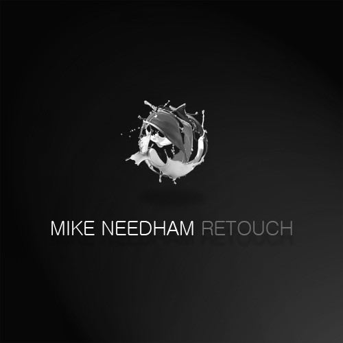
Hmm, having slept on it I predictably hate it on reflection. Don't know why I chose that shape and I hate the colour too, oh and the pixels need something else either adding or removing :p
Roll on iteration two. _________________ If life serves you lemons, make lemonade!
Joined: 05 Mar 2003
Posts: 3987
Location: Cheltenham, UK
Posted: Fri May 20, 2011 5:47 am Post subject:
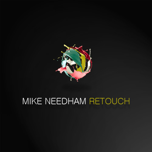
I have come up with another take on the idea, whilst still ever only a transition before the final product, I feel it's somewhat 'slicker'. I would still like to either 'pixelate' one half or add 3D cubes or similar, appreciate any thoughts on the matter.
Colours aren't set in stone, feel free to critique and the choice of font is not final, although I am fairly keen on it, alternatives welcomed if you have any.
Any other ideas feel free to show and tell.
Oh and the second image is for you know who
iteration-2-B&W.jpg
Description:
Filesize:
20.18 KB
Viewed:
898 Time(s)
iteration-2.jpg
Description:
Filesize:
25.43 KB
Viewed:
898 Time(s)
_________________ If life serves you lemons, make lemonade!
Joined: 26 Nov 2010
Posts: 368
Location: Australia
Posted: Fri May 20, 2011 6:54 am Post subject:
Wow, I think they're impressive. I don't have the imagination to come up with logos. I can't comment technically, but sometimes it helps to get impressions of people who are "outside"?
If I came across these logos, my impression would be firstly that they belong to somebody who definitely knows what he is doing and knows his stuff.
I would also expect this person's work to be fairly modern, perhaps trendy.
Finally - I'm not sure whether this is an impression that you intend - I would wonder if I could afford this person! That's because they do look so very "classy".
If I saw the first one, I would think more of a company or organisation. If I saw the second one, I would think of a single artist.
Joined: 05 Mar 2003
Posts: 3987
Location: Cheltenham, UK
Posted: Mon May 23, 2011 1:25 pm Post subject:
Cheers for the input folks, I had a quick go with friends and acquaintances and they all loved it, it is to that end I thought I would stick with it and run, unless I pay for someone to do it (unthinkable) I doubt I will come up with any other inspiration.
It is going to be part of a re-branding for my business and a departure to be trading under my own name, this means I have also had to consider joining the 21st century and get a website too, more on that bad joke later...
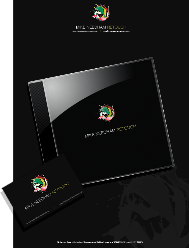
Stationary that is included is fairly vast, comprising such exciting things as invoices (on & offline), compliments slips, letterheads, jewel cases and business card amongst others. I have provided a brief illustration to demonstrate my overall branding aims. Final designs may change slightly to allow better use of information architecture. Sorry for the poor quality of the image, it's downsized considerably for the forum.
Comments and critique welcome if you wish, no problem if not, consider it a show and tell
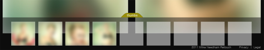
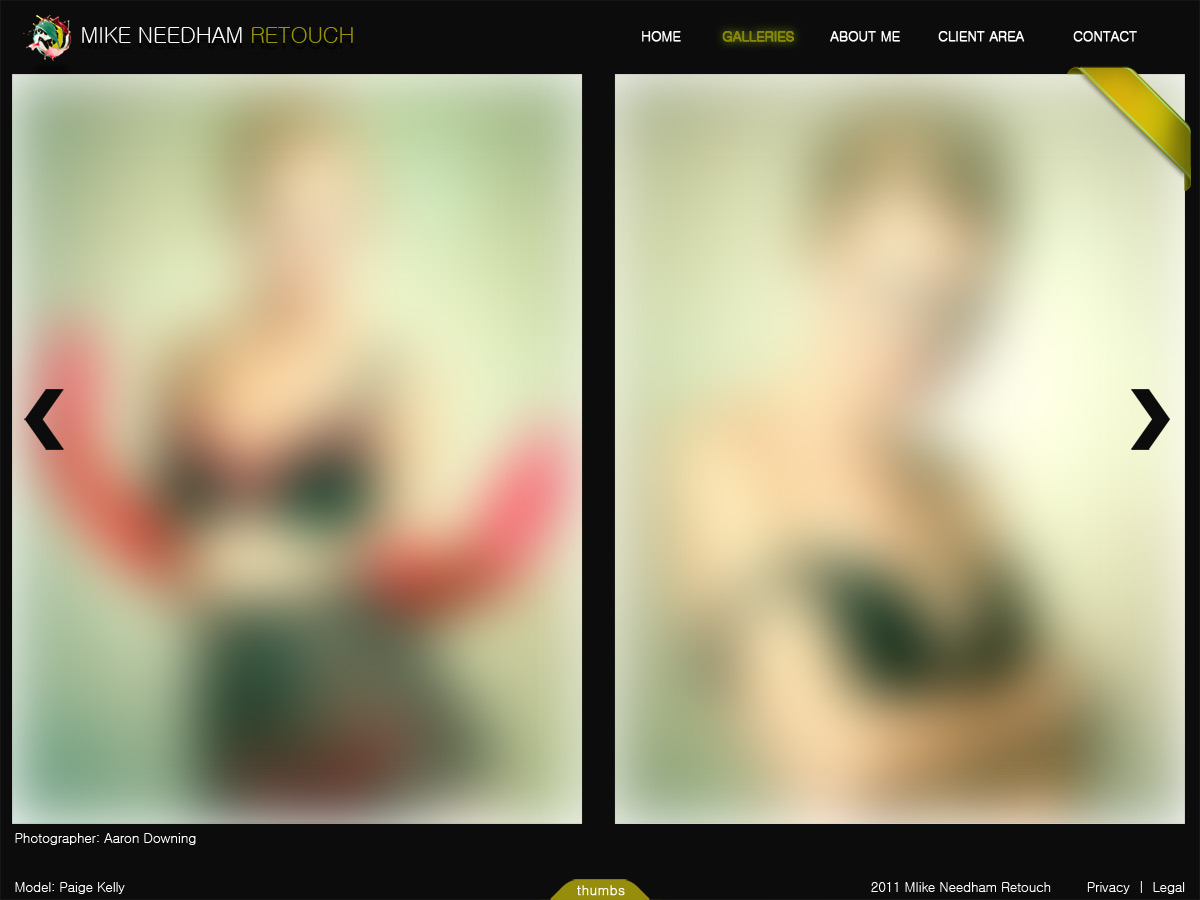
The second image I have posted is the proposed website, it is with regret I have had to admit I am a dolt at coding or anything related, even after extensive reading, it's a painful admission to have to admit to yourself you're an idiot! lol. I am hoping to modify a pre-existing Java script gallery, already out there, don't be surprised if the freebie section gets some attention from me in the near future
The idea behind the site is a 100% scale to fit to your browser window size, so uniformity should be maintained between resolutions. Although it is illustrated with a 2 window page, my aim is primarily to have 1 window for most images to maximise the impact.
Not totally sure of the navigation elements or the structure, but I have to keep it simple (remember, I'm an idiot), any suggestions or for glaring omissions I may have made welcomed. The main idea for navigating the galleries is the pop-up thumbnail browser at the bottom (also illustrated, in part).
All very much a work in progress, photos blurred until launch date fyi.
Again any and all comments, critique welcome.
thumbnail-working.jpg
Description:
Filesize:
24.14 KB
Viewed:
875 Time(s)
website-working.jpg
Description:
Filesize:
103.62 KB
Viewed:
875 Time(s)
stationary-example.gif
Description:
Filesize:
86.55 KB
Viewed:
875 Time(s)
_________________ If life serves you lemons, make lemonade!
You cannot post new topics in this forum You cannot reply to topics in this forum You cannot edit your posts in this forum You cannot delete your posts in this forum You cannot vote in polls in this forum You cannot attach files in this forum You can download files in this forum