Posted: Sun Mar 06, 2011 11:01 pm Post subject: University Project
On a scale from 1/10 as a photoshop guru, I'd rate myself around a 4. However, I am currently taking some classes at the local Community College to improve that score.
In my current class I have a project due 3/22 which I am excited to work on. What better tool than these forums for some feedback from the pros.
These are the requirements for the current project:
Quote:
General
Obtain a minimum of 6 different photos or drawings. You may obtain these either from the web or from your personal photo collection. Combine your images/photos to create a collage in tribute to someone/something you admire. This can include, but is not limited to, parents, places, historical figures, inventors/inventions, ideas, etc. You are encouraged to discuss your topic with the instructor before the due date.
Dimensions
(Must be exact) 1275x1650 (vertical composition) or 1650x1275 (horizontal comp.)
Resolution
(Must be exact) 150ppi
Elements to Include
6 or more photos/drawings in the composite used to represent your specific theme.
Use of layer styles (ie. drop shadow, stroke, outer glow, bevel, emboss, etc.)
Use of selection tool (lasso, quick selection tool, pen tool, etc.).
Layers properly labeled according to contents.
Use of at least two adjustment layers (levels, curves, hue/saturation, etc.).
Use of at least two layer masks (must affect image in some way).
Use of the clone stamp tool or healing brush.
Grading Standard
Overall Aesthetics - 60pts
Correct Dimensions - 20pts
Appropriate use of layer styles - 15pts
Selection made using a selection tool - 15pts
Layers properly labeled - 20pts
Appropriate use of adjustment layers - 15pts
Use of layer masks - 15pts
Appropriate use of clone stamp/healing brushes - 30pts
Now naturally without the actual attachment file you all won't be able to see the specifics of the requirements I have adhered to, however I'd like to, with permission from my instructor of course, submit for all of your critique the rough draft. Please feel free to give feedback as you see fit. I will be making changes to improve as this will be the rough draft.
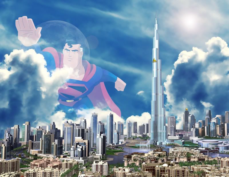
This picture is a superman fans edit of the downtown Dubai concept to look and feel like metropolis.
Most of the problems you should be able to fix using the non destructive technique of layer masking.
Here is what i saw..
You can see the moon and clouds through superman.
The city is too sharp, real life gets blurry with distance.
The reflection in the water is a different colour to the sky.
Suns location does not match city shadows.
When working with images that seem to cross layers like this a good trick is to ctrl + click the layer thumbs to create selections what you want to keep, inverse the selection and then start working with the layer mask.
the biggest problem is in the composition itself. You have the tower on the right, with superman on the left and both are about the same size, so the eye is battling back and forth between the two.
I would centralize Superman and the moon, and make the tower way smaller and off-centre a bit. This means you'll also have to shrink down the city.
Joined: 16 Feb 2011
Posts: 332
Location: Earth PS Version: CS6 OS: Windows 7 Professional
Posted: Wed Mar 23, 2011 1:43 am Post subject:
Over all your graphic is good but it's distracting. As I look at it, I think what is the aim of it so I think you need to follow these steps:
* Think about this; what is the subject of your picture, is it the city and tower or the huge superman.
* Once you have decided who or what is going to be your subject, make that subject stand out by either accentuating the subject in sum way or demoting everything but the subject.
You cannot post new topics in this forum You cannot reply to topics in this forum You cannot edit your posts in this forum You cannot delete your posts in this forum You cannot vote in polls in this forum You cannot attach files in this forum You can download files in this forum