|
|
| Author |
Message |
Mikhale
Joined: 08 Feb 2011
Posts: 3
Location: US
|
 Posted: Tue Feb 08, 2011 3:10 pm Post subject: Maxx in a Blizzard Critique Posted: Tue Feb 08, 2011 3:10 pm Post subject: Maxx in a Blizzard Critique |
 |
|
Top of the day to all my PhotoShop fanatics,
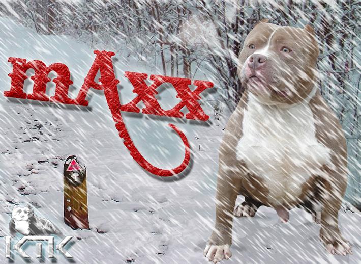
This is my first post on this forum, so I would like to give thanks to all of you for sharing it with me. I was currently hired by an American Pitbull Terrier Kennel to design some graphics advertising their dogs. They provided me with the font style they wanted to use as well as the KTK logo in the bottom corner. They wanted something aggressive but creative, and after some serious thought and research on Bully graphics, I found that nothing like this had been done before
So I decided to make Maxx freeze and put him in the middle of a blizzard. Using some motion blur techniques, and adjusting the hue/saturation. I tried to create a more realistic scene by adding breath near his mouth, as well as shadow underneath him in the snow, to make it appear as though he was indeed sitting in the white powder.
From a photoshop perspective, my shadowing needs some serious work, but to my clients they were overjoyed. I welcome any and all observations and evaluations.
Salute,
Mikhale
| Description: |
|
| Filesize: |
106.83 KB |
| Viewed: |
1030 Time(s) |

|
|
|
|
|
|
 |
Ivan55
Joined: 06 Feb 2011
Posts: 6
Location: Illinois
|
 Posted: Fri Feb 11, 2011 9:28 pm Post subject: Posted: Fri Feb 11, 2011 9:28 pm Post subject: |
 |
|
Is only my amature opinion but I like this !
_________________
Definition of insanity is repeating the same behavior over and over again , expecting different results. - Albert Einstein |
|
|
|
|
 |
thehermit
Joined: 05 Mar 2003
Posts: 3987
Location: Cheltenham, UK
|
 Posted: Sat Feb 12, 2011 5:44 pm Post subject: Posted: Sat Feb 12, 2011 5:44 pm Post subject: |
 |
|
I think I would be tempted to emasculate Maxx  The only thing that strikes me as a little odd is the angle of the snow. Nice touch with the breath. The only thing that strikes me as a little odd is the angle of the snow. Nice touch with the breath.
_________________
If life serves you lemons, make lemonade! |
|
|
|
|
 |
psyclop
Joined: 16 Dec 2010
Posts: 10
|
 Posted: Tue Feb 15, 2011 8:14 am Post subject: Posted: Tue Feb 15, 2011 8:14 am Post subject: |
 |
|
I dont find the dog at all agressive, also a little too much in focus to be seen
thru the snow. I like the breath but if it would come down from the nose, that
might make the dog look like a little more agressive.
|
|
|
|
|
 |
thehermit
Joined: 05 Mar 2003
Posts: 3987
Location: Cheltenham, UK
|
 Posted: Tue Feb 15, 2011 10:49 am Post subject: Posted: Tue Feb 15, 2011 10:49 am Post subject: |
 |
|
| Quote: | | I dont find the dog at all agressive, |
I didn't say he looked aggressive I said I would emasculate him, it's a different thing, I was alluding to digitally neutering him.
_________________
If life serves you lemons, make lemonade! |
|
|
|
|
 |
psyclop
Joined: 16 Dec 2010
Posts: 10
|
 Posted: Tue Feb 15, 2011 11:05 am Post subject: Re: Maxx in a Blizzard Critique Posted: Tue Feb 15, 2011 11:05 am Post subject: Re: Maxx in a Blizzard Critique |
 |
|
| Mikhale wrote: | Top of the day to all my PhotoShop fanatics,
This is my first post on this forum, so I would like to give thanks to all of you for sharing it with me. I was currently hired by an American Pitbull Terrier Kennel to design some graphics advertising their dogs. They provided me with the font style they wanted to use as well as the KTK logo in the bottom corner. They wanted something aggressive but creative, and after some serious thought and research on Bully graphics, I found that nothing like this had been done before
So I decided to make Maxx freeze and put him in the middle of a blizzard. Using some motion blur techniques, and adjusting the hue/saturation. I tried to create a more realistic scene by adding breath near his mouth, as well as shadow underneath him in the snow, to make it appear as though he was indeed sitting in the white powder.
From a photoshop perspective, my shadowing needs some serious work, but to my clients they were overjoyed. I welcome any and all observations and evaluations.
Salute,
Mikhale |
this is why I said that
|
|
|
|
|
 |
thehermit
Joined: 05 Mar 2003
Posts: 3987
Location: Cheltenham, UK
|
 Posted: Tue Feb 15, 2011 12:34 pm Post subject: Posted: Tue Feb 15, 2011 12:34 pm Post subject: |
 |
|
Ahh I see, I missed OP aggressive comment.
_________________
If life serves you lemons, make lemonade! |
|
|
|
|
 |
GraceO

Joined: 15 Feb 2011
Posts: 1
|
 Posted: Wed Feb 16, 2011 12:19 am Post subject: Posted: Wed Feb 16, 2011 12:19 am Post subject: |
 |
|
Hi Mikhale. I'm new to this forum too and here's my first post.
I think you did a great job, nice concept and execution. My only suggestion would be to put the logo on top of the snow and not behind it although that's just a minor thing and totally up to you. And maybe use another effect to make it stand out, I mean not another drop shadow. Hope this helps some. 
_________________
Change is easy... Photoshop it!
http://graceoris.com/ |
|
|
|
|
 |
Dumpling-Boy
Joined: 25 Nov 2009
Posts: 27
|
 Posted: Fri Feb 18, 2011 12:06 pm Post subject: Posted: Fri Feb 18, 2011 12:06 pm Post subject: |
 |
|
I would totally remove his private part, I just find that so odd, lol
nice other than that!!
|
|
|
|
|
 |
|


