|
|
| Author |
Message |
Passe
Joined: 13 Jun 2010
Posts: 11
|
 Posted: Thu Jan 27, 2011 7:34 pm Post subject: Posted: Thu Jan 27, 2011 7:34 pm Post subject: |
 |
|
I know for sure this isn't going to be the actual size its going to be a lot smaller than it is right now.

Thanks for the idea on the stream. I took some of the glow out on the circle and took it off on the text because I thought it looked to odd with all of it. Thanks for all the tips guys its really helping me out with the logo and my CS4 skills 
|
|
|
|
|
 |
YourOnlySin
Joined: 23 Jan 2011
Posts: 230
|
 Posted: Thu Jan 27, 2011 9:08 pm Post subject: Posted: Thu Jan 27, 2011 9:08 pm Post subject: |
 |
|
Awesome! Now, I would put the text layer above everything else, even above the vapor trail....the text should be unobstructed (IMO). The vapor trail looks fantastic now the way it travels right over the circle without being affected by the drop shadows within the circle. Good job there! The only other thing I could see anyone mentioning is the fact that its a four engine plane with three vapor trails. Who's being nit picky now? 
_________________
http://www.jmerrittphotorestoration.com/ |
|
|
|
|
 |
thehermit
Joined: 05 Mar 2003
Posts: 3987
Location: Cheltenham, UK
|
 Posted: Fri Jan 28, 2011 7:11 am Post subject: Posted: Fri Jan 28, 2011 7:11 am Post subject: |
 |
|
What will it look like photocopied and in B&W? Oh and the type is squiffy! 
_________________
If life serves you lemons, make lemonade! |
|
|
|
|
 |
Auieos
Joined: 29 Jan 2010
Posts: 2019
|
 Posted: Fri Jan 28, 2011 5:34 pm Post subject: Posted: Fri Jan 28, 2011 5:34 pm Post subject: |
 |
|
Hey looking good 
|
|
|
|
|
 |
Passe
Joined: 13 Jun 2010
Posts: 11
|
 Posted: Sun Jan 30, 2011 11:42 am Post subject: Posted: Sun Jan 30, 2011 11:42 am Post subject: |
 |
|
I sent him the one I just posted. Again he thinks it looks like a cartoon. Do you guys have any ideas on how I can make it looks more "professional"? Thought it was looking really good but, I guess its not what he is looking for 
|
|
|
|
|
 |
thehermit
Joined: 05 Mar 2003
Posts: 3987
Location: Cheltenham, UK
|
 Posted: Sun Jan 30, 2011 3:53 pm Post subject: Posted: Sun Jan 30, 2011 3:53 pm Post subject: |
 |
|
Hi Passe, I think the client may be looking for another 'style', but don't despair, I have had plenty of designs rejected for reasons I may never know. If you know why, work on it, if you don't then let it go. Hurts doesn't it?
Your best bet is to ask, costs nothing!
_________________
If life serves you lemons, make lemonade! |
|
|
|
|
 |
Auieos
Joined: 29 Jan 2010
Posts: 2019
|
|
|
|
|
 |
YourOnlySin
Joined: 23 Jan 2011
Posts: 230
|
 Posted: Sun Jan 30, 2011 8:07 pm Post subject: Posted: Sun Jan 30, 2011 8:07 pm Post subject: |
 |
|
IMO, the logo looked more professional and technical when you had the text inside the circle. I think just about everything else could remain...just revert back to the text you had in the beginning, inside the circle.
_________________
http://www.jmerrittphotorestoration.com/ |
|
|
|
|
 |
Passe
Joined: 13 Jun 2010
Posts: 11
|
 Posted: Sun Jan 30, 2011 9:46 pm Post subject: Posted: Sun Jan 30, 2011 9:46 pm Post subject: |
 |
|
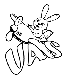
After my heart was crushed after the rejection of the last one I made this one. 
Just doesn't seem right lol
|
|
|
|
|
 |
Patrick
Administrator

Joined: 14 Feb 2003
Posts: 11945
Location: Harbinger, NC, U.S.A.
|
 Posted: Mon Jan 31, 2011 11:30 am Post subject: Posted: Mon Jan 31, 2011 11:30 am Post subject: |
 |
|
|
|
|
|
|
 |
|


