|
|
| Author |
Message |
Passe
Joined: 13 Jun 2010
Posts: 11
|
 Posted: Wed Jan 26, 2011 6:14 pm Post subject: How does my logo look? Posted: Wed Jan 26, 2011 6:14 pm Post subject: How does my logo look? |
 |
|

This is for my friend that wants a new logo for his airplane company. Does it look professional and good? Any feedback is good I haven't used Photoshop in a while so I would like good and bad comments thanks 
|
|
|
|
|
 |
Auieos
Joined: 29 Jan 2010
Posts: 2019
|
| Posted: Wed Jan 26, 2011 6:35 pm Post subject: |
|
|
Hey good work, i'm not going to sugar coat it for both our sakes.
Big button looks good.
Plane shillowette looks good. (lol spelling)
Plane needs to be bigger.
Jetstream looks off, maybe fade it off being fuzzy like it is.
Font doesn't provoke much excitement.
UAS should overlap the button.
Light blue outer glow doesn't seem to match the dark blue.
Background should be transparent. (now i'm being picky)
The overall design is solid and simplistic, perfect for a logo.
|
|
|
|
|
|
Passe
Joined: 13 Jun 2010
Posts: 11
|
| Posted: Wed Jan 26, 2011 7:26 pm Post subject: |
|
|
| Auieos wrote: | Hey good work, i'm not going to sugar coat it for both our sakes.
Big button looks good.
Plane shillowette looks good. (lol spelling)
Plane needs to be bigger.
Jetstream looks off, maybe fade it off being fuzzy like it is.
Font doesn't provoke much excitement.
UAS should overlap the button.
Light blue outer glow doesn't seem to match the dark blue.
Background should be transparent. (now i'm being picky)
The overall design is solid and simplistic, perfect for a logo. |
Thanks a lot!
Jet stream was the hardest thing for me I think lol. I couldn't find a way to get it to work. I'll get back to work and hopefully get a better outcome this time!
|
|
|
|
|
|
YourOnlySin
Joined: 23 Jan 2011
Posts: 230
|
| Posted: Wed Jan 26, 2011 8:08 pm Post subject: |
|
|
I like it! I think the jet stream looks fine....very NASA. I would relocate the aircraft or the jetstream images slightly to center them up with each other a tad better. I'm not an expert, but I know a lot of companies ask that any logos be provided in vector format so that they can be re-sized to any size without image distortions. Some of the fade effects might be hard to do, but I think you can use the pen tool to recreate this as a vector image. Im sure someone here has more experience with that than I. Maybe its not necessary anyway?
_________________
http://www.jmerrittphotorestoration.com/ |
|
|
|
|
|
Passe
Joined: 13 Jun 2010
Posts: 11
|
| Posted: Wed Jan 26, 2011 9:40 pm Post subject: |
|
|

Plane is bigger.
Tried to fix the jetstream but I think I failed on it again 
All the blue colors are the same.
New Font(Didn't want to use anything real crazy since its for a professional logo)
Font size is a lot bigger.
UAS is a lot bigger.
In Photoshop it is transparent but on here it does look like it is.
Hopefully its better than the first time. The jetstream is whats killing me. I'm going to try to get the Art teacher at my school to mess around with it because she teaches a computer graphics class and they use CS3 in there. I couldn't really get the fade I was looking for
Now that I look at it again I feel like the outer glow on the letters is kind of an over kill? Does it look fine to you or should I make it smaller or just take it off?
|
|
|
|
|
|
Passe
Joined: 13 Jun 2010
Posts: 11
|
| Posted: Wed Jan 26, 2011 9:49 pm Post subject: |
|
|

Everything is the same I just mess with the outer glow and the contour of the text.
I don't know if this will make a difference but the logo will be a lot smaller than what it is right now.
|
|
|
|
|
|
YourOnlySin
Joined: 23 Jan 2011
Posts: 230
|
| Posted: Wed Jan 26, 2011 10:00 pm Post subject: |
|
|
That looks nice too! With the jetstream, maybe create it on its own layer above everything else so that it isnt affected by the depth perception of the blue ring, then give it some gaus blur and adjust the radius a bit?
Personally, I think the smaller text that fits inside the circle looked a bit more technical, but overall, I really like it. Good job.
_________________
http://www.jmerrittphotorestoration.com/ |
|
|
|
|
|
hubert
Joined: 21 Jan 2011
Posts: 14
|
| Posted: Thu Jan 27, 2011 3:51 am Post subject: Logo |
|
|
|
|
|
|
|
|
Auieos
Joined: 29 Jan 2010
Posts: 2019
|
| Posted: Thu Jan 27, 2011 5:46 pm Post subject: |
|
|
Hey that's looking heaps better.
I didn't mind the first change you did, there both good.
The gap between the text and the plane is still large and i think the size of the pane could be increase to fill it slightly better.
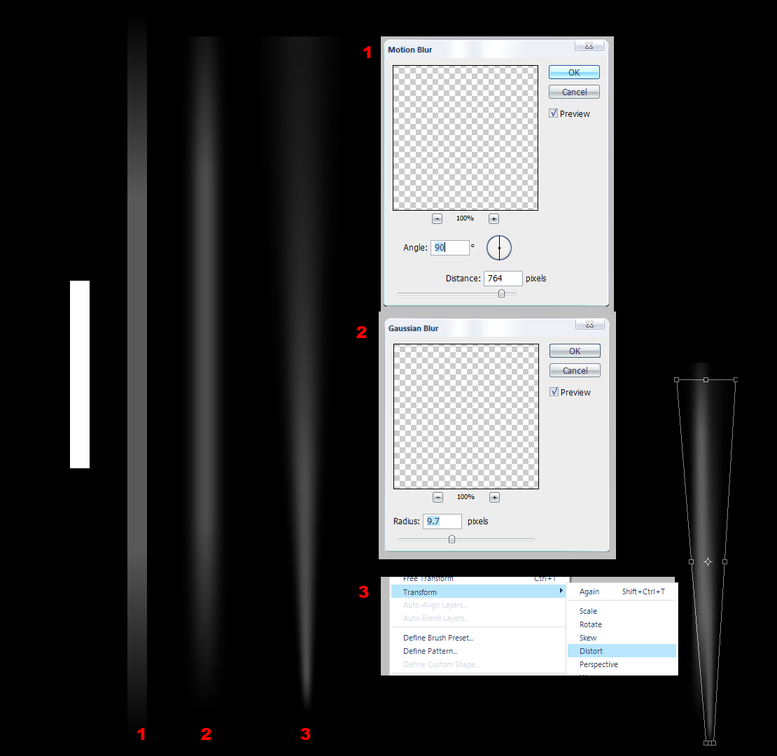
Here's a way of making the jetstream better.
| Description: |
|
| Filesize: |
65.45 KB |
| Viewed: |
1050 Time(s) |
|
|
|
|
|
|
|
thehermit
Joined: 05 Mar 2003
Posts: 3987
Location: Cheltenham, UK
|
| Posted: Thu Jan 27, 2011 7:00 pm Post subject: |
|
|
For my taste, the type is too large, I would reduce it by about a 1/3 or thereabouts and the logo is too small, I would enlarge it by about 1/2to 3 times, depending upon the composition,
that, and reduce it to two colours (maybe 3 or 4, grey scale), does it still hold its integrity? Forget colour in it's early stages.
_________________
If life serves you lemons, make lemonade! |
|
|
|
|
|
|


