|
|
| Author |
Message |
Lifted
Joined: 05 Oct 2010
Posts: 6
|
 Posted: Wed Oct 06, 2010 6:06 pm Post subject: rate this please Posted: Wed Oct 06, 2010 6:06 pm Post subject: rate this please |
 |
|
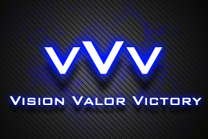
This is a logo I made for my Xbox360 Gamebattles team a while ago. What do you think?
| Description: |
|
| Filesize: |
76.58 KB |
| Viewed: |
698 Time(s) |
|
|
|
|
|
|
 |
Auieos
Joined: 29 Jan 2010
Posts: 2019
|
| Posted: Thu Oct 07, 2010 12:36 am Post subject: |
|
|
I like it, tad bland if anything. 
|
|
|
|
|
|
ctw
Joined: 05 Oct 2010
Posts: 9
Location: Enschede, The Netherlands
|
| Posted: Thu Oct 07, 2010 6:08 am Post subject: |
|
|
i like the idea, maybe try putting the middle V in a new layer and try overlapping the other 2 V's and maybe drop it a little.
_________________
color the world |
|
|
|
|
|
thehermit
Joined: 05 Mar 2003
Posts: 3987
Location: Cheltenham, UK
|
| Posted: Thu Oct 07, 2010 8:07 am Post subject: |
|
|
The blue is a little too blue so to speak, I mean too much of a royal blue, perhaps a more neon shade? I also like the idea of associating the V's with eachother in someway.
_________________
If life serves you lemons, make lemonade! |
|
|
|
|
|
Lifted
Joined: 05 Oct 2010
Posts: 6
|
| Posted: Thu Oct 07, 2010 1:52 pm Post subject: |
|
|
Thank you for all the feedback :]
@Auieos
Yeah haha, I was going for a more classy look, didn't want to do too much.
@ctw
I'm trying to envision what it would look like.. maybe you could make me an example of what you're talking about. :]
Also, I love your work. Color the World.
@thehermit
I agree, the blue could use a tad bit more... neon tone and, thank you; I'm glad you caught that I was trying to associate the V's with each other.
|
|
|
|
|
|
ctw
Joined: 05 Oct 2010
Posts: 9
Location: Enschede, The Netherlands
|
| Posted: Sun Oct 10, 2010 12:18 pm Post subject: |
|
|
somthing likes this
dont look @ the colors, just made an example so you know where the middle V should be. It makes the logo more complete and fitting together. ( but thats my opinion)
| Description: |
|
| Filesize: |
24.52 KB |
| Viewed: |
632 Time(s) |

|
_________________
color the world |
|
|
|
|
|
|


