|
|
| Author |
Message |
Fubsywubkis
Joined: 18 Jul 2010
Posts: 6
|
 Posted: Wed Jul 21, 2010 2:09 am Post subject: Gaming Website Logo Posted: Wed Jul 21, 2010 2:09 am Post subject: Gaming Website Logo |
 |
|
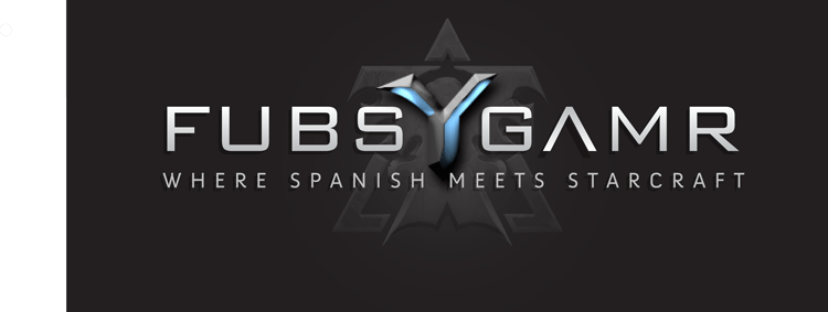
Hey guys, this is my very first attempt at using Illustrator, so please be nice! I found some tutorials online, and they helped me get to here.
What can I do to make it look awesome? There are many other areas for improvement as well.
Thanks for any tips/tricks/advice you may have. The logo is going to be on the corner of videos of Professional Starcraft 2 replays.
EDIT: I keep swapping in and out, but I'm pretty sure I like this one the best. Please, let me know what I can do to make it look even better (especially the design in the background)
EDIT2: Ok I fixed the 'M', you are right it helps a lot
| Description: |
|
| Filesize: |
37.95 KB |
| Viewed: |
957 Time(s) |
|
Last edited by Fubsywubkis on Wed Jul 21, 2010 6:53 pm; edited 1 time in total |
|
|
|
|
 |
darklite
Joined: 19 Dec 2009
Posts: 277
Location: Oregon, U.S.
PS Version: cs
OS: windows 7
|
| Posted: Wed Jul 21, 2010 5:25 pm Post subject: |
|
|
I absolutely love this! I wish I could give you tips, but if it were mine, I'd fly with it. This is all Illustrator? I'd say the program has improved somewhat! Of course, I'm only 8 years behind on upgrades. anyway, great job, it deserves to be displayed. BTW, love the font.
_________________
Jeff
http://www.autumnwindstudios.com |
|
|
|
|
|
darklite
Joined: 19 Dec 2009
Posts: 277
Location: Oregon, U.S.
PS Version: cs
OS: windows 7
|
| Posted: Wed Jul 21, 2010 5:26 pm Post subject: |
|
|
Oh yeah, one quick thing: the bottom line where is says 'where spanish meets starcraft', the M is a bit too shadowed to me. The rest of the type is open, but the M is shadowed. If it were me, I'd bring it forward.
_________________
Jeff
http://www.autumnwindstudios.com |
|
|
|
|
|
thehermit
Joined: 05 Mar 2003
Posts: 3987
Location: Cheltenham, UK
|
| Posted: Wed Jul 21, 2010 6:18 pm Post subject: |
|
|
The Y is much improved from the last iteration, I think it still needs some work in final polishing but not in concept. I do prefer the spiral background in the last though and it would look neater in smaller sizes.
_________________
If life serves you lemons, make lemonade! |
|
|
|
|
|
Fubsywubkis
Joined: 18 Jul 2010
Posts: 6
|
| Posted: Wed Jul 21, 2010 6:44 pm Post subject: |
|
|
Thanks so much for the encouragement! Yes, I made everything except the Y symbol in the middle with Illustrator, although I'm sure you could do that as well.
I made the Y using Photoshop, because my original goal was to copy the Starcraft Font, and I found a step-by-step guide on how to do it in Photoshop, so I made the letter. After that I tweaked it a bit to my own preferences, then copied it over to Illustrator.
Like I said, though, you can probably make it just as easily with Illustrator.
I'll take a look at the M that you mentioned. I think it's the shadow from the Y, and I'll see what I can do.
|
|
|
|
|
|
Fubsywubkis
Joined: 18 Jul 2010
Posts: 6
|
| Posted: Wed Jul 21, 2010 6:46 pm Post subject: |
|
|
| thehermit wrote: | | The Y is much improved from the last iteration, I think it still needs some work in final polishing but not in concept. I do prefer the spiral background in the last though and it would look neater in smaller sizes. |
Hey wow I'm impressed that you remembered what the old one looked like!
The reason I swapped the Spiral for this other Design is because this logo comes straight from Starcraft 2 (Blizzard released a package to download with logos, avatars, and things like that) and I decided to add in this symbol so that people who play Starcraft 2 would immediately be able to recognize it without being forced to read the text.
When you say "I think it still needs some work in the final polishing" what exactly do you mean by that? I'm sorry for my n00b-ness, but I am new to creating logos. What sorts of things do I need to polish? How can I really make it shine?
p.s. Should I post the older versions for people to see? Or is that generally frowned upon, in these forums?
EDIT: One thing I would love to do is tweak the FUBS GAMR letters just a little, little bit, to bring them out. What would you recommend I could do that would make them look *that* much better, without turning it into me throwing it in your face?
|
|
|
|
|
|
Auieos
Joined: 29 Jan 2010
Posts: 2019
|
| Posted: Thu Jul 22, 2010 12:53 am Post subject: |
|
|
Mmmmm that's a good looking logo. Nice work.
|
|
|
|
|
|
myphotos
Joined: 09 Jun 2010
Posts: 37
|
| Posted: Thu Jul 22, 2010 4:18 am Post subject: |
|
|
I think you have done fantastic work in first time. Keep it up.
_________________
Photoshop is not a verb. It is a noun. It is the means to an end, not the end itself |
|
|
|
|
|
MRN Studios
Joined: 15 Jun 2010
Posts: 11
|
| Posted: Sat Aug 14, 2010 10:26 pm Post subject: |
|
|
i like it but the y just seems well idk it just doesnt seem right i know its the starcraft y but i would put a regular y in and inbetween the two words put the starcraft symbol if you can get it or if its ok to use. but other then its awsome great work!
|
|
|
|
|
|
maraz
Joined: 01 Sep 2010
Posts: 4
|
| Posted: Wed Sep 01, 2010 2:11 pm Post subject: |
|
|
Wow I love the design, the colors and fonts are great.
|
|
|
|
|
|
|


