|
|
| What doyou think for this design? |
great |
|
66% |
[ 2 ] |
bad |
|
33% |
[ 1 ] |
|
| Total Votes : 3 |
|
| Author |
Message |
egzon41
Joined: 22 Jun 2010
Posts: 102
Location: Kosovo
|
 Posted: Tue Jun 22, 2010 1:02 am Post subject: design a sport player Posted: Tue Jun 22, 2010 1:02 am Post subject: design a sport player |
 |
|
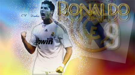
i designed cristiano ronaldo and im new on ps so i want a co0mment from you about my work. Your advice will make me more pleasure and professional in my way of working on photoshop
| Description: |
|
| Filesize: |
142.48 KB |
| Viewed: |
608 Time(s) |
|
_________________
egzon korenica |
|
|
|
|
 |
Patrick
Administrator

Joined: 14 Feb 2003
Posts: 11945
Location: Harbinger, NC, U.S.A.
|
| Posted: Tue Jun 22, 2010 10:14 am Post subject: |
|
|
|
|
|
|
|
|
bladecx321
Joined: 27 Jun 2010
Posts: 24
Location: New Hampshire
|
| Posted: Mon Jun 28, 2010 11:52 pm Post subject: |
|
|
What I Like:
I like the design and the colors. I also like the way you "cascaded" the text 'renaldo.' Also, your composition is nice!
What to work on:
One change i think would be nice is if you had the noise over the whole image, but decreasing as it moves away from the body. An example of this would be in the upper left corner.
_________________
http://www.bladecx321.deviantart.com/ |
|
|
|
|
|
egzon41
Joined: 22 Jun 2010
Posts: 102
Location: Kosovo
|
| Posted: Tue Jun 29, 2010 2:16 am Post subject: |
|
|
thank you very much bladecx321 
_________________
egzon korenica |
|
|
|
|
|
jk3000
Joined: 16 Apr 2009
Posts: 38
|
| Posted: Tue Jun 29, 2010 2:43 am Post subject: |
|
|
| bladecx321 wrote: | What I Like:
I like the design and the colors. I also like the way you "cascaded" the text 'renaldo.' Also, your composition is nice!
What to work on:
One change i think would be nice is if you had the noise over the whole image, but decreasing as it moves away from the body. An example of this would be in the upper left corner. |
very fair assessment I completely agree
|
|
|
|
|
|
egzon41
Joined: 22 Jun 2010
Posts: 102
Location: Kosovo
|
| Posted: Tue Jun 29, 2010 3:04 am Post subject: |
|
|
aan another guy wrote me that
_________________
egzon korenica |
|
|
|
|
|
thehermit
Joined: 05 Mar 2003
Posts: 3987
Location: Cheltenham, UK
|
| Posted: Tue Jun 29, 2010 8:14 am Post subject: |
|
|
There needs to be more dynamism in them, they are after all sports stars, the text effect is a bit too distracting and finally, I would have masked him out from the colours. The colours are good though and reminiscent of Barcelona's.
_________________
If life serves you lemons, make lemonade! |
|
|
|
|
|
egzon41
Joined: 22 Jun 2010
Posts: 102
Location: Kosovo
|
| Posted: Tue Jun 29, 2010 11:53 am Post subject: |
|
|
ok thanks
_________________
egzon korenica |
|
|
|
|
|
Speakers
Joined: 11 Mar 2010
Posts: 77
|
| Posted: Sat Jul 03, 2010 9:41 am Post subject: |
|
|
Hi egzon, I think you need more focus on the face really and not have as much opacity in it. Also the layer with the Real Madrid badge could be cut down a bit, by this.. I mean remove the white around the badge.
Good start though
|
|
|
|
|
|
egzon41
Joined: 22 Jun 2010
Posts: 102
Location: Kosovo
|
| Posted: Sat Jul 03, 2010 12:17 pm Post subject: |
|
|
thank you for your reply. i'm pleased for telling me that. i will do that what you and some other think
_________________
egzon korenica |
|
|
|
|
|
|


