|
|
| Author |
Message |
siimonc
Joined: 27 Mar 2010
Posts: 3
Location: london, uk
|
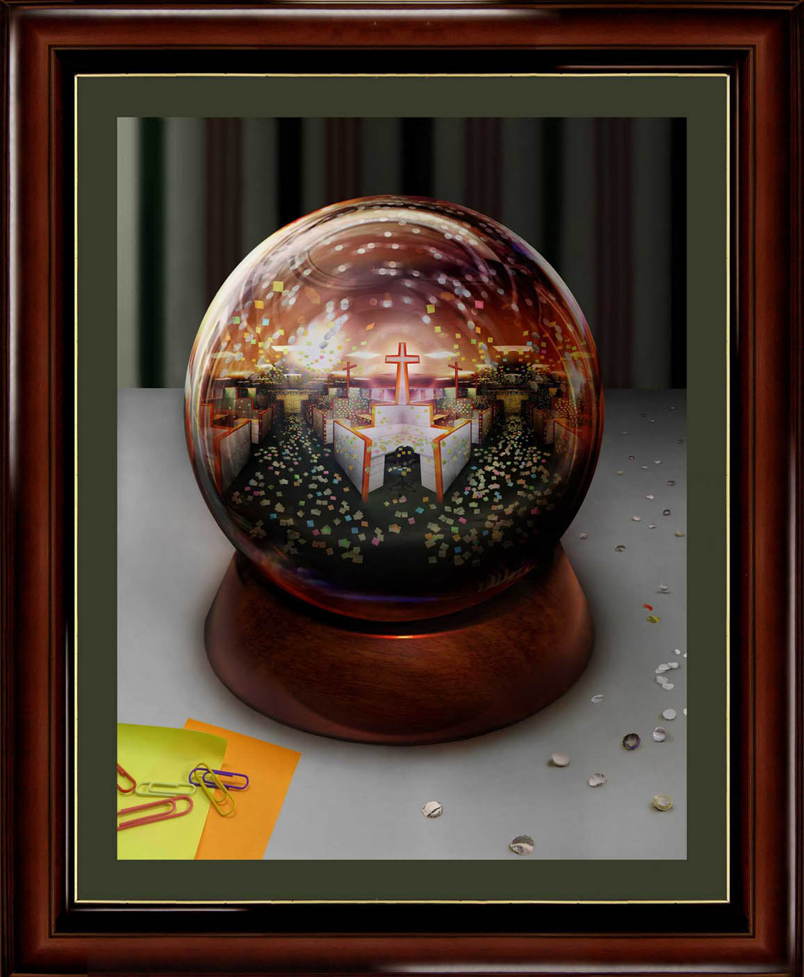
 Posted: Mon Mar 29, 2010 10:28 am Post subject: New artwork completed - the call centre crucifiction Posted: Mon Mar 29, 2010 10:28 am Post subject: New artwork completed - the call centre crucifiction |
 |
|
Hey, any comments/thoughts or suggestions on this latest work would be greatfully appreciated. All up it measures about 6 foot in height and has taken the best part of a year to finish. It's inspired by my mundane and boring daily work environment and includes examples of me wasting company time and resources!
| Description: |
|
| Filesize: |
162.81 KB |
| Viewed: |
686 Time(s) |

|
|
|
|
|
|
 |
darklite
Joined: 19 Dec 2009
Posts: 277
Location: Oregon, U.S.
PS Version: cs
OS: windows 7
|
 Posted: Thu Apr 08, 2010 8:06 pm Post subject: Posted: Thu Apr 08, 2010 8:06 pm Post subject: |
 |
|
This is one gorgeous piece of work. My only suggestion is that some of the office cubicles in the back of the ball seem as clear as the ones up front. There should be a bit of blurring, or lighter tones to show that they are in the distance. It's a great piece though, good job.
_________________
Jeff
http://www.autumnwindstudios.com |
|
|
|
|
 |
Minahitnir
Joined: 08 Mar 2010
Posts: 15
PS Version: CS4
OS: Windows7 Professional
|
 Posted: Fri Apr 09, 2010 1:07 pm Post subject: Posted: Fri Apr 09, 2010 1:07 pm Post subject: |
 |
|
Jesus christ bro, this is absolutely awesome! Not only it displays a good painting and photoshop skill, but also there's an original idea behind your work!
May I ask, did you paint out everything or edited some existing stuff?
I mean, how exactly did u create your artwork?
_________________
O o
/¯____________________________
| BLAAAAAAAAAAAAAAAAARGH!
\_¯¯¯¯¯¯¯¯¯¯¯¯¯¯¯¯¯¯¯¯¯¯¯¯¯¯¯¯ |
|
|
|
|
 |
CadillacMatt
Joined: 19 Aug 2009
Posts: 12
|
 Posted: Sun Apr 11, 2010 8:07 pm Post subject: Posted: Sun Apr 11, 2010 8:07 pm Post subject: |
 |
|
Absolutely amazing for sure... the only thing I see that sticks out are the fluorescent lights above the cubicles, I can see the imagery you're trying to get across but they seem a little out of place.
Keep up the stellar work!
|
|
|
|
|
 |
FATAL_BYTE

Joined: 18 Apr 2010
Posts: 4
Location: Indiana
PS Version: CS4
OS: Vista 64bit
|
 Posted: Mon Apr 19, 2010 9:42 pm Post subject: Posted: Mon Apr 19, 2010 9:42 pm Post subject: |
 |
|
Very sharp!
_________________
Deploy Art. |
|
|
|
|
 |
icesamurai
Joined: 08 Mar 2010
Posts: 35
|
 Posted: Fri Apr 23, 2010 5:20 pm Post subject: Posted: Fri Apr 23, 2010 5:20 pm Post subject: |
 |
|
I love it, its a new take on a old concept.
|
|
|
|
|
 |
|


