|
|
| Author |
Message |
Minahitnir
Joined: 08 Mar 2010
Posts: 15
PS Version: CS4
OS: Windows7 Professional
|
 Posted: Mon Mar 29, 2010 5:21 am Post subject: Playing the strings of hell Posted: Mon Mar 29, 2010 5:21 am Post subject: Playing the strings of hell |
 |
|
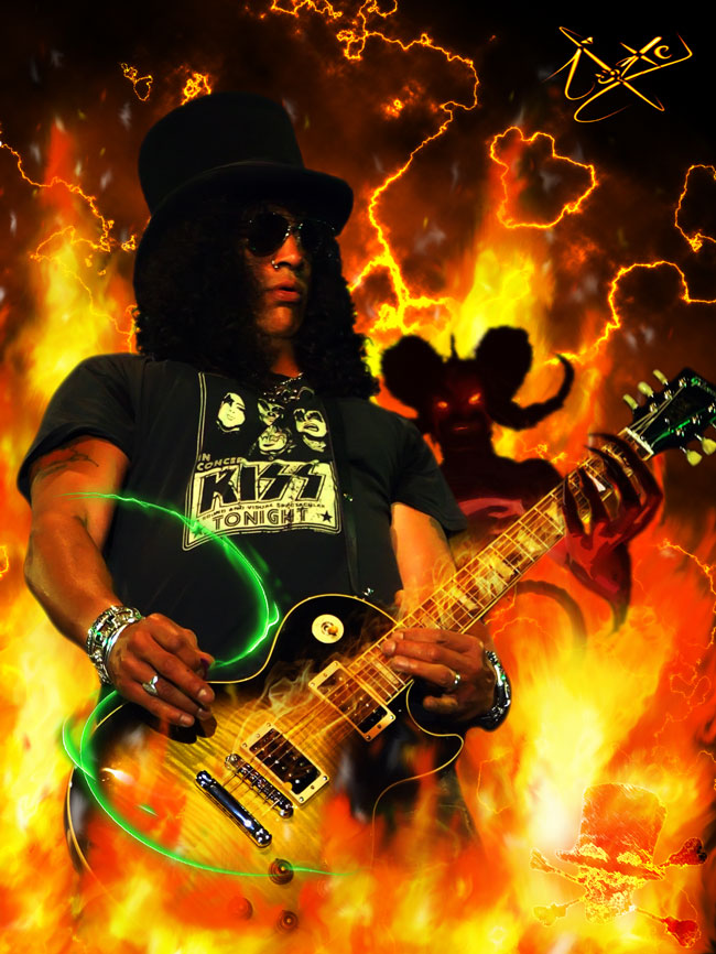
Slash artwork. What do you guys think? Any tip, tricks, should I add something else, whatever?
Personally I had the intention to add moar sparkly and green stuff, however I came out with nothing good so I left it that way.
Thanks in advance ^^.
| Description: |
|
| Filesize: |
151.63 KB |
| Viewed: |
755 Time(s) |
|
_________________
O o
/¯____________________________
| BLAAAAAAAAAAAAAAAAARGH!
\_¯¯¯¯¯¯¯¯¯¯¯¯¯¯¯¯¯¯¯¯¯¯¯¯¯¯¯¯ |
|
|
|
|
 |
Auieos
Joined: 29 Jan 2010
Posts: 2019
|
| Posted: Tue Mar 30, 2010 7:19 pm Post subject: |
|
|
Needs more Slash!!!!!! Yeah!!!  ... its now my wallpaper. Luv it. Any chance of a widescreen edition? 1920x1080 ... its now my wallpaper. Luv it. Any chance of a widescreen edition? 1920x1080 
|
|
|
|
|
|
Minahitnir
Joined: 08 Mar 2010
Posts: 15
PS Version: CS4
OS: Windows7 Professional
|
| Posted: Thu Apr 01, 2010 5:57 am Post subject: |
|
|
I'm glad you like it so much. well if you want I can try to make a wide screen one, but it will just have moar flames and stuff ^^. I'll try and post results.
_________________
O o
/¯____________________________
| BLAAAAAAAAAAAAAAAAARGH!
\_¯¯¯¯¯¯¯¯¯¯¯¯¯¯¯¯¯¯¯¯¯¯¯¯¯¯¯¯ |
|
|
|
|
|
MartinW

Joined: 03 Mar 2010
Posts: 43
Location: Sheffield
PS Version: CS4
OS: Windows 7
|
| Posted: Mon Apr 05, 2010 7:48 am Post subject: |
|
|
Aye up! Minahitnir
I love slash! and this is some great artwork, i have a few tips or advice for ya for this type of art work.
- personally i wouldn't have that small logo thing in the corner, cause it looks abit distroted
- other would be, be careful how you us lightening affects cause some do come out, some lightening effects come out slightly pixally.
Just a idea but you should try and blend the devil in with the fire.
part from that, it's a good piece of work
_________________
www.mpw3d.co.uk |
|
|
|
|
|
Minahitnir
Joined: 08 Mar 2010
Posts: 15
PS Version: CS4
OS: Windows7 Professional
|
| Posted: Wed Apr 07, 2010 4:19 am Post subject: |
|
|
About the logo, it was my intention to make it a bit blurred. I used some filters to make its shape less clear so it would have been not barely an icon sticking out but something that is seen/not seen.
About the lighting effects, u're referring to the green swirly stuff or the lightning stuff behind?
Also, u said blending in the devil with fire, u mean as I did with slash around his legs?
_________________
O o
/¯____________________________
| BLAAAAAAAAAAAAAAAAARGH!
\_¯¯¯¯¯¯¯¯¯¯¯¯¯¯¯¯¯¯¯¯¯¯¯¯¯¯¯¯ |
|
|
|
|
|
|


