|
|
| Author |
Message |
birdmadgirl7
Joined: 09 Mar 2010
Posts: 5
Location: Portland
|
 Posted: Tue Mar 09, 2010 3:14 am Post subject: Project for class Posted: Tue Mar 09, 2010 3:14 am Post subject: Project for class |
 |
|
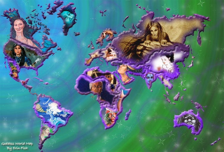
I did this project instead of a paper for my women studies class. It is a world map of the different goddesses worshiped throughout time in different areas. This is my first photoshop major project but I have been using Gimp for a few years now. Any opinions would help me because I have a hard time being objective with my own work. Thanks!
| Description: |
|
| Filesize: |
141.85 KB |
| Viewed: |
540 Time(s) |
|
|
|
|
|
|
 |
thehermit
Joined: 05 Mar 2003
Posts: 3987
Location: Cheltenham, UK
|
| Posted: Tue Mar 09, 2010 4:20 am Post subject: |
|
|
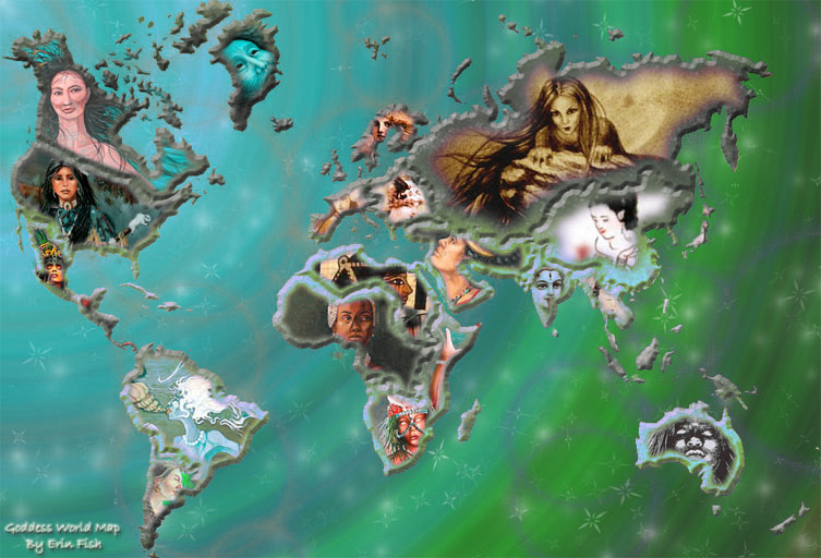
Perhaps a little less bevel and emboss and maybe a different colour scheme, but that's just personal preference.
_________________
If life serves you lemons, make lemonade! |
|
|
|
|
|
icesamurai
Joined: 08 Mar 2010
Posts: 35
|
| Posted: Tue Mar 09, 2010 10:09 am Post subject: |
|
|
If you still have the PSD file then i'd say try adding a texture to the states would make it seem more real. Also like thehermit, Less B&E and a different colour scheme. But as for it now i like it.
|
|
|
|
|
|
birdmadgirl7
Joined: 09 Mar 2010
Posts: 5
Location: Portland
|
| Posted: Tue Mar 09, 2010 1:50 pm Post subject: |
|
|
| icesamurai wrote: | | If you still have the PSD file then i'd say try adding a texture to the states would make it seem more real. Also like thehermit, Less B&E and a different color scheme. But as for it now i like it. |
I like the texture idea a lot! Maybe contouring the pattern on the land to fit a more geographical map. That sounds pretty cool but out of my realm of know how with photoshop, maybe if I experiment a little... I used the bevel to make each geographical area stand out on it's own, before that it was a REAL mess! Lol, my boyfriend doesn't like the color scheme either, I do still have the PSD and I was thinking about playing around with the background. I always have trouble with not making the same boring background over and over. Thanks for all the input guys!
|
|
|
|
|
|
niftyned
Joined: 07 Mar 2010
Posts: 154
Location: Australia
PS Version: CS4
OS: Windows7
|
| Posted: Tue Mar 09, 2010 10:03 pm Post subject: |
|
|
I really like the concept and the execution but have to agree about the color. I think there is too much magenta in it but colors are a really tricky thing because everyones tastes are different. Before you go doing too much re-working have a play with the color adjustments. Select the image tab on the menu bar and go to adjustments>selective color and reduce the amount of magenta and maybe the blue as well. Have a play around to get a color scheme that works for you. The great thing about photoshop is the ability to change the color of any element within your design fairly easily.
| Description: |
|
| Filesize: |
148.64 KB |
| Viewed: |
508 Time(s) |
|
_________________
The only limitation is my imagination. |
|
|
|
|
|
niftyned
Joined: 07 Mar 2010
Posts: 154
Location: Australia
PS Version: CS4
OS: Windows7
|
| Posted: Tue Mar 09, 2010 10:21 pm Post subject: |
|
|
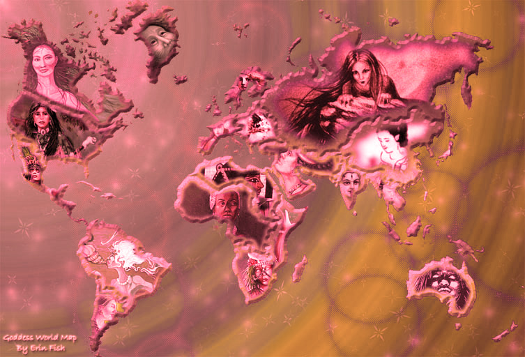
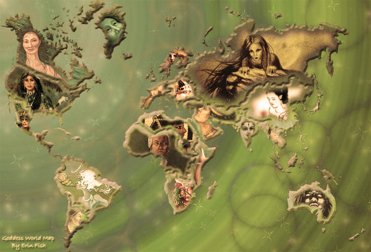
Also the use of photo filters,located in the same menu, can dramatically change the look of an image.
| Description: |
|
| Filesize: |
158.53 KB |
| Viewed: |
506 Time(s) |
|
| Description: |
|
| Filesize: |
142.04 KB |
| Viewed: |
506 Time(s) |
|
_________________
The only limitation is my imagination. |
|
|
|
|
|
birdmadgirl7
Joined: 09 Mar 2010
Posts: 5
Location: Portland
|
| Posted: Tue Mar 09, 2010 11:09 pm Post subject: |
|
|
| niftyned wrote: | | I really like the concept and the execution but have to agree about the color. I think there is too much magenta in it but colors are a really tricky thing because everyones tastes are different. Before you go doing too much re-working have a play with the color adjustments. Select the image tab on the menu bar and go to adjustments>selective color and reduce the amount of magenta and maybe the blue as well. Have a play around to get a color scheme that works for you. The great thing about photoshop is the ability to change the color of any element within your design fairly easily. |
That's exactly what I was thinking of doing. I think maybe the colors need to be toned down a little bit but I still want to keep it sort of mystical, you know? Not too toned down but maybe less right IN YOUR FACE I guess is what I'm trying to get at.
|
|
|
|
|
|
|


