|
|
| Author |
Message |
Ground Up
Joined: 03 Mar 2010
Posts: 8
Location: NY
|
 Posted: Fri Mar 05, 2010 11:15 am Post subject: Intro page for a car dealership. Opinions please!! Posted: Fri Mar 05, 2010 11:15 am Post subject: Intro page for a car dealership. Opinions please!! |
 |
|
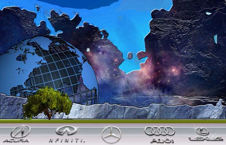
The name of the dealership is Planet Motor Cars. I did this for the greeting page for there website. They added some flash on their site but I still like the original.
Check out the bushes!

|
|
|
|
|
 |
darklite
Joined: 19 Dec 2009
Posts: 277
Location: Oregon, U.S.
PS Version: cs
OS: windows 7
|
| Posted: Fri Mar 05, 2010 5:38 pm Post subject: |
|
|
This is indeed one beautiful background. I really like the idea-especially with the green below. I found the bushes as logos interesting, but a bit hard to see. I hope you don't mind, but I played around with it displaying a more chrome effect for the logos. I figured I could do it easier than explaining the idea I was seeing in my head.
Still, your green logo design is still pretty cool, and I wouldn't want to take away from your idea. It's just a suggestion.
| Description: |
|
| Filesize: |
55.66 KB |
| Viewed: |
500 Time(s) |
|
_________________
Jeff
http://www.autumnwindstudios.com |
|
|
|
|
|
Ground Up
Joined: 03 Mar 2010
Posts: 8
Location: NY
|
| Posted: Fri Mar 05, 2010 5:59 pm Post subject: |
|
|
I'm with ya on the hard to see Logo Bushes and I was going to have a different effect on them before finalizing but the artsy part of me couldn't let go.
|
|
|
|
|
|
thehermit
Joined: 05 Mar 2003
Posts: 3987
Location: Cheltenham, UK
|
| Posted: Fri Mar 05, 2010 7:27 pm Post subject: |
|
|
Not a fan at all. First things first you should not have a 'greetings page' it's just another click for customers who don't really care about a vanity page. Caveats in this area should be, do I need it? does it add value?
The grass, tree and 'white cliffs of Dover' are a jarring element within the planetary style you were shooting for. The grass makes it difficult to decipher the logos of the companies. However there is one Almighty error, companies spend good money on brand identity and won't take kindly to you messing with their identity.
Here's an example of corporate branding guidelines:
www.channel4.com/about_c4/styleguide/
Other than that the design is a little '1998' with stock art globes and the like. I will be interested though to see how it develops, have you gone to other car dealership websites and seen how they do it? That might clarify some ideas.
_________________
If life serves you lemons, make lemonade! |
|
|
|
|
|
niftyned
Joined: 07 Mar 2010
Posts: 154
Location: Australia
PS Version: CS4
OS: Windows7
|
| Posted: Sun Mar 07, 2010 9:05 pm Post subject: |
|
|
I can see what you were aiming at and I like the concept but I dont think you quite hit the mark. It seems a bit too cluttered and needs to be simplified. Sometimes less really is more. Also make sure you have permission to use the logos of the car companies before you find yourself in breach of copyright laws.
_________________
The only limitation is my imagination. |
|
|
|
|
|
Ground Up
Joined: 03 Mar 2010
Posts: 8
Location: NY
|
| Posted: Sun Mar 07, 2010 10:34 pm Post subject: |
|
|
Thank you for all of your input so far. this was done for a used car dealership in crappy neighborhood. The owner just wanted something different to stand out. As far a the car companies suing for copyright infringement...
...not my problem. I got paid already.
|
|
|
|
|
|
thehermit
Joined: 05 Mar 2003
Posts: 3987
Location: Cheltenham, UK
|
| Posted: Mon Mar 08, 2010 4:46 am Post subject: |
|
|
"..not my problem. I got paid already."
It is your problem, as a designer who is willing to take money on the proviso that you take a professional approach to a project, your attitude should not be 'sod it'.
_________________
If life serves you lemons, make lemonade! |
|
|
|
|
|
niftyned
Joined: 07 Mar 2010
Posts: 154
Location: Australia
PS Version: CS4
OS: Windows7
|
| Posted: Mon Mar 08, 2010 7:01 am Post subject: |
|
|
| Ground Up wrote: | Thank you for all of your input so far. this was done for a used car dealership in crappy neighborhood. The owner just wanted something different to stand out. As far a the car companies suing for copyright infringement...
...not my problem. I got paid already. |
So you are confident that a car salesman from a crappy caryard in a dodgy neighbourhood is going to take the rap for you infringing on someone else`s copyright. Good luck with that.
_________________
The only limitation is my imagination. |
|
|
|
|
|
|


