|
|
| Author |
Message |
Kairakilla
Joined: 26 Mar 2009
Posts: 50
|
 Posted: Thu Mar 04, 2010 4:21 pm Post subject: Rave Poster What do you think Posted: Thu Mar 04, 2010 4:21 pm Post subject: Rave Poster What do you think |
 |
|
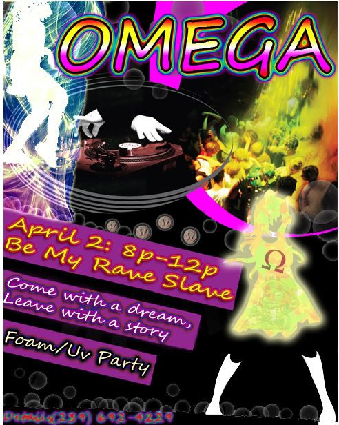
Im throwing a rave this is my 2n picture ive worked on tell me what you think
feel free to touch up:bigwink:
-Karia
 |
|
|
|
|
 |
thehermit
Joined: 05 Mar 2003
Posts: 3987
Location: Cheltenham, UK
|
| Posted: Thu Mar 04, 2010 4:58 pm Post subject: |
|
|
I think for a rave type event the colours are fine, I would however change the font, I don't have ready suggestions, as you could go in different directions, I would trawl 80's and 90's club posters and CD's for something suitable.
You Might want to include other vital details such as venue, price, location etc.
_________________
If life serves you lemons, make lemonade! |
|
|
|
|
|
pixel8or
Joined: 31 Oct 2009
Posts: 142
Location: Ireland
|
| Posted: Fri Mar 05, 2010 10:46 am Post subject: |
|
|
It looks fine for a rave poster, I agree with the other comments, you need to get rid of some of the text in the panels on the left side. Either get rid of Be My Rave Slave or Come with a dream, leave with a story and put in the vital details such as venue, price, location etc instead. |
|
|
|
|
|
Ground Up
Joined: 03 Mar 2010
Posts: 8
Location: NY
|
| Posted: Fri Mar 05, 2010 11:03 am Post subject: review |
|
|
The layout is great but I do agree with changing the font. Other than that, I like it alot. |
|
|
|
|
|
darklite
Joined: 19 Dec 2009
Posts: 277
Location: Oregon, U.S.
PS Version: cs
OS: windows 7
|
| Posted: Fri Mar 05, 2010 1:00 pm Post subject: |
|
|
Gotta throw in my agreement here. It's an awesome peice and I love it, but the font doesn't work for me. It has a definite 70's look-unless that's what you wanted. It makes me think of something light and mellow. Type faces are tricky.
Also, your entire piece is linear-everything moving from left to right. I think if it were me, I'd run the type horizontal and not at angle. Or, maybe trade angles like having the top bar the way it is, and the bottom at an opposite angle or something.
_________________
Jeff
http://www.autumnwindstudios.com |
|
|
|
|
|
|


