|
|
| Author |
Message |
darklite
Joined: 19 Dec 2009
Posts: 277
Location: Oregon, U.S.
PS Version: cs
OS: windows 7
|
 Posted: Wed Feb 24, 2010 8:21 am Post subject: Mi Ibanita Posted: Wed Feb 24, 2010 8:21 am Post subject: Mi Ibanita |
 |
|
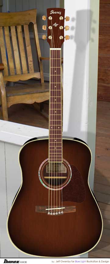
Okay, here's the finished copy (I hope). I figured out the simplest way I think. What I did was make a copy of the body, leveled it to 100% black, then filled it with the desired color. Then I scaled it just a bit larger and moved it to the back. I did the same process for the second part of the trim. Afterward I blurred gently. The photo in the background I shot a few years back of an old 30's travel court.
| Description: |
|
| Filesize: |
31.05 KB |
| Viewed: |
426 Time(s) |

|
_________________
Jeff
http://www.autumnwindstudios.com |
|
|
|
|
 |
thehermit
Joined: 05 Mar 2003
Posts: 3987
Location: Cheltenham, UK
|
 Posted: Wed Feb 24, 2010 8:42 am Post subject: Posted: Wed Feb 24, 2010 8:42 am Post subject: |
 |
|
Good work, looks great. I presume a close up would reveal wood grain better etc. I especially like the pattern work around the soundhole.
ps: It would be cool if you could composite it into the photo in a realistic way.
_________________
If life serves you lemons, make lemonade! |
|
|
|
|
 |
darklite
Joined: 19 Dec 2009
Posts: 277
Location: Oregon, U.S.
PS Version: cs
OS: windows 7
|
 Posted: Wed Feb 24, 2010 9:10 am Post subject: Posted: Wed Feb 24, 2010 9:10 am Post subject: |
 |
|
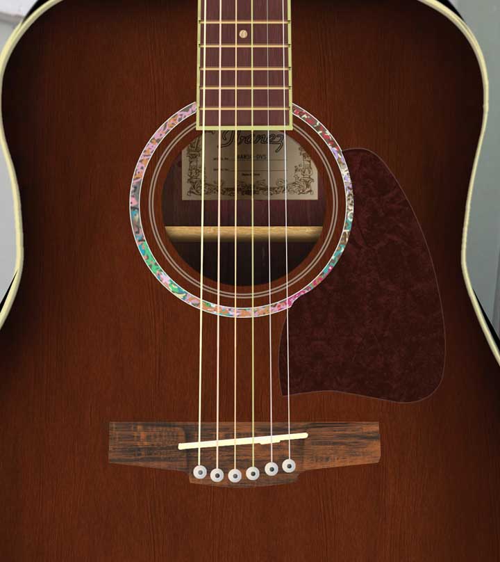
Here's a close up of the body. The wood grain, and the pick guard were done with textures I created previously in photoshop. The texture on the pick guard works very well for clothing-especially sweaters. You can see some of the edge horrors when blown up, but that's what it's all about. Learning as you go. I only put it on a background to show the outside trim.
The strings were done simply with the line tool (after numerous battles with the presets!!! I hate presets.)
The detailing around the hole was done with a solid circle. Then:
1. find edges
used a hard brush to dabble misc. tones inside
2. glass filter
3. sharpen edges
then added a stroke to the layer for the outlines of the circle.
In reality, the design is abalone shell which is crazy with swirls and detail.
| Description: |
|
| Filesize: |
43.06 KB |
| Viewed: |
418 Time(s) |

|
_________________
Jeff
http://www.autumnwindstudios.com |
|
|
|
|
 |
pixel8or
Joined: 31 Oct 2009
Posts: 142
Location: Ireland
|
 Posted: Wed Feb 24, 2010 11:51 am Post subject: Posted: Wed Feb 24, 2010 11:51 am Post subject: |
 |
|
Great work, I like it. The only thing I would change is, it looks like it just came straight out of a music shop. I would put some scratches and worn away areas on the surface as it looks too clean.
|
|
|
|
|
 |
thehermit
Joined: 05 Mar 2003
Posts: 3987
Location: Cheltenham, UK
|
 Posted: Wed Feb 24, 2010 11:57 am Post subject: Posted: Wed Feb 24, 2010 11:57 am Post subject: |
 |
|
I can appreciate the mother of pearl effect now. One small knitpick if I was being ultra critical, perhaps a little shadow effect for the block of wood that the strings are attached to and for the strings themselves.
Love the details though.
_________________
If life serves you lemons, make lemonade! |
|
|
|
|
 |
darklite
Joined: 19 Dec 2009
Posts: 277
Location: Oregon, U.S.
PS Version: cs
OS: windows 7
|
 Posted: Wed Feb 24, 2010 12:36 pm Post subject: Posted: Wed Feb 24, 2010 12:36 pm Post subject: |
 |
|
Thanks all. Great nitpicking too. I also considered the string shadows across the bridge. And, she is sparkling brand new, just picked her up on Saturday.
_________________
Jeff
http://www.autumnwindstudios.com |
|
|
|
|
 |
|


