|
|
| Author |
Message |
dustyrockon
Joined: 21 Jan 2010
Posts: 6
|
 Posted: Thu Jan 21, 2010 2:08 am Post subject: Hockey Wallpapers Posted: Thu Jan 21, 2010 2:08 am Post subject: Hockey Wallpapers |
 |
|
So I'm pretty new to Photoshop, its been several weeks now. Just curious on some input... I know its a little weak, but this is mainly why I joined, I like constructive and helpful critisism. Anyways let me know!

 |
|
|
|
|
 |
Patrick
Administrator

Joined: 14 Feb 2003
Posts: 11945
Location: Harbinger, NC, U.S.A.
|
| Posted: Thu Jan 21, 2010 12:50 pm Post subject: |
|
|
Hello and welcome, dustyrockon. 
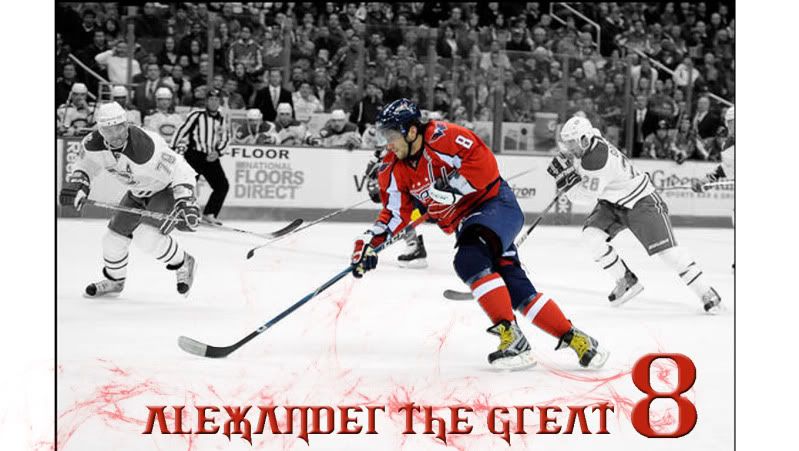
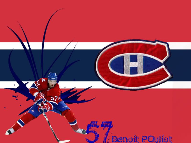
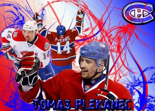
One thing I noticed in these that might help in a way is the spacing of your text. For example, for each of the images (listed by the order they appear in your post:
1. Try vertically aligning "Alexander the Great" in the center of the 8.
2. Move the number and text up and to the right a bit so that it's centered between the player and the right border. This keeps the text away from his skate, as well.
3. Give "Go Habs Go" some space at the top.
4. Give "Tomas Plekanec" some space at the bottom. Basically, with these last two, so the text isn't so flush against the bottom. I'd also move the C logo on number 4 off the right and top a bit, give it a little more spacing.
I hope that this helps give you some ideas.
Thanks,
Patrick
_________________
Patrick O'Keefe - PhotoshopForums.com Administrator
Have a suggestion or a bit of feedback relating to PhotoshopForums.com? Please contact me!
User Guidelines |
|
|
|
|
|
dustyrockon
Joined: 21 Jan 2010
Posts: 6
|
| Posted: Thu Jan 21, 2010 3:56 pm Post subject: |
|
|
Hey thanks!
Im going to start reworking some of those. #3 is just to cluttered so I'm just going to ignore it but the 1st and 4th are my favorite so I plan on taking your advise and re-working them. Where should i move the Logo on 4? |
|
|
|
|
|
Patrick
Administrator
Joined: 14 Feb 2003
Posts: 11945
Location: Harbinger, NC, U.S.A.
|
| Posted: Wed Jan 27, 2010 2:10 pm Post subject: |
|
|
|
|
|
|
|
|
dustyrockon
Joined: 21 Jan 2010
Posts: 6
|
| Posted: Wed Feb 10, 2010 4:56 am Post subject: Heres Another... |
|
|
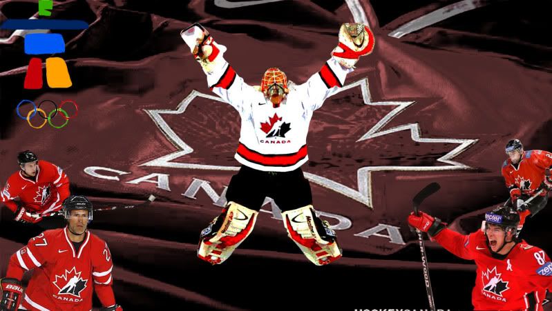
Heres a new background i made... but i feel like theres something missing. any suggestions? |
|
|
|
|
|
dustyrockon
Joined: 21 Jan 2010
Posts: 6
|
| Posted: Wed Feb 10, 2010 4:57 am Post subject: |
|
|
The attatchement is to big so....
 |
|
|
|
|
|
Patrick
Administrator
Joined: 14 Feb 2003
Posts: 11945
Location: Harbinger, NC, U.S.A.
|
| Posted: Wed Feb 10, 2010 2:26 pm Post subject: |
|
|
|
|
|
|
|
|
dustyrockon
Joined: 21 Jan 2010
Posts: 6
|
| Posted: Wed Feb 10, 2010 3:31 pm Post subject: |
|
|
Anything else? Cuz quite honestly I dont like it. lol It is a team canada background its gotta be epic... |
|
|
|
|
|
Patrick
Administrator
Joined: 14 Feb 2003
Posts: 11945
Location: Harbinger, NC, U.S.A.
|
| Posted: Fri Feb 12, 2010 7:52 pm Post subject: |
|
|
|
|
|
|
|
|
dustyrockon
Joined: 21 Jan 2010
Posts: 6
|
| Posted: Sat Feb 13, 2010 12:04 pm Post subject: |
|
|
I think I will, and once its done Ill post it back up. Should i start a new thread or just keep using this one ? |
|
|
|
|
|
|


