|
|
| Author |
Message |
tomsta

Joined: 14 Aug 2009
Posts: 11
PS Version: Cs2
OS: XP
|
 Posted: Fri Aug 14, 2009 12:16 pm Post subject: old profile pic for a project Posted: Fri Aug 14, 2009 12:16 pm Post subject: old profile pic for a project |
 |
|
|
|
|
|
|
 |
tomsta
Joined: 14 Aug 2009
Posts: 11
PS Version: Cs2
OS: XP
|
| Posted: Fri Aug 14, 2009 12:17 pm Post subject: |
|
|
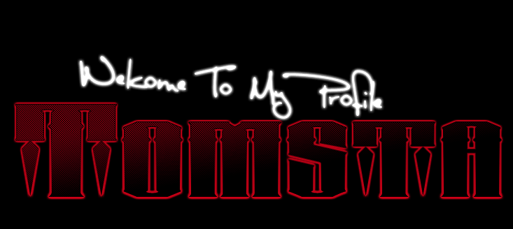
also this done ages ago
| Description: |
|
| Filesize: |
48.61 KB |
| Viewed: |
383 Time(s) |

|
|
|
|
|
|
|
Patrick
Administrator

Joined: 14 Feb 2003
Posts: 11945
Location: Harbinger, NC, U.S.A.
|
| Posted: Sat Aug 15, 2009 12:22 pm Post subject: |
|
|
|
|
|
|
|
|
JASCreative
Joined: 15 Aug 2009
Posts: 8
|
| Posted: Sat Aug 15, 2009 5:44 pm Post subject: |
|
|
Let's start with bad then finish with the good, so your not mad at me  I don't like on the first one, how the 'Welcome to My Profile' is crooked. It has a nice look to it and the font is nice, but it being crooked makes it look unplanned. Also, the designs under the T's aren't doing it for me. Some people may like them, but in my opinion they're unnecessary. I DO like the fade, however, it could be a more centered fade to make it look symmetrical. I really like the small diagonal lines, those are some of my favorite patterns to use. The second design is a bit too simple to even judge I don't like on the first one, how the 'Welcome to My Profile' is crooked. It has a nice look to it and the font is nice, but it being crooked makes it look unplanned. Also, the designs under the T's aren't doing it for me. Some people may like them, but in my opinion they're unnecessary. I DO like the fade, however, it could be a more centered fade to make it look symmetrical. I really like the small diagonal lines, those are some of my favorite patterns to use. The second design is a bit too simple to even judge  It's not good or bad. Good stuff though. It's not good or bad. Good stuff though.
JASCreative.
|
|
|
|
|
|
|