|
|
| Author |
Message |
Self-Serve
Joined: 19 Nov 2008
Posts: 3
|
 Posted: Wed Nov 19, 2008 2:49 pm Post subject: Holiday Banner Posted: Wed Nov 19, 2008 2:49 pm Post subject: Holiday Banner |
 |
|
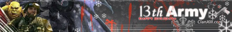
I'd like to know what's well done, what could be improved, overall comments and critics of the banner.
Also, give it a score out of 10, 1 being Bad, 10 being Good.
 |
|
|
|
|
 |
Ducky316

Joined: 15 Nov 2007
Posts: 213
Location: Wichita, KS
PS Version: 7.0
OS: Windows XP
|
| Posted: Wed Nov 19, 2008 3:25 pm Post subject: |
|
|
Blending is very nice...I think I would have actually used an ARMY font though. Other than that, I like it 
_________________
Melanie Ward
designwards@yahoo.com |
|
|
|
|
|
moondog

Joined: 02 Apr 2008
Posts: 778
Location: Michigan
PS Version: CS2
OS: Vista
|
| Posted: Wed Nov 19, 2008 5:14 pm Post subject: |
|
|
I agree with Ducky .... a good "army" font .... stencil or something like that. The only other thing is the Happy Holidays could be a bit easier to read.
dog |
|
|
|
|
|
Self-Serve
Joined: 19 Nov 2008
Posts: 3
|
| Posted: Wed Nov 19, 2008 8:25 pm Post subject: |
|
|

I was told the Renders I chose didn't match the theme of the banner, think this is better?
I also couldn't find an Army font . . . =[
But Thanks! |
|
|
|
|
|
stash
Joined: 30 Oct 2008
Posts: 9
|
| Posted: Fri Nov 21, 2008 9:10 am Post subject: |
|
|
I like the snow in the back. I would mash the dudes a little together and overlap them more. I would also look at where the little splatters overlap and where they don't. Looks like you misplaced a layer or two. Less outerglow on the Happy Holidays, some elements are great, others could use some work. 6
_________________
Professional Media Hack by day...Ninja by night |
|
|
|
|
|
|


