effectwebdesign
Joined: 02 Oct 2008
Posts: 5
|
 Posted: Thu Oct 02, 2008 9:31 am Post subject: Aliasing / Jagged Text & Lines Posted: Thu Oct 02, 2008 9:31 am Post subject: Aliasing / Jagged Text & Lines |
 |
|
Did my best to search the forums. I design fairly small canvas graphics for the Web.
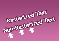
I create text, Ctrl+T to transform, rotate. The characters look horribly jumbled like their baseline shift is all different.
I really don't want to make my text rasterized and then rotate it because I'll probably want to edit it again.
For small text I've tried cutting on/off fractional widths and different anti-aliasing modes and it doesn't really help.
Also, sometimes when I add a stroke to rotated images, the stroke looks horribly aliased and jaggedy. I can't always work at 300dpi because many images are supplied at 72dpi.
What am I missing? Seems like this should be easy. THANKS!
| Description: |
| The arrows show the funny baseline shift / jumbling. I've seen it effect tracking appearance as well. |
|
| Filesize: |
16.7 KB |
| Viewed: |
325 Time(s) |
|
|
|


