|
|
| Author |
Message |
bluescreenkid
Joined: 26 Aug 2004
Posts: 2
|
 Posted: Thu Aug 26, 2004 3:40 pm Post subject: Soap Bubble Posted: Thu Aug 26, 2004 3:40 pm Post subject: Soap Bubble |
 |
|
hi ...
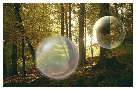
this is my first post here ... have only recently got into photoshopping ... n i wanted to create a soap bubble effect ... this is what i have so far ...

would like to know you're opinions on it & how to make it better ...
cheers
BSK 
|
|
|
|
|
 |
webguy
Joined: 25 Aug 2004
Posts: 165
Location: Canada
|
 Posted: Thu Aug 26, 2004 11:04 pm Post subject: Posted: Thu Aug 26, 2004 11:04 pm Post subject: |
 |
|
very cool! 
Only thing I would suggest is it needs to be a little clearer. It's, well for me anyway, to hazy/foggy.
Other than that, good job 
_________________
Providing small business with high quality affordable websites:
Alberta Custom Websites
Keep up todate with latest virus scares, google, microsoft, linspire and more:
Web and Technology News |
|
|
|
|
 |
TiDaL

Joined: 12 Apr 2003
Posts: 384
|
 Posted: Thu Aug 26, 2004 11:11 pm Post subject: Posted: Thu Aug 26, 2004 11:11 pm Post subject: |
 |
|
here's my version, just bo red and decided to see how good i could do it
its pretty hard to make it look clear unless you resize hte picture down once ur done becuase you distorting hte image but i hope i did it good
what do you think?
| Description: |
|
| Filesize: |
155.74 KB |
| Viewed: |
1187 Time(s) |

|
_________________
http://i337m1k3.deviantart.com for my ART Profile. |
|
|
|
|
 |
bluescreenkid
Joined: 26 Aug 2004
Posts: 2
|
 Posted: Fri Aug 27, 2004 1:04 am Post subject: Posted: Fri Aug 27, 2004 1:04 am Post subject: |
 |
|
@TiDaL
That is really good ... How did you manage to do that please ?
BSK 
|
|
|
|
|
 |
thehermit
Joined: 05 Mar 2003
Posts: 3987
Location: Cheltenham, UK
|
 Posted: Fri Aug 27, 2004 5:27 am Post subject: Posted: Fri Aug 27, 2004 5:27 am Post subject: |
 |
|
It would be even better with a slight circular magnification of the leaves in the middle of the bubble  gj gj
_________________
If life serves you lemons, make lemonade! |
|
|
|
|
 |
TiDaL

Joined: 12 Apr 2003
Posts: 384
|
 Posted: Fri Aug 27, 2004 12:17 pm Post subject: Posted: Fri Aug 27, 2004 12:17 pm Post subject: |
 |
|
i did a tiny bit of spherize, then i used the dodge tool to make it loko like its even more 3-d and a lighter color to it, and a little more dodge on one area the top left, and then i blured hte outsides of it a tiny bit to make it look more on top of the pic
_________________
http://i337m1k3.deviantart.com for my ART Profile. |
|
|
|
|
 |
webguy
Joined: 25 Aug 2004
Posts: 165
Location: Canada
|
 Posted: Fri Aug 27, 2004 3:29 pm Post subject: Posted: Fri Aug 27, 2004 3:29 pm Post subject: |
 |
|
cool.
Sure did make it clearer 
Now I'd say a little raindbow gradiant with a little waving or liquifying for tha oily soapy look and that would be one killer soap bubble. 
_________________
Providing small business with high quality affordable websites:
Alberta Custom Websites
Keep up todate with latest virus scares, google, microsoft, linspire and more:
Web and Technology News |
|
|
|
|
 |
|


