|
|
| Author |
Message |
ducmp

Joined: 20 May 2007
Posts: 5
Location: Denmark
PS Version: PS CS2
OS: Gentoo Linux
|
 Posted: Fri May 25, 2007 12:42 pm Post subject: Is this too much? Posted: Fri May 25, 2007 12:42 pm Post subject: Is this too much? |
 |
|
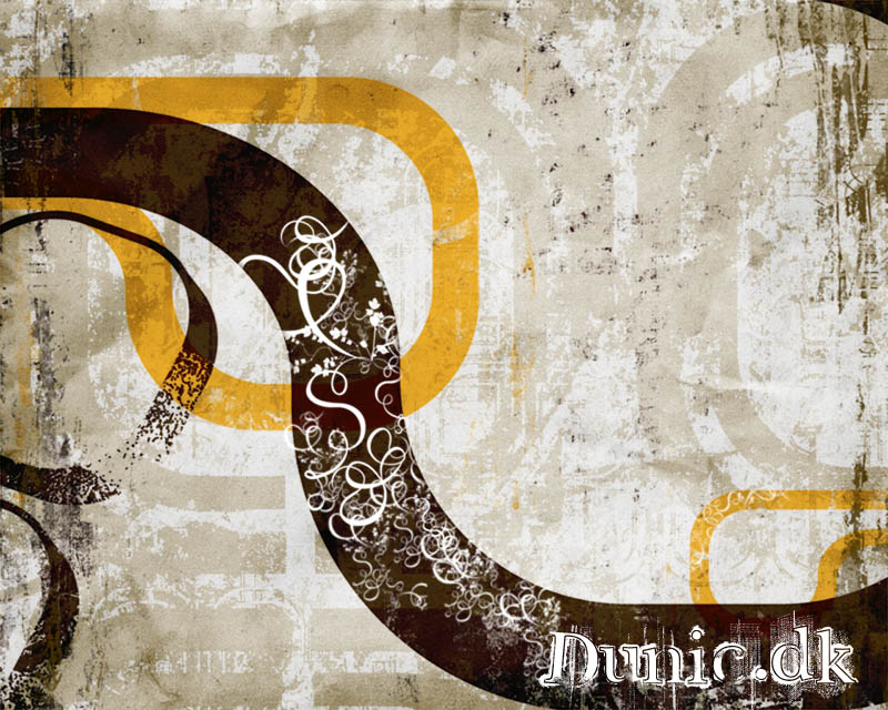
i can't really tell if theres too much on this print. Is it confusing to look at?
| Description: |
|
| Filesize: |
162.94 KB |
| Viewed: |
668 Time(s) |

|
|
|
|
|
|
 |
BryanDowning

Joined: 05 Jul 2004
Posts: 1554
Location: California, USA
|
 Posted: Fri May 25, 2007 3:07 pm Post subject: Posted: Fri May 25, 2007 3:07 pm Post subject: |
 |
|
I think it looks great. The only suggestions I have are:
Make the text pop a little more. You want that to be the focus of the print. The art in the upper left leads your eyes down there nicely, but I think if the text stood out a bit more you'd be golden.
The top right corner bugs me a bit. There's a dark brown piece in the very corner which looks like a new windy bar. I would either remove it or move it more in sight. Could be good both ways.
Keep up the good work!
_________________
Best Regards,
Bryan Downing
bryandowning.com |
|
|
|
|
 |
ducmp

Joined: 20 May 2007
Posts: 5
Location: Denmark
PS Version: PS CS2
OS: Gentoo Linux
|
 Posted: Fri May 25, 2007 6:16 pm Post subject: Posted: Fri May 25, 2007 6:16 pm Post subject: |
 |
|
ahh thanks alot Oybro, finally someone with something to say and something useful he he.  Your' right about the brown piece, hadn't noticed it. I think removing it is the way Your' right about the brown piece, hadn't noticed it. I think removing it is the way  The lines from the bottom left corner leads to the bottom right corner. i kinda like the empty space in the upper right corner. The lines from the bottom left corner leads to the bottom right corner. i kinda like the empty space in the upper right corner. 
|
|
|
|
|
 |
BryanDowning

Joined: 05 Jul 2004
Posts: 1554
Location: California, USA
|
 Posted: Sat May 26, 2007 1:59 pm Post subject: Posted: Sat May 26, 2007 1:59 pm Post subject: |
 |
|
No problem. Glad I could help! 
_________________
Best Regards,
Bryan Downing
bryandowning.com |
|
|
|
|
 |
nexusfire
Joined: 01 Jul 2007
Posts: 26
|
 Posted: Sun Jul 01, 2007 4:54 pm Post subject: Posted: Sun Jul 01, 2007 4:54 pm Post subject: |
 |
|
no its pretty nice, give your text a big fat black outline and see what that does for it, should make it look better.
|
|
|
|
|
 |
gonzo13
Joined: 25 Jun 2007
Posts: 40
|
 Posted: Mon Jul 09, 2007 8:55 am Post subject: Posted: Mon Jul 09, 2007 8:55 am Post subject: |
 |
|
|
|
|
|
|
 |
Patrick
Administrator

Joined: 14 Feb 2003
Posts: 11945
Location: Harbinger, NC, U.S.A.
|
 Posted: Mon Jul 09, 2007 11:08 am Post subject: Posted: Mon Jul 09, 2007 11:08 am Post subject: |
 |
|
|
|
|
|
|
 |
gonzo13
Joined: 25 Jun 2007
Posts: 40
|
 Posted: Mon Jul 09, 2007 2:03 pm Post subject: Posted: Mon Jul 09, 2007 2:03 pm Post subject: |
 |
|
Golden ratio or the divine proportion , the golden section....
it is always the top-left part of an image. People always look at a picture starting from the top left. That's why I was suggesting putting the text there.
_________________
SQL Training SQL Canada Jobs Canada Banks |
|
|
|
|
 |
Patrick
Administrator

Joined: 14 Feb 2003
Posts: 11945
Location: Harbinger, NC, U.S.A.
|
 Posted: Tue Jul 10, 2007 12:05 pm Post subject: Posted: Tue Jul 10, 2007 12:05 pm Post subject: |
 |
|
|
|
|
|
|
 |
|


