|
|
| Author |
Message |
julievive

Joined: 06 Mar 2007
Posts: 64
|
 Posted: Thu Mar 08, 2007 12:24 am Post subject: Interior Design Posted: Thu Mar 08, 2007 12:24 am Post subject: Interior Design |
 |
|
|
|
|
|
|
 |
malcon
Joined: 23 Feb 2005
Posts: 391
Location: miami florida
|
 Posted: Thu Mar 08, 2007 10:17 am Post subject: Posted: Thu Mar 08, 2007 10:17 am Post subject: |
 |
|
hey whats up. welcome to the forum. im guessing you used photoshop for the texturing. as far as the layout etc. its not quite to scale. if you look at how big lets say the refrigerator is in comparison to how tall the counter top is. that seems a little to larg or the counters seem really small. i like your chair though. i would like to see more of it. but if this is a kitchen layout why is there a chair blocking alot of view of the kitchen? it seems counterproductive in a way. just looking at the texturing it looks pretty good. but i think the design could use more work.
kitchens usually require alot of storage. i dont see any pull out drawers, just cabinets. maybe the drawers are hidden behing the cabinet doors but that seems like a little to much work for sombody to deo everytime they want a spoon. also you have more of a bathroom sink, not very functional in a kitchen. and one last thing is the lighting. it seems very dark and mundane for a kitchen. it is sort of depressing.
but on the other hand if you are designing a kitchen lets say for a new sleek hotel or somthing, you wont need the storage etc and the sing could just be used as sort of a mini bar sink. the lighting would be fine because since alot of hotel rooms are just a single roof that shares the bedroom and the kitchen the lighting is just fine...
anyway i like where you are going with this. keep it up!
what program are you using? im working in maya right now actually. keep it up!
-malcon
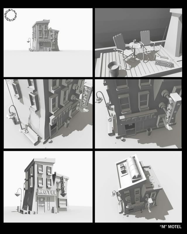
(here is a hotel that will become the letter M in my intro for my demo...i just finished it the other day! go 3d!)

_________________
http://malconpierce.deviantart.com/
http://malcon.cgsociety.org/gallery/
FOR HIRE! malconpierce@gmail.com |
|
|
|
|
 |
julievive

Joined: 06 Mar 2007
Posts: 64
|
 Posted: Thu Mar 08, 2007 7:20 pm Post subject: Posted: Thu Mar 08, 2007 7:20 pm Post subject: |
 |
|
Oh hi Malcon.. Thanks for the critics
its really helpful to improve my skills. Why is it that there is a chair? Well, it seems like a studio type thats why theres a chair. Actually Im using 3D Studio Max
Wow! You have a great work, I like it 
Once again thanks a lot Malcon
_________________
"Clipping Path and Photo Restoration" |
|
|
|
|
 |
malcon
Joined: 23 Feb 2005
Posts: 391
Location: miami florida
|
 Posted: Fri Mar 09, 2007 10:16 am Post subject: Posted: Fri Mar 09, 2007 10:16 am Post subject: |
 |
|
|
|
|
|
|
 |
gonzo13
Joined: 25 Jun 2007
Posts: 40
|
 Posted: Fri Jul 06, 2007 10:37 am Post subject: Posted: Fri Jul 06, 2007 10:37 am Post subject: |
 |
|
I've never used 3D programs I always thought it too difficult. How long it took you to create those images? I like them both.
Thanks
_________________
SQL Training SQL Canada Jobs Canada Banks |
|
|
|
|
 |
|


