|
|
| Author |
Message |
bassrocker208
Joined: 20 Jun 2006
Posts: 41
|
 Posted: Tue Feb 20, 2007 5:04 pm Post subject: Posted: Tue Feb 20, 2007 5:04 pm Post subject: |
 |
|
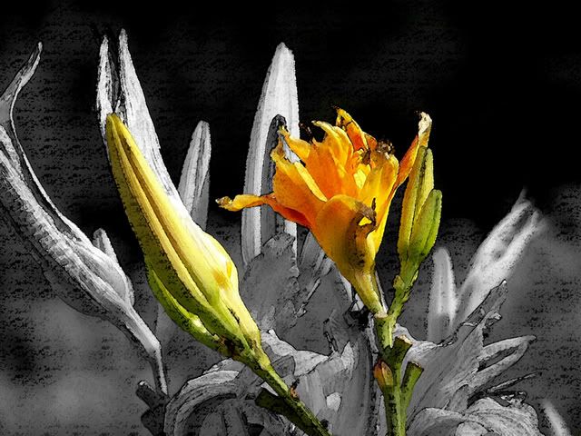
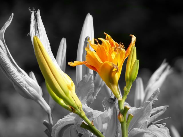
i tried some more but i didnt like them as much especialy not the one that i tried to make like a rough painting (you will see what i mean) and then my mom had me do a picture of her friends little boy for fun
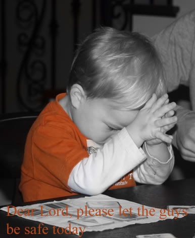
i know it looks like i missed that big white square on the kids t shirt but it really is supposed to be white i swear haha
_________________
Matthew
Last edited by bassrocker208 on Wed Feb 21, 2007 6:37 am; edited 1 time in total |
|
|
|
|
 |
AgfaD2
Joined: 03 Nov 2005
Posts: 267
Location: California
PS Version: Photoshop 9.0 CS2
OS: Windows XP Pro SP2/VISTA ULTIMATE
|
| Posted: Tue Feb 20, 2007 8:56 pm Post subject: |
|
|
You could always do a drop shadow on the text to make the text stand out.  |
|
|
|
|
|
malcon
Joined: 23 Feb 2005
Posts: 391
Location: miami florida
|
| Posted: Wed Feb 21, 2007 12:11 am Post subject: |
|
|
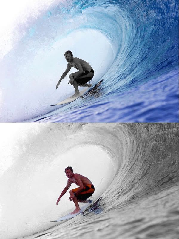
hey you know what, i like the rough painting one.. i like both of them i think with the awesome contrast, it works being the rough paint. but i also like the sharpness of the picture without the filter.
the boy is good. i dont like the text. text takes to much away from pictures. i try to now use it when i can help it. Not only does the text take away from the picture, it is left justified and very very plain. the left justification makes the entire image off balance and the plain-ness of the text just makes the image look cheap. i like the black and white with the orange shirt but i dont really understand why you chose the shirt to colorize? i like how the other pictures draw attention to the focal point of the picture. the shirt doesnt seem as important as maybe the boys eyes, or hands...its like highlighting the unimortant stuff (if that makes sense)
i think it would be cool to just do his hands or maybe both his hands and his head. that could draw more meaning... and loose the text.
i like it alot though! keep up the great work!
your developing a cool series! you could make money off these! i can see these being sold in places like urban outfitters, or peir one or somthing haha.
-malcon
_________________
http://malconpierce.deviantart.com/
http://malcon.cgsociety.org/gallery/
FOR HIRE! malconpierce@gmail.com |
|
|
|
|
|
bassrocker208
Joined: 20 Jun 2006
Posts: 41
|
| Posted: Wed Feb 21, 2007 6:41 am Post subject: |
|
|
i wasnt crazy about the text either buy my mom asked me to write it at the bottom. the only reason i did the shirt orange was because it was the only thing really colorful in the first place but ill have to try the hands like you mentioned. how would you get something like that to sell?
_________________
Matthew |
|
|
|
|
|
malcon
Joined: 23 Feb 2005
Posts: 391
Location: miami florida
|
| Posted: Wed Feb 21, 2007 11:42 am Post subject: |
|
|
|
|
|
|
|
|
malcon
Joined: 23 Feb 2005
Posts: 391
Location: miami florida
|
| Posted: Wed Feb 21, 2007 4:54 pm Post subject: |
|
|
|
|
|
|
|
|
|