|
|
| Author |
Message |
cleverchrisco
Joined: 31 Jan 2007
Posts: 14
|
 Posted: Wed Jan 31, 2007 8:41 pm Post subject: My Wallpaper design...critical comments welcome Posted: Wed Jan 31, 2007 8:41 pm Post subject: My Wallpaper design...critical comments welcome |
 |
|
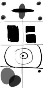
alright so this is at 1680*1050 and its all photoshop with the exception of a couple of renders i made in cinema 4d...they are the 3 in the middle-left side of the piece
http://justyourphotos.com/users/cleverchrisco/new_bg_2.jpg
_________________
>img resizemod="on" onload="rmw_img_loaded(this)" src="http://justyourphotos.com/users/cleverchrisco/sig2.jpg"> |
|
|
|
|
 |
malcon
Joined: 23 Feb 2005
Posts: 391
Location: miami florida
|
| Posted: Thu Feb 01, 2007 10:03 am Post subject: |
|
|
hello, first of all, i think for a wallpaper design alot of things can work. i think what you have created is intresting. it is very nonobjective so that is a style that is used alot for wallpapers. the thing i would say that it is lacking is balance.
you have objects all over the place. the top left and right hand corner, the bottum left and three floating objects left of center. then you have text in the middle aswell. i think you could make all this work with better placment. the balance is off so its unconfortable to look at. i think i like it alot better if i ignore the grey objects. then it has anice flow from left to right, leading the eye. with the grey objects it disrupts that and makes the eye jump all over the place. also i dont think you need the text. it stands out and looking almost like a watermark rather than part of the image.
i think you could balance this more so that it is more successful
the colors are there, i like the cool blue with the aqua type blue and white. its very "flowy" i fill almost like its underwater with the way you have the white almost shining down through the picture.
keep it up and if you change anything please post what you have changed
_________________
http://malconpierce.deviantart.com/
http://malcon.cgsociety.org/gallery/
FOR HIRE! malconpierce@gmail.com |
|
|
|
|
|
malcon
Joined: 23 Feb 2005
Posts: 391
Location: miami florida
|
| Posted: Thu Feb 01, 2007 10:09 am Post subject: |
|
|
|
|
|
|
|
|
cleverchrisco
Joined: 31 Jan 2007
Posts: 14
|
| Posted: Thu Feb 01, 2007 3:20 pm Post subject: |
|
|
hey thanx for the hints i will play around with the placement and see how it goes
EDIT: alright i tryed to add some symetry tell me if i am headed in the right direction
[img=http://img2.freeimagehosting.net/uploads/th.8d50ad4e85.jpg]
_________________
>img resizemod="on" onload="rmw_img_loaded(this)" src="http://justyourphotos.com/users/cleverchrisco/sig2.jpg"> |
|
|
|
|
|
malcon
Joined: 23 Feb 2005
Posts: 391
Location: miami florida
|
| Posted: Sat Feb 03, 2007 3:15 pm Post subject: |
|
|
|
|
|
|
|
|
|