Posted: Sat Nov 11, 2006 7:29 pm Post subject: Feels like something is missing...
I decided, after playing Kingdom hearts 2 for several hours straight, that I was going to make a simple signature to show how much I loved it, haha, nerdish I know, but play the game and you'll see what I mean. Anyway, here is the image, and any criticism is welcome, even if it's fault picking.
At first I thought it might be the middle, but if you put something in the middle it feels too crowded, so, what do you guys and gals think?
Limmy, _________________ Flatter me, and I may not believe you.
Criticize me, and I may not like you.
Ignore me, and I may not forgive you.
Encourage me, and I will not forget you
Joined: 23 Feb 2005
Posts: 391
Location: miami florida
Posted: Sat Nov 11, 2006 9:13 pm Post subject:
i think this is simple. it seems your missing something because of your compasition. you have created so much balance with the two figures that your eye gos to the middle of the peice...and what is in themiddle of this banner? nothing. so maybe try putting both figures on one side and have the text on the other . just make sure the text isnt the same size as the figures nor centered with the figures.
balance is good but symetry can somtimes be boring. try asymetry . just moe stuff around . you dont nessessarly have to add anything else
anywya i hope this is helpful
keep it up
-malcon
Considering my laptop has a hissy fit with photoshop, I'll have to do it later, but your point makes sense. I usually go for balanced images because to me, it feels wrong otherwise. I don't know why. I was hoping to add a dark image, but I guess I'll have to see what the moving of said images will do. Anyway, thanks for you advice, it's really helpful and thanks for responding so quickly =)
Limmy, _________________ Flatter me, and I may not believe you.
Criticize me, and I may not like you.
Ignore me, and I may not forgive you.
Encourage me, and I will not forget you
Joined: 23 Feb 2005
Posts: 391
Location: miami florida
Posted: Sun Nov 12, 2006 11:55 am Post subject:
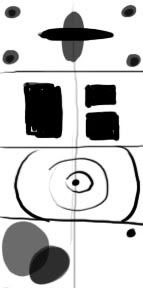
well for an image to be successful you have to have balance. but there are difference ways to do this. i really good compasition will keep the eye moving around the image, or move the eye from one point to the next. here are some examples for you so i make a little more sence
Ah, well I understood the last one, asymetry from what you said first off, but thanks for the image, I'll try each of them and see how it works out
Limmy, _________________ Flatter me, and I may not believe you.
Criticize me, and I may not like you.
Ignore me, and I may not forgive you.
Encourage me, and I will not forget you
You cannot post new topics in this forum You cannot reply to topics in this forum You cannot edit your posts in this forum You cannot delete your posts in this forum You cannot vote in polls in this forum You cannot attach files in this forum You can download files in this forum